Architecture+Data+UX
I Studied Architecture...
Designing digital experiences with structure and data
Turns out buildings and apps fail for the same reasons
A beautiful glass mansion with zero ventilation is a "fine failure." The same way a "clean" app layout that is too confusing to use is just a waste of data.
design isn't just to make things fine. If the person using it is frustrated, then we have a problem!
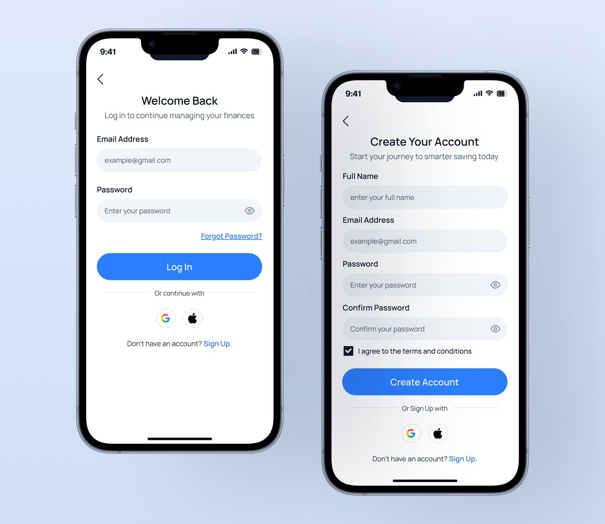
ektós Sign up & Sign in page
The focus was reducing friction around account access while keeping the experience familiar and trustworthy.
Clear fields, straightforward actions, helpful states, and minimal distractions
@TechCrushHQ@JoshOpaleke@Meedayyy#UIUX#UXDesign
ektós fintech hero section - A balance of strong hierarchy, clear CTAs, and financial visuals to make the value instantly clear.
Feel free to drop your comments and reviews...
My @TechCrushHQ exercise assigned to me by my mentor @JoshOpaleke
Designed a profile card with a focus on using grids layout principles, usability, visual hierarchy, and clean spacing, keeping the experience simple and intuitive.
#UIUX#MobileDesign#Figma#UIDesign
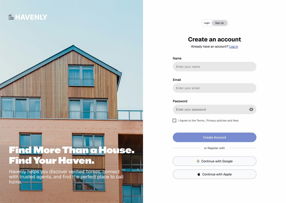
While designing an auth page for a Real estate platform, I focused on reducing friction through clear hierarchy, concise copy, and a familiar layout.
Good UX starts long before users reach the home page.
#UIUX#UXDesign#ProductDesign
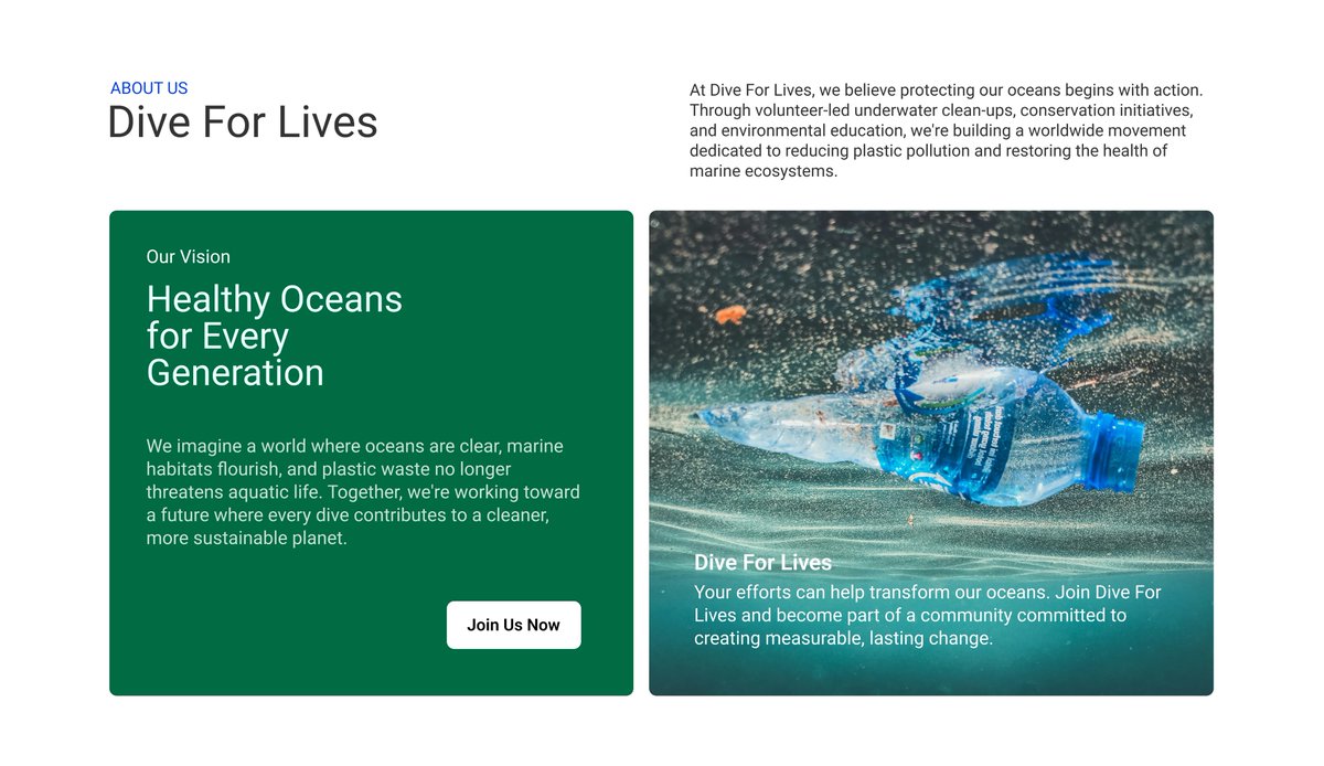
Designed Dive For Lives with one goal: turn awareness into action.
Instead of just creating a website, I designed a journey that educates users about ocean plastic pollution and encourages them to volunteer.
Great UX isn't just seen, it's felt.
#UXDesign#UIDesign#Webdesign
Waiting is part of UX,but uncertainty doesn’t have to be. Great loading/progress states tell users what’s happening, how far along they are, and what to do if something goes wrong. From initial to stalled to completed, clear status + actions like Retry build trust. #UXUIDesign