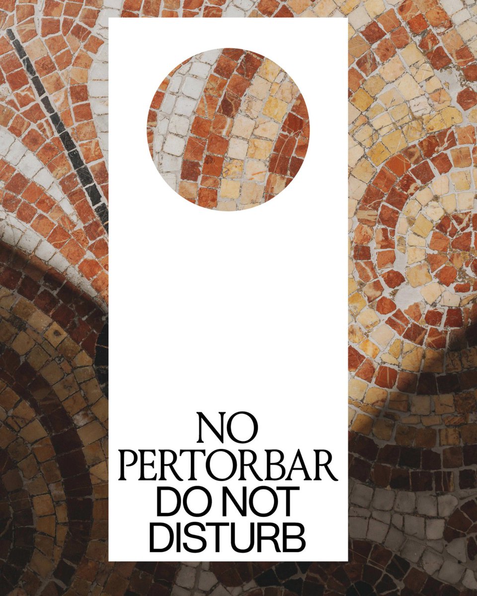
Casa Llimona Hotel, an identity drawn from Barcelona's modernist architecture —
designed by Atipus Barcelona
Curated by the WeLoveDaily editorial team.
Congrats @atipus
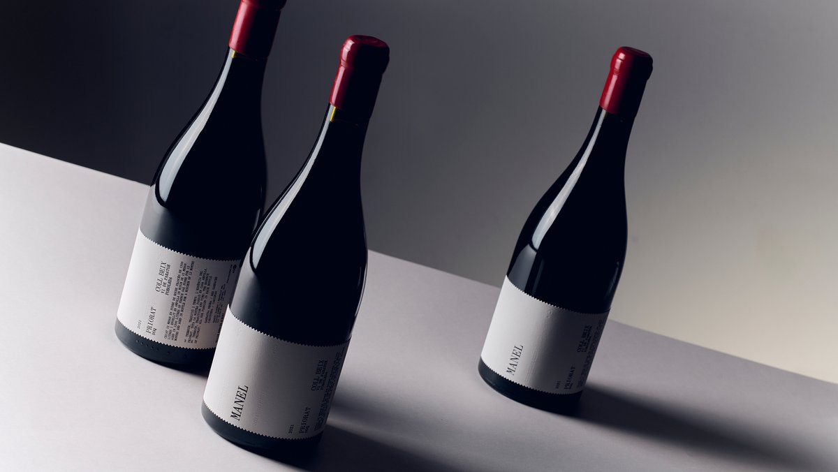
A new label for Manel🍷
We took their original visual language as our starting point, keeping its essence while giving it a more contemporary expression. The winery’s symbol acts as a link to its origins. 🍁
A new identity for Vinya Llarga, @mariarigolordi’s first wine after years devoted to cava.
We took the name as our starting point, letting it stretch across the bottle and turn the label into its main character. 🔄
📷: Marc G. Camps
5 Inbook mentions:
📓 Disseny Market Static
Outdoor Advertising
📓 Disseny Market
Applied Graphics in Space
📓 Vinya Llarga
Packaging
📓 BASS - In collaboration with digital of things
Poster Design
📓 BASS - In collaboration with digital of things Corporate ID
For @teatrenacional's new season, we turned Barcelona into the campaign. A blue inspired by the city’s horizon connects outdoor panels, buses, posters and a mural at Glòries, bringing the season into the streets.
New season at @teatrenacional is shaped by the writers and directors behind each work.
The launch film maps the season through its creators, with Barcelona as a horizon in soft blue.
3D Video: Pablo Arenas
Photography: Geraldine Leloutre
Sound Design: Josefina Rozenwasser Marin
Para Jordi Roy, creatividad y espíritu resolutivo siempre han ido de la mano. Este impulso lo ha llevado a moverse por diferentes disciplinas.
En esta conversación reivindica la incomodidad como motor y el diseño de producto como vehículo cultural.
👉https://t.co/btxyo2pbLq
For Viefe’s 2026 catalogue, we shifted toward a more editorial format.
Expressive visuals highlight materials and finishes, while modular grids keep information structured. Interviews add context, creating a flexible system that’s still easy to navigate.
For Disseny Market 25 we created a brand that evolves. @adgfad’s symbol frames hand-drawn, airbrushed illustrations, bold, simple and adaptable letting the market’s personality come through, now and in future editions.
For this year's Disseny Market, we designed a brand built to evolve.
The visual system creates a frame using @adgfad’s symbol, where hand-drawn illustrations live, keeping the market visible and recognizable from a distance.
For Disseny Market, we created a brand that can adapt over time.
The @adgfad symbol works as a frame where ideas take place. The typography follows its visual codes, keeping the identity neutral and connected to the institution.
Different editions all under the same brand. 🏠
At the Sanatori de Puig d’Olena, Màrius Torres shaped his poetry through a deep bond with nature. 🌿
For the 2025 Literary Awards by @cultura_lleida, the campaign reflects that connection in a green palette across all formats.
During his time at Sanatori de Puig d’Olena, Màrius Torres wove nature into the heart of his poetry. 🌿
For this year’s @cultura_lleida Literary Awards, our campaign mirrors that: a green backdrop evokes his world, across digital, print & outdoor.