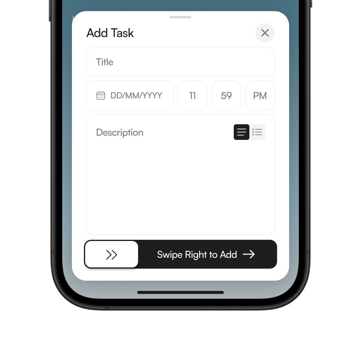
Designing the Add Task modal for Queue.
No clutter.
Title, deadline, description.
Swipe right to add.
Trying to keep task creation as lightweight as sending a message.
Most task apps are just tap, tap, tap.
Open. Edit. Complete.
It works. But marking something “done” ends up feeling like flipping a setting.
While building Queue, I kept wondering why finishing a task felt the same as changing a preference.
So we switched it up:
Swipe right = done
Swipe left = blocked
Drag = reorder
It’s a small thing. But moving a task feels different than toggling a checkbox.
Took a small break from UX and web design these past few days and went back to my original passion, 3D.
Had a little too much fun with this micro project.
Published the full case study about this landing page design built in @framer on @contra and attached the demo here 👇
Spent the last week designing this — learned a lot about structure, trust cues, and emotional pacing along the way.
Would love your feedback.
Reposts and follows are always appreciated 🤍
Full case study → https://t.co/O0AQdnAYt4
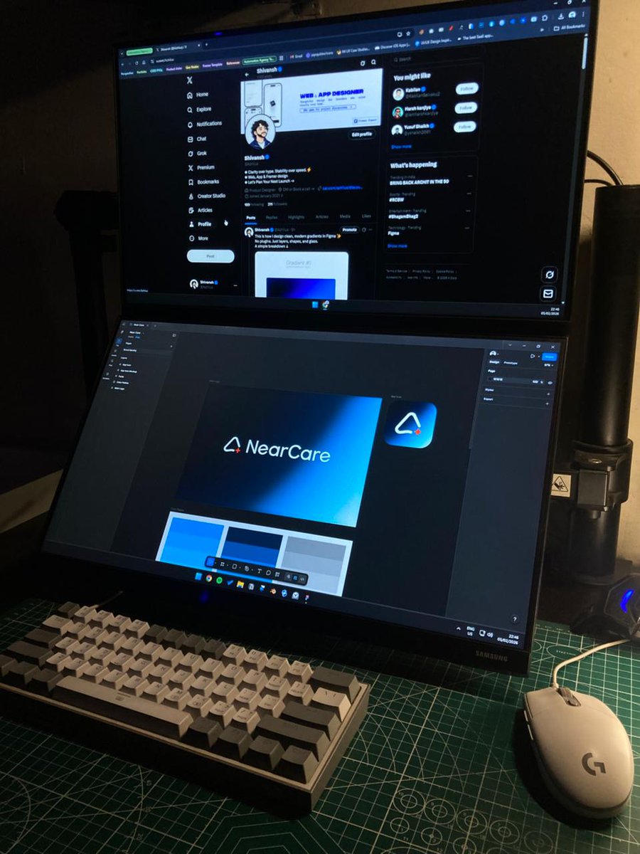
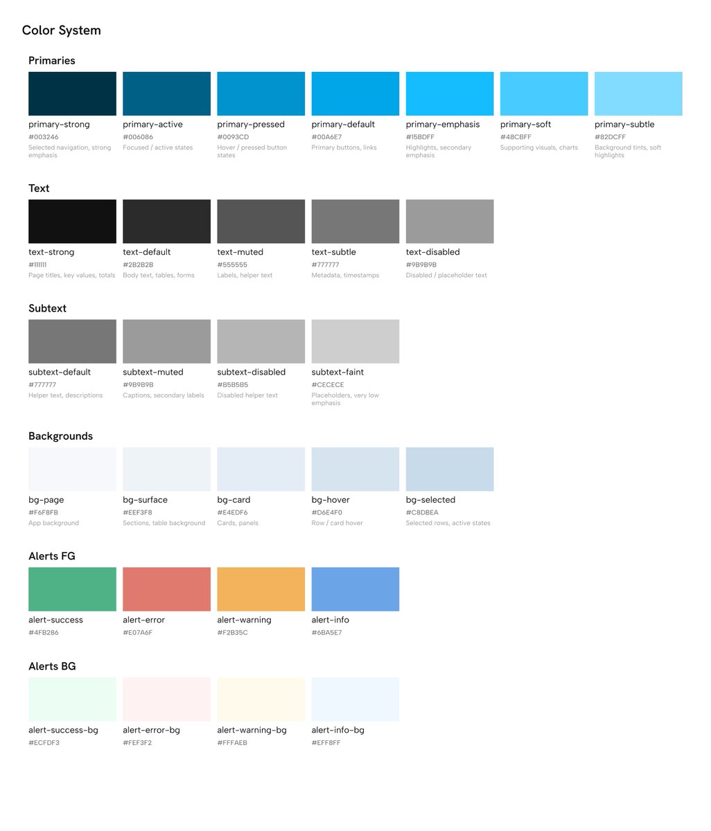
Today I didn’t get much time to post, Was working on refining the colour system and figuring out the typography guide for the quoted project. What are you guys up to this weekend? 👀
Today I didn’t get much time to post, Was working on refining the colour system and figuring out the typography guide for the quoted project. What are you guys up to this weekend? 👀