🥳 Hey tweeps, we've got a cool #dataviz project to share!
🎬 With @TheAcademy Oscars right around the corner, we created an interactive data visual showing all the vehicles ever used by @007#JamesBond.
➡ Check it out at https://t.co/Aq7blgcrKt
(1/12)
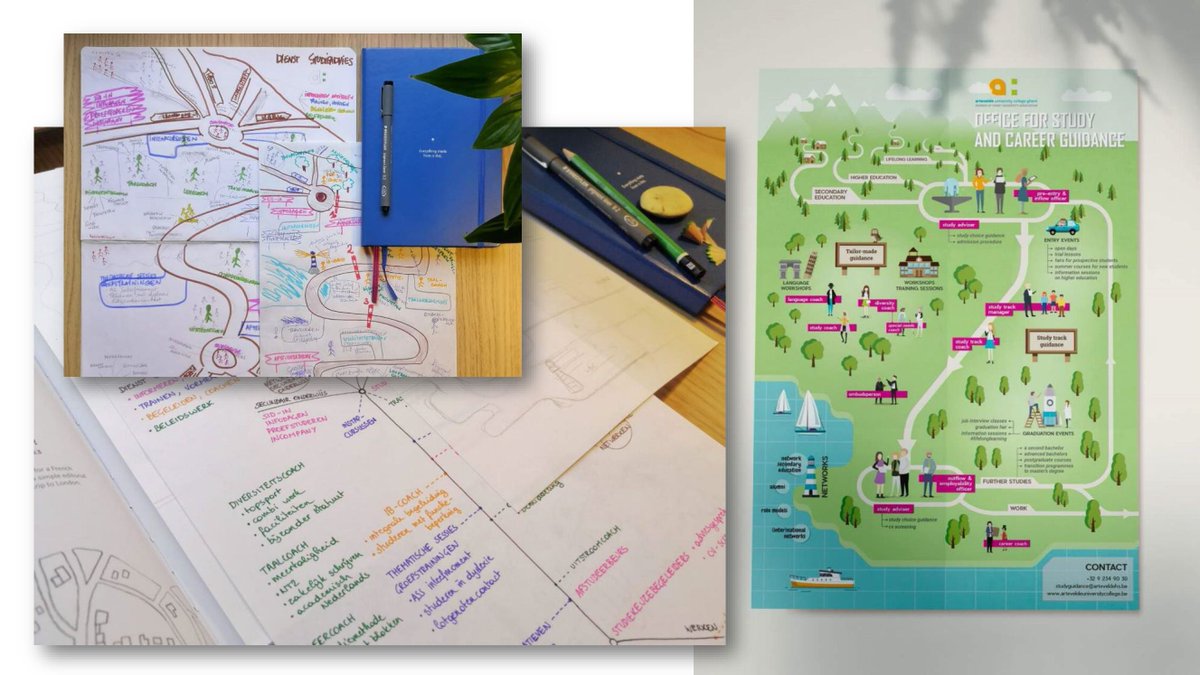
This #infographic by Stephanie Phung is always a favorite example during my workshops.
✅ What WORKS in this infographic?
• Consistency: colors, fonts, font sizes and illustration style are the same throughout the entire visual. Everything in the visual belongs together.
1/7
🎨 Not sure how your color combination will look like in real life?
I love how @coolors_co's "Palette Visualizer" helps you with exactly that in a fast and simple way: pick any color combination and see it applied in illustrations, typography, and even a dashboard.
1/3
Why do some infographics feel very professional, while yours feels amateurish?
There are 3 essential keys you might be missing:
🔑 Sketching: never start creating an infographic without working on paper first. Sketch ideas, explore layouts, iterate!
1/3
Michael Friendly & Howard Wainer clearly love graphs. But "A History of Data Visualization & Graphic Communication" isn’t just about graphs — it’s about the stories behind them: the context, people, new measurements that made them necessary, and the discoveries they enabled.
1/3
Very few charts are famous enough to have their own Wikipedia page. In climate studies there are the hockey stick graph and warming stripes. The energy sector also has one: the duck curve. It's one of the rare charts that jumped from engineering papers into public debate.
1/5
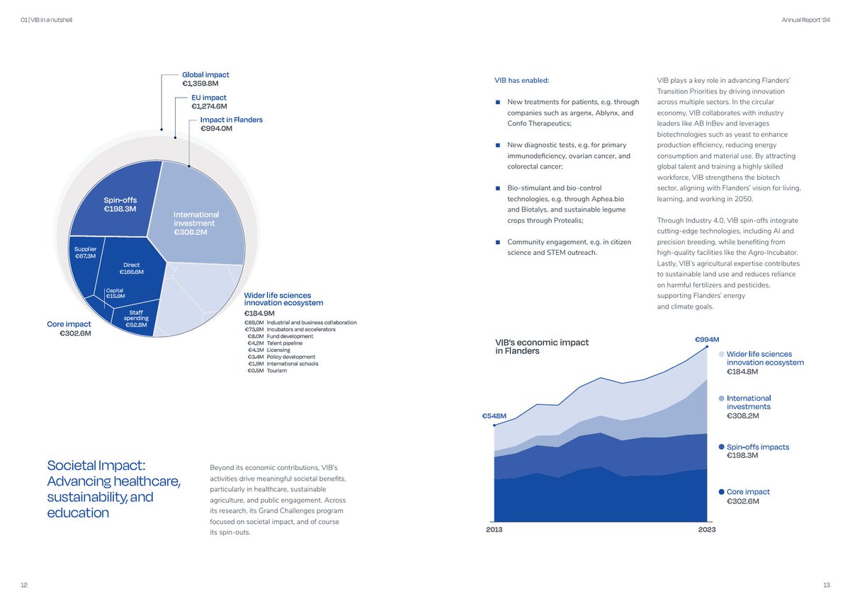
A data visual doesn't need a ton of colors. But working with only 1 color? That's quite a challenge!
In the most recent @VIBLifeSciences annual report, each chapter uses its own characteristic brand color. However, this means the visuals also needed to use this single hue!
1/4
🧐 If you're a more analytically inclined person, you might find the process of creating and evaluating data visuals a bit too 'fuzzy'.
No worries! The amazing Stephanie Evergreen has created just the thing for you: the Data Visualization Checklist.
(1/2)
Clustered bar charts are messy.
And worst of all, they often don't even show what you want to see.
Here's an example: the impact AI will have on our jobs. It's a big mess with 34 bars and 34 data labels, in two colors. It makes me a little bit dizzy just looking at it.
(1/4)
Now that we know all the Nobel Prize laureates for 2024, let's have a look at the numbers! I've been making infographic about the gender balance among laureates for a few years now.
#NobelPrize#WomenoftheNobelPrize#infographic
(1/8)
🎨 Should you use classed or unclassed color scales... and why does it matter?
I encountered this suboptimal map on X a few days ago. But let's find out exactly why it's suboptimal.
Ready? Let's nerd out about #dataviz colors 😎
(1/10)
Day 2 of exploring alternatives for this line chart: how about a stacked bar chart?
✅ Also shows the total number of cars, which might be interesting.
❌ I find it a bit harder to read values for intermediate years.
(1/3)
📊 Yay! New charts!
Yesterday, @Scivil_Flanders published their very first 'Citizen Science Scan', an overview of #citizenscience initiatives in Belgium. And it's massive: Belgian citizens have participated in science over a million times!
(1/13)
Well, I've been asked to design the charts and layout for the report of the @Sensoa_be 'Big Condom Survey' on condom use in Flanders.
It's a 125-page report with 60 charts: stacked bars, dot plots, histograms, dumbbell charts, and of course the occasional matrix chart.
(2/13)
😶 I don't like #dashboards. There, I said it.
Ok, some nuance: I don't like _most_ dashboards. The main reason: they're trying to do everything, everywhere, all at once.
(1/8)
🥰 In my top 5 favourite chart types: a matrix chart!
🤔 What is it? A matrix chart is similar to a heatmap, and it has the same compact design. But rather than relying on color differences, we use bubbles with different sizes to show the data.
(1/7)
#dataviz
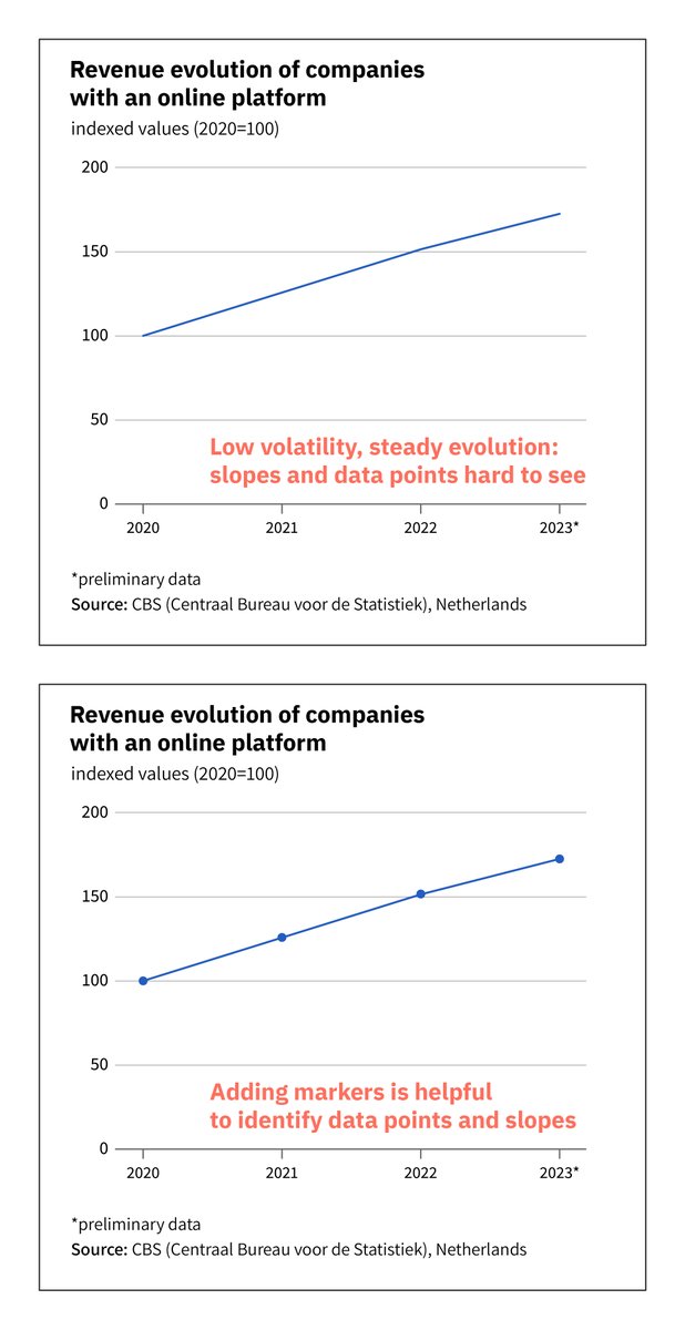
📈 The necessity for markers in a line chart is mainly driven by the volatility of the data. When evolution is steady, markers help to spot the data points and clarify the slopes of the lines.
Mainly useful for small datasets, but large datasets can benefit as well!
#dataviz
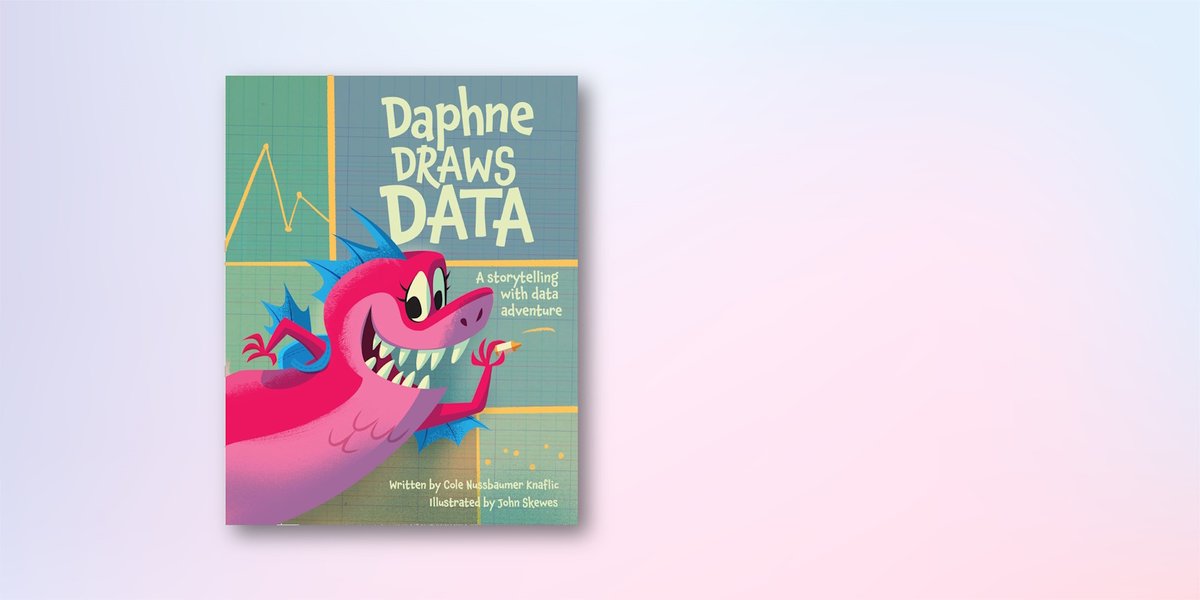
I've added 'Daphne Draws Data' to my #dataviz book list:
https://t.co/9kbxQO6iXm
Probably the cutest book on there! 6 to 9-year olds will love this introduction to gathering data and drawing charts.
The newest @storywithdata book with beautiful illustrations by John Skewes.
Yes, @NotionHQ charts are here!
Some very quick first thoughts:
✅ four solid chart options for now (bar, column, line and doughnut) which will cover most of the basic needs.
✅ extremely intuitive way of setting them up
🤔 bar and column width feels very narrow
(1/3)