You don’t get 30 seconds to explain a product.
You get about 3.
So I redesigned this hero around one question:
“What does the customer get if they keep scrolling?”
The answer needed to be obvious before anything else.
Before → after.
Most before & afters show a prettier design.
This one is about closing the gap between:
“Here’s the product.”
and
“Here’s why I need it.”
I rebuilt the hero around the transformation first because that’s what the customer actually cares about.
Before → after below.
I’ve started noticing something with advertorials:
The best ones don’t feel like they’re trying to sell you anything.
They make you stop and think,
“Wait… this is exactly what I’ve been dealing with.”
That was the goal behind this Motherlove redesign.
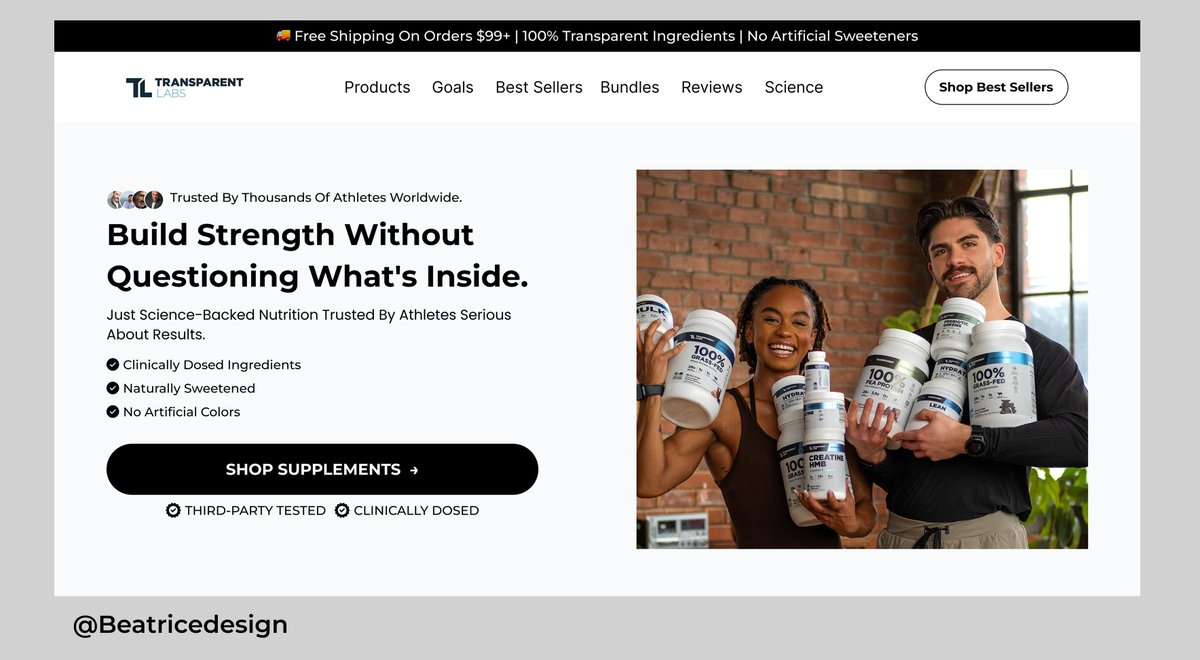
Redesigned the hero section for Transparent Labs today.
Most brands think the hero section is where you introduce the product.
I think it's where you remove doubt.
That's the standard I designed for.
#LandingPage#DTC#Ecommerce#CRO#Figma
Redesigned a listicle page today.
The biggest conversion killer wasn't the copy.
It wasn't the offer.
It wasn't the product.
It was making people work too hard to understand what they were looking at.
Good design removes questions before they become objections.
#Figma#Ecommerce
Redesigned a listicle page today.
One thing I've noticed:
Brands talk about their product.
Customers care about solving a problem.
Good design bridges that gap.
Every section should earn the next scroll.
#Figma#CRO#ecommerce#LandingPageDesign
I redesigned a listicle page today.
Most listicle pages read like blogs not sales pages.
A great listicle builds trust, answers objections, and makes buying feel like the next logical step.
Small design tweaks. Big conversion gains.
#Shopify#ecommerce#CRO#DTC
Just wrapped up a redesign of a listicle page for Word Coffee.
One thing I kept asking while designing:
"If I knew nothing about this brand, what would I need to see before I'd trust it?"
That single question shaped every section on the page.
#LandingPage#CRO#WebDesign