come join my✨ Data Visualization workshop ✨ with @smashingmag, starting this Thursday!
You'll leave with a really solid foundation to build the amazing, custom, interactive visualizations you see in places like the @nytimes, using d3 + SVG + @sveltejs
https://t.co/f8Z1dF5pHV
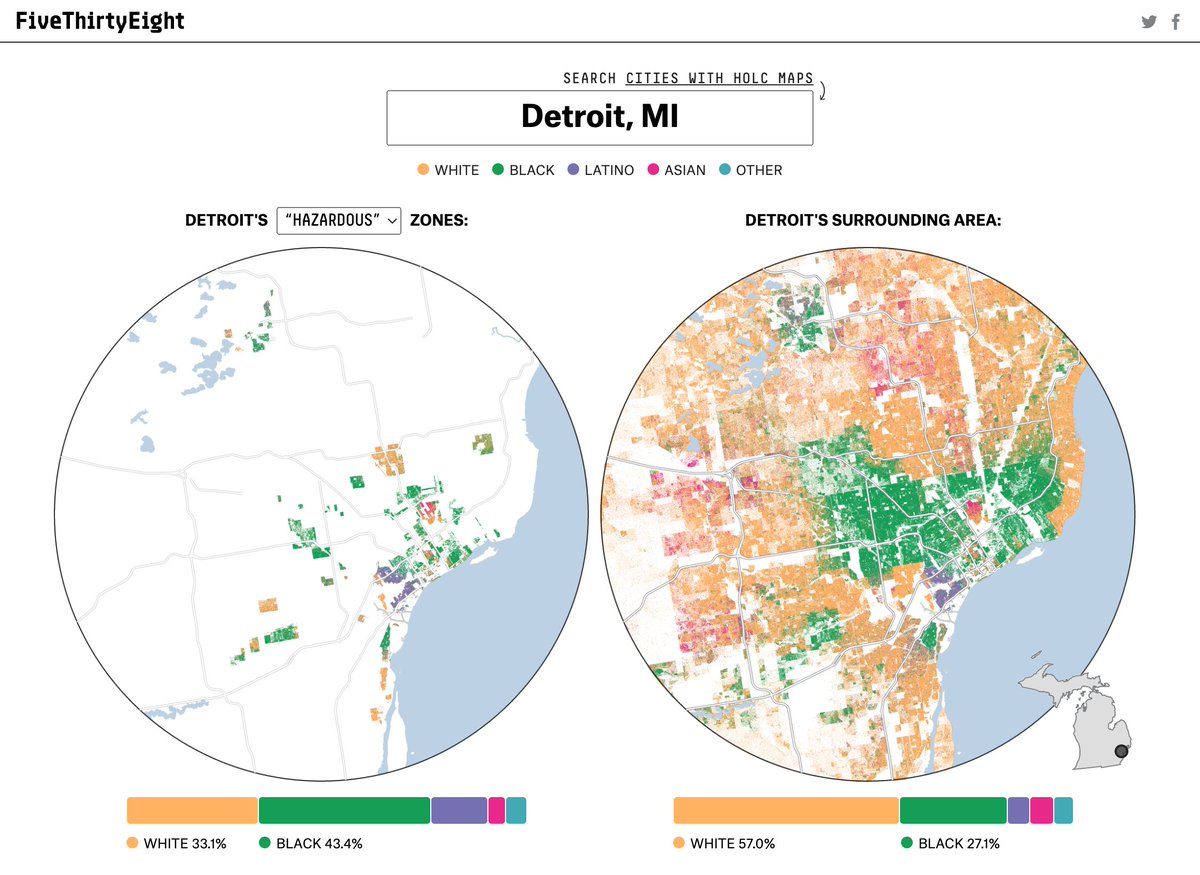
Like so many examples of systemic racism, redlining has had destructive, generational effects on American society. @elena___mejia and I dove into evidence of its long-lasting imprint on racial segregation in our cities. Here’s what went into the maps: 🧵
https://t.co/iYGvUgtIKC
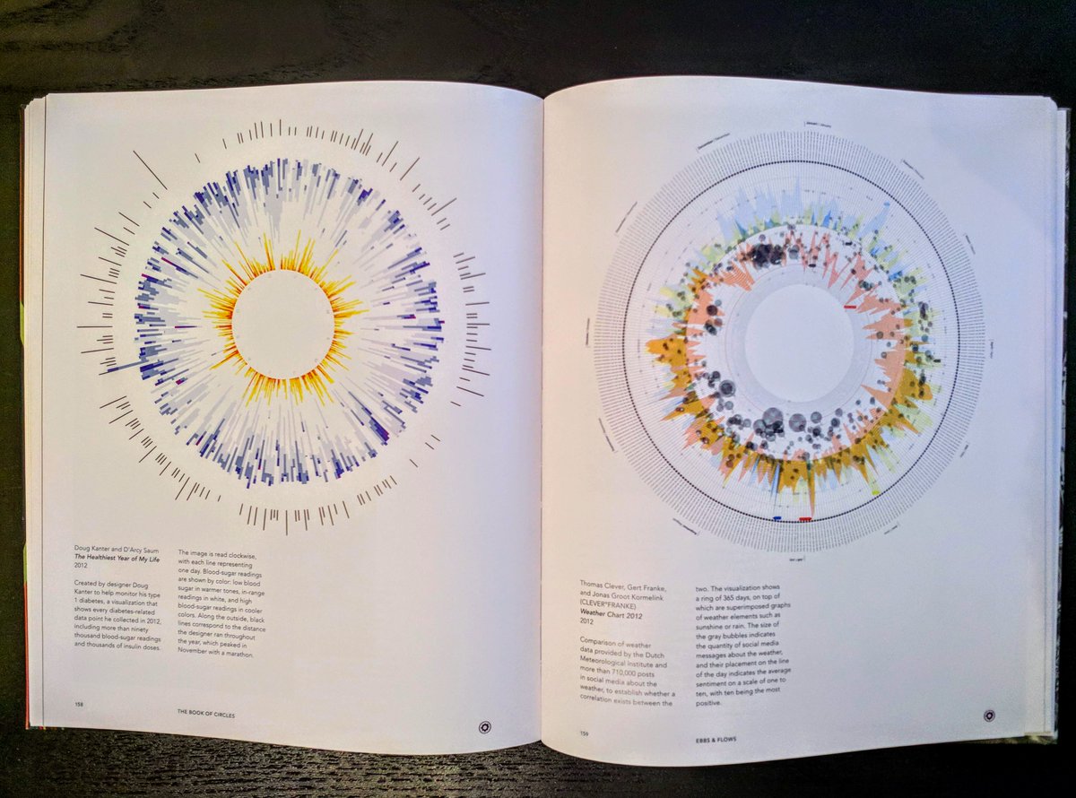
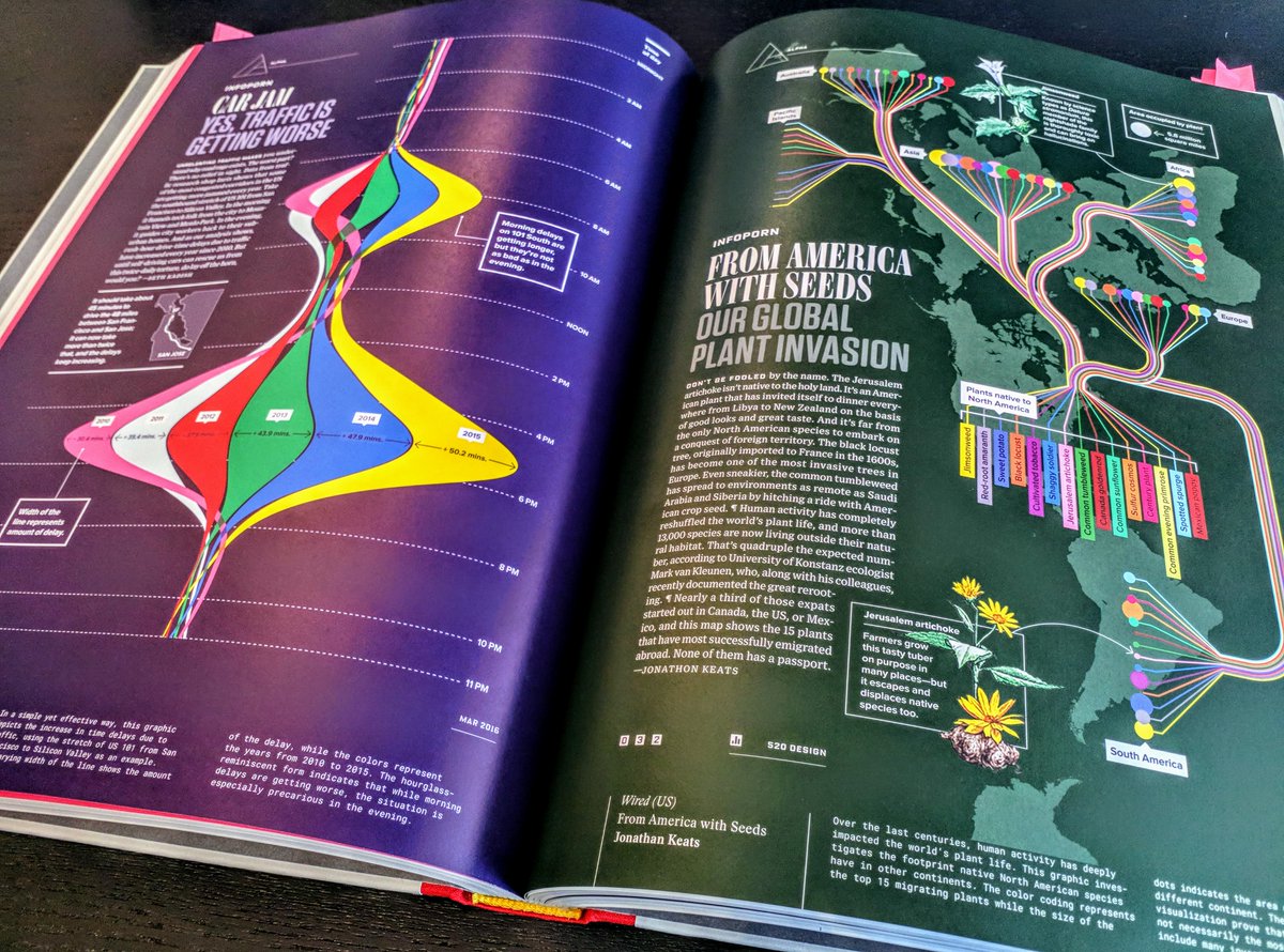
I expanded my "#DataViz Book Review" page with 13 new reviews!! 🔥 Now also including "dataviz collection books" by masters such as @srendgen and @mslima
You can find all ±30 of my dataviz book reviews here:
https://t.co/GcKHKclyvN
🥳 Tableau Software just launched #DataKids—a program for kids to get involved and get inspired by data. Find resources, explore tips and tricks, and get started with the first activity: https://t.co/xigYKGpOfH
So, @tableau 2020.2 dropped last night and today, I'm pleased to share the biggest playlist yet. I covered new features across Desktop, Prep & Server. 20 videos! & starting next week join me every Wednesday for a deep dive! Videos>> https://t.co/rgWaGKFi3m
🥳 Let’s give a warm welcome to the 2020 class of Zen Masters! Meet our exceptional inductees and learn more about the selection process: https://t.co/Xl2xIjb4xa
Want a birds-eye-view of D3.js?
https://t.co/jDRVGRygPc
I finally finished my MONGO "blog post" on the different parts of d3, grouped by similar functionality.
I learned a ton of new methods. I hope you find it useful - I bet you'll learn something new even with a quick scan.
NEW!! 🎉 Watch the explosive growth of all refugee deportation flights from the EU since 2006, done by "Deportation Machine" Frontex, made for @LHreports with data from Freedom of Information requests #ReturnsNetwork
Bigger version (best seen big): https://t.co/VsqirMCFHn
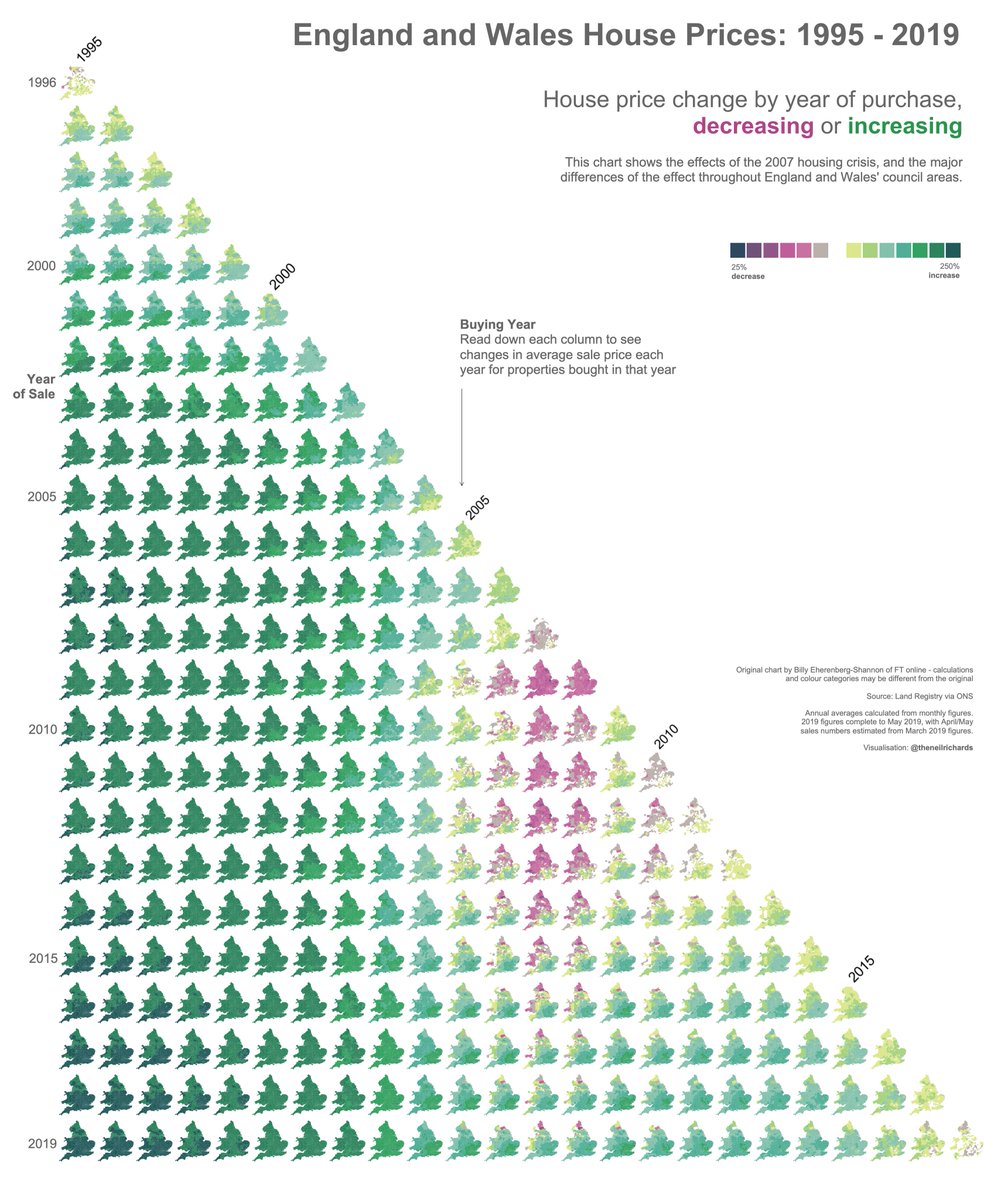
House Prices 1995-2019: My friend and boss, @markee88 told me "I've got a crazy idea for that triangle house prices chart. What about doing one triangle shape of the country map? I think it should show a ripple and sustained impact in the North West". Not crazy, he was right!