El Gran Premio del Jurado de #Cannes2025.
Un Oscar a Mejor Película Internacional.
Y ahora, un hueco en tu estantería.
🏠❤️🩹 ¡#ValorSentimental ya está disponible en Blu-ray con una semana de preventa y precio reducido!
Puedes encontrarlo en https://t.co/NXyvHzfcmG
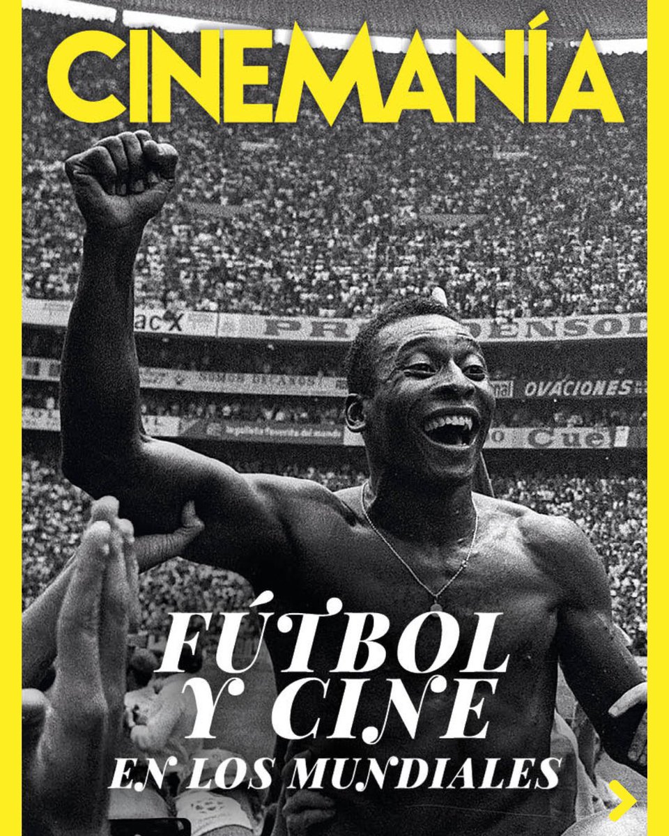
El programa absurdo premium que no sabías que necesitabas: una charla semanal entre @lalibreta y @futbolycine sobre películas y la historia de los Mundiales (mientras dure la movida esta trionda de la FIFA) en @CINEMANIA_ES
https://t.co/kEDSGoCuTl
In their latest column, @adriancurry shares reminiscences of the late poster artist Tony Stella with his main artistic collaborator, @midmarauder → https://t.co/JtCpYrBe1A
Ecos del cartel de 'Marco', la película de los guipuzcoanos Arregi y Garaño (con los Moriarty) para el nuevo diseño de Darín para el Zinemaldia. El diseño de aquel estupendo cartel es también de Estudio Wallijai
Ecos del cartel de 'Marco', la película de los guipuzcoanos Arregi y Garaño (con los Moriarty) para el nuevo diseño de Darín para el Zinemaldia. El diseño de aquel estupendo cartel es también de Estudio Wallijai
El gran Ricardo Darín, en el cartel del 74 Festival de San Sebastián 2026. Un diseño de Estudio Wallijai, un collage a partir de un retrato de Sebastián Arpesella. Novena figura del cine mundial que aparece en la serie reciente de los carteles oficiales de @sansebastianfes
... y siguiendo con la dirección de arte (Nest), el maquillaje (Culinary Zinema), los efectos especiales (Zinemira) y la producción (Made in Spain). @sansebastianfes
Estudio Wallijai ha presentado también los diseños de los carteles de las secciones del @sansebastianfes, siguiendo un tema común basado en los oficios del cine: guion (New Directors), el sonido (Horizontes Latinos), la dirección (Zabaltegi-Tabakalera), el montaje (Perlak)...
#74SSIFF ⭐️ Ricardo Darín protagoniza el cartel oficial de la 74ª edición del Festival de San Sebastián.
El actor, productor y director argentino @BombitaDarin, rostro habitual del Festival y Premio Donostia en 2017, es la imagen del póster principal, diseñado de nuevo por el estudio Wallijai, que ha creado un collage a partir de un retrato tomado en 2024 por el fotógrafo Sebastián Arpesella.
🎬 El estudio donostiarra ha elaborado también los carteles del resto de secciones, cuyo leitmotiv son los oficios del cine.
🌐 https://t.co/Ay33d3QaIl
Y, entre los ecos de un presunta polémica entre críticos en Cannes, apareció este cartel ad hoc, sencillo pero correcto, compuesto por algunas de las voces (y no son pocas) a las que la película de los Javis ha convencido dentro y fuera de España.
Han salido varios carteles de 'LA BOLA NEGRA', pero sin duda el más expresivo, el más rotundo, es el teaser tipográfico, aparentemente sencillo, pero muy contundente. Ese efecto pintadas en la pared transmite mucho. Está guapísimo.
Otro cartel que apareció, con esa bola pintada entre la nieve, aunque interesante la técnica de pintura, me interesa menos por el recurso para el título, esa 'L' que compite demasiado con la bola y rompe el cuadro.
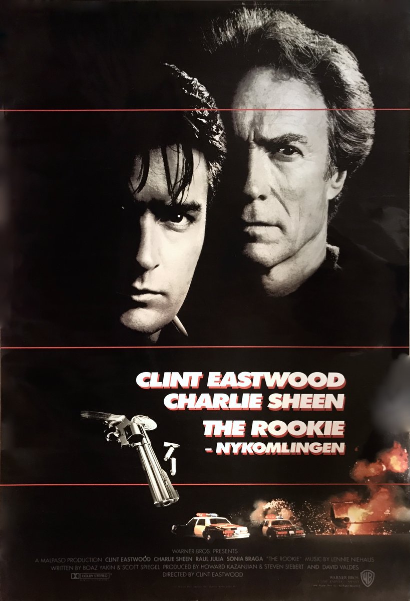
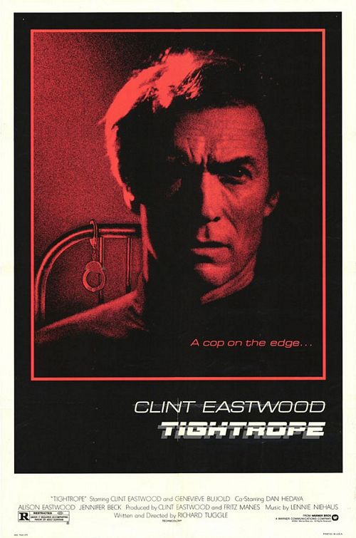
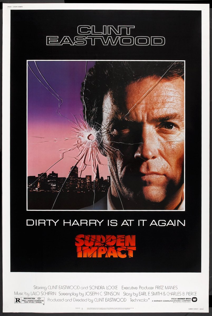
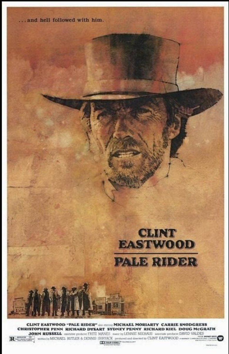
For a bunch of years, I did work for the famous movie poster designer Bill Gold. One of his clients was Clint Eastwood. I worked on a ton of posters for his movies during that time. Some below. Clint knew what sold his movies- his face big on the poster- and this was before computers so we would get stock shots of Clint and design posters around them- using paint, bleach and dye and stripping images and airbrushing effects and so on... when we did not just use illustrators like with Pale Rider. Part of the job was designing a bunch for different countries as well. Clint always hand picked the posters he liked best and they - again- were the ones with his head the main focus.
The Sudden Impact poster - I remember this one well- I had a shot of Clints head, cut it out, sanded the edges of the back of the photo, stripped it on a color airbrush background I did using paint, softened the edges of the hair by hand, then stripped a cityscape in the background and hand painted the bullet hole and crack working from a photo and then drew the cracks with black and white paint and colored dyes over Clint's head, indicating shadows. If you look close you can see the paint...but the illusion was there- again, before computers took that job away. The collar and jack are obviously airbrushed. The sweat and lighting on the face done with Dyes and a brush. The Tightrope one, we had a photo shot of the handcuffs on a bed post-stripped it to the background and so on- all of these are photo composite with some retouching except for pale Rider which was an illustration.