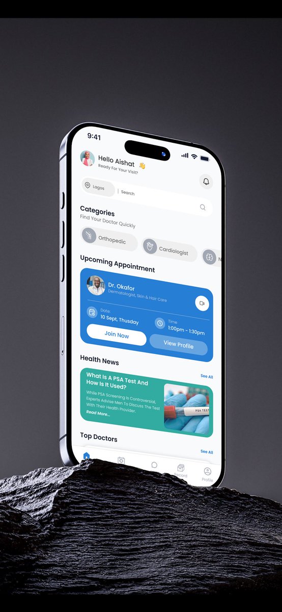
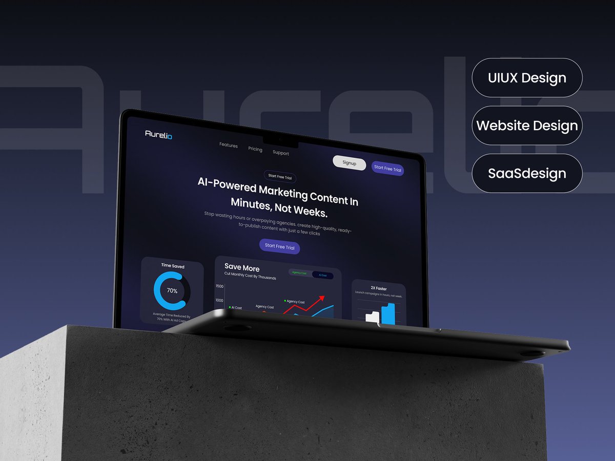
After a space with @thedennisobaro1 Denis, @desgnwitkinsley & @Tegadesigns last month, I revisited my portfolio and completed 3 case studies:
Healthcare Ap, AI Marketing Website
E-commerce Redesign
Financial Coaching App casestudy coming soon 👀
https://t.co/qdtJ2polGk
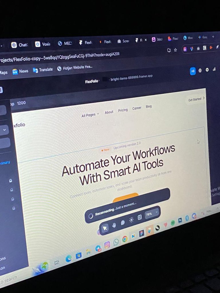
🚧 WIP, This is a Feature section for an AI workflow SaaS I’m building.
Designing this to make automation feel simple before users even try it.
Still refining spacing, hierarchy, and motion.
More updates coming.
#buildinpublic#framer#saas#webdesign
happy new week everyone 🙂
building an AI workflow landing page on Framer this week
goal is to make it simple and clear enough that you want to try the product before you finish reading
@framer
happy new week everyone 🙂
building an AI workflow landing page on Framer this week
goal is to make it simple and clear enough that you want to try the product before you finish reading
@framer
Nothing is broken.
But in both cases, something small happens.
The energy drops. Right when someone is ready to act, they pause.
And those small pauses?
Over time, they quietly turn into fewer transactions and fewer upgrades.
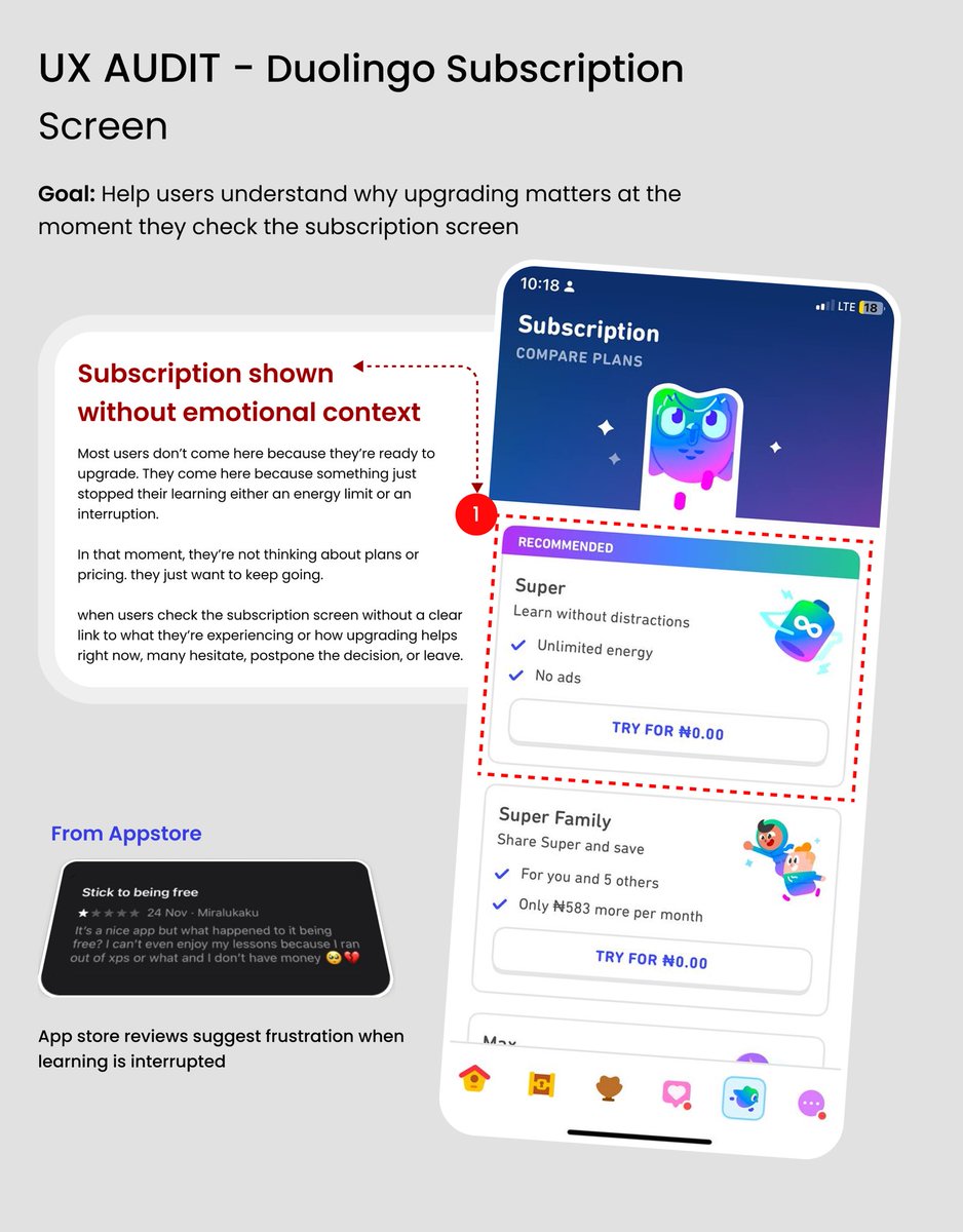
What Duolingo and PalmPay taught me this week
Two different apps. Same pattern.
In PalmPay, users open the app to send money but everything looks equally important.
In Duolingo, users hit a limit and want to continue they see pricing immediately.
Small UX thought from Duolingo.
Many users hit the subscription screen because their lesson just got blocked not because they want to upgrade.
In that moment, they just want to keep going. Jumping straight to pricing makes people pause.
Small timing details matter.
Your thought?
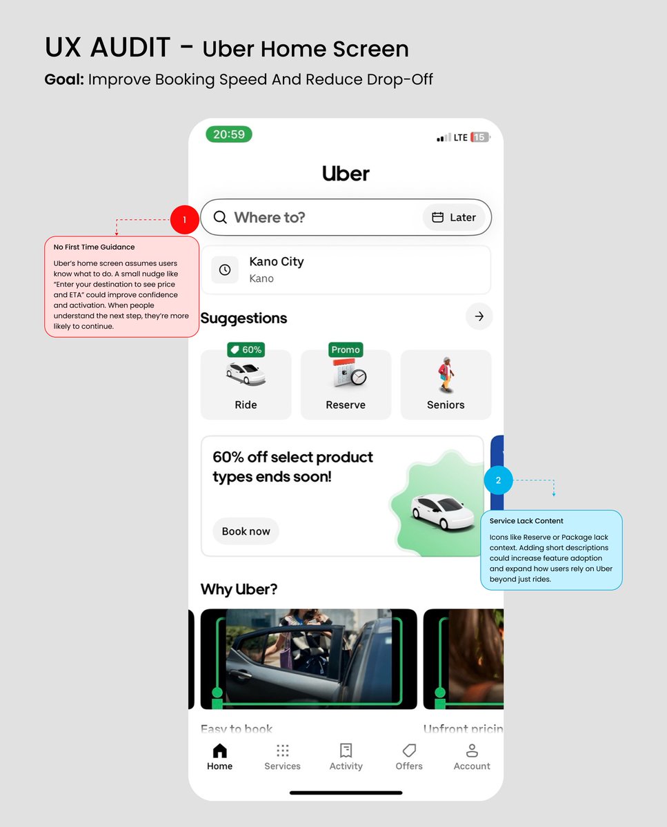
Quick UX check on Uber’s home screen.
Nothing is broken, but a few things slow people down:
• New users aren’t told what to do next
• Some features aren’t easy to understand
No redesign needed.
Just clearer guidance at the right moment.
Small UX choices add up fast.
This page looked fine but it wasn’t doing its job.
Nothing was wrong.
But Nothing was helping a new visitor decide either.
So I redesigned the hero for clarity:
clear message, clearer CTA, proof upfront.
Which version would make you reach out?