On Veterans Day, we extend our deepest gratitude to all who have served. Your courage and sacrifice inspire us. Thank you for your service! #VeteransDay#HonorOurVets#csufedtech
Mistake: Poor Color Contrast Using images as slide backgrounds without sufficient color contrast impacts legibility for many. Ensure your text stands out clearly against its background! #ColorContrast#Readability#CSUFEdTech
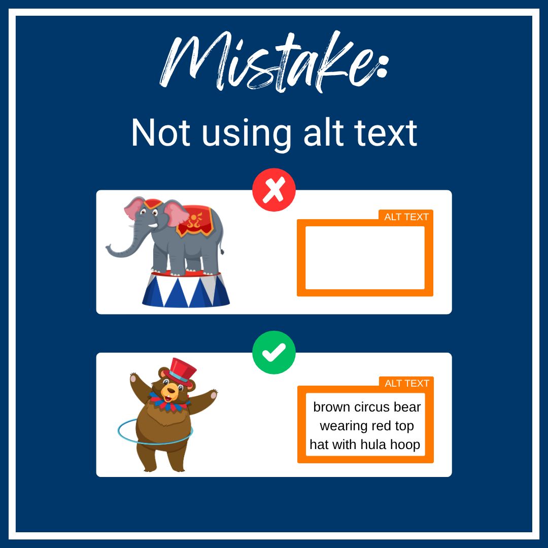
Mistake: Images Without Alt Text Sharing pictures without alternative text (alt text) leaves out visually impaired learners. Always describe your images so everyone can engage with your content! #AltText#VisualImpairment#CSUFEdTech
Mistake: Underlining for Emphasis Underlining text signals a link to many users. Avoid confusion by reserving underlines strictly for hyperlinks and using bold or italics for emphasis! #WebAccessibility#ClarityInContent#CSUFEdTech
Mistake: Emojis as Bullets Using emojis as bullet points or within text can garble messages for screen readers. Keep your digital content clear and accessible by choosing text-based formatting! #ScreenReaderFriendly#DigitalAccessibility#CSUFEdTech
Mistake: Color-Coding Only Don't rely only on color to convey information! For our color-blind learners, always provide alternative ways to understand content. Think shapes, labels, or patterns! #AccessibleContent#InclusiveDesign#CSUFEdTech
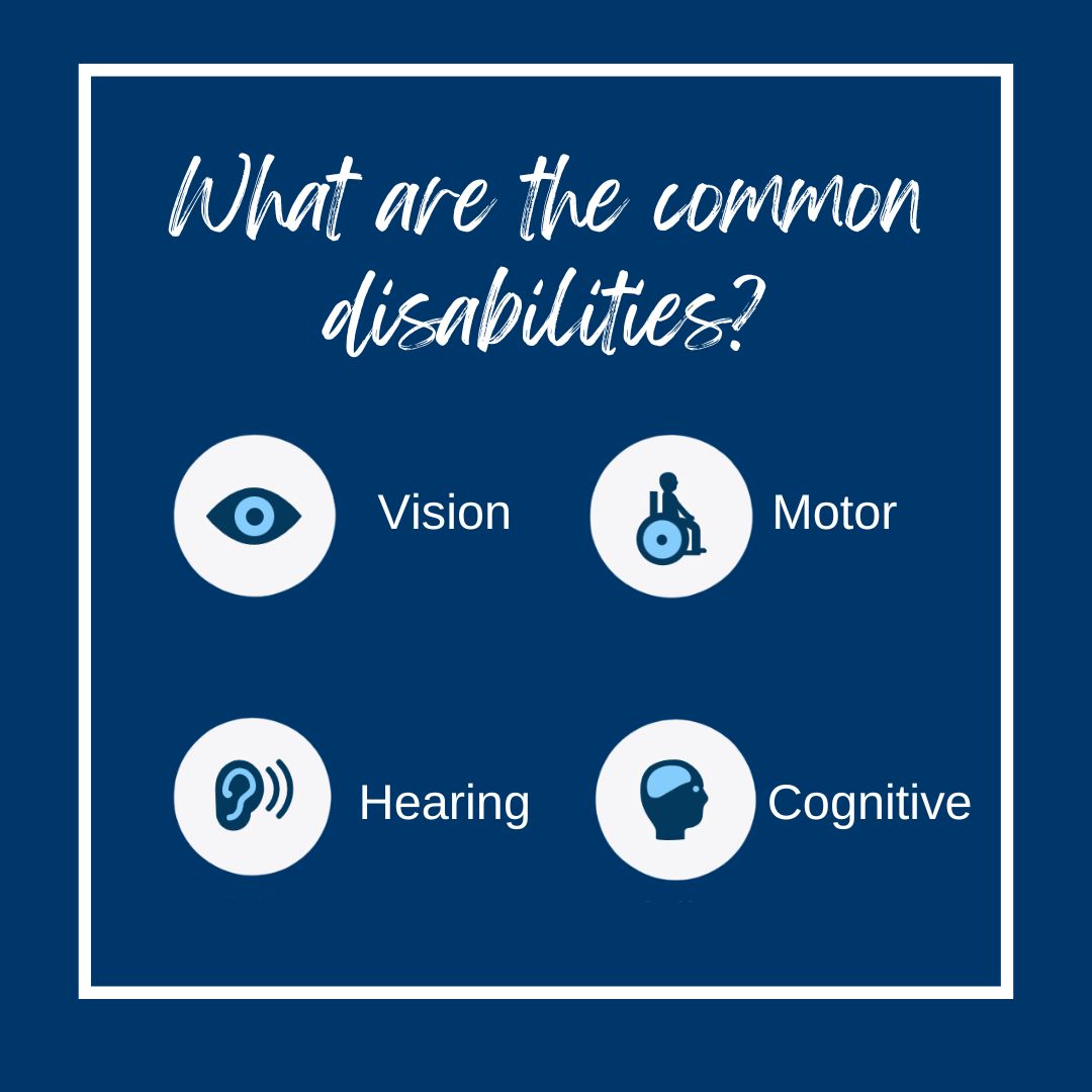
This month we are going to take a close look at Digital Accessibility. Follow along for some common mistakes and how to fix them.
https://t.co/92qyIxtBp8
#DigitalAccessibility#CSUFEdTech