I had a blast doing the #30DayMapChallenge created by @tjukanov. All of the maps I made I compiled into a portfolio, if anyone wants to check it out, it's here: https://t.co/YXPghYz1jU (1/6)
Every time I would come across some data, I would think if I could create a map and put it up as part of this year's challenge. I had quite a few maps ready even before the themes for this year were announced, I fit them into themes later. (3/6)
I had a blast doing the #30DayMapChallenge created by @tjukanov. All of the maps I made I compiled into a portfolio, if anyone wants to check it out, it's here: https://t.co/YXPghYz1jU (1/6)
I stumbled across the #30DayMappingChallenge accidentally in March or April of this year. As a person who loves mapping was sad I had never heard of it before. I had been waiting for November ever since. (2/6)
I surprised myself with how some of the maps turned out, while a few I was not happy at all with but posted only because I wanted to complete the 30 days. But I am so happy I was able to do all 30 days!
I cannot wait to learn and do this again next year! (6/6)
Through the 30 maps, I explored several data sources and mapping techniques and even ventured into unfamiliar (for me) territories like coding on R and GEE and 3D rendering. Some maps I made in less than 5 minutes, and some others took hours and days. (5/6)
Concluding the #30DayMapChallenge with the map/ GIF that I made even before this year's themes were announced. Traced here are the growth of all the towns marked as urban according to the 2011 Census.
Data Source: Census of India, Tools: QGIS
Day 30: My Favourite!
I took my recent obsession with dots to new heights!
I have more maps for the challenge which represent population data in some way or the other. Here is another one.
Data Source: Kontur Population Dataset, Tools: QGIS, Aerialod, PS
Day 29: Population for the #30DayMapChallenge
If there was one theme I was extremely excited for but very disappointed with the output, it would be this.
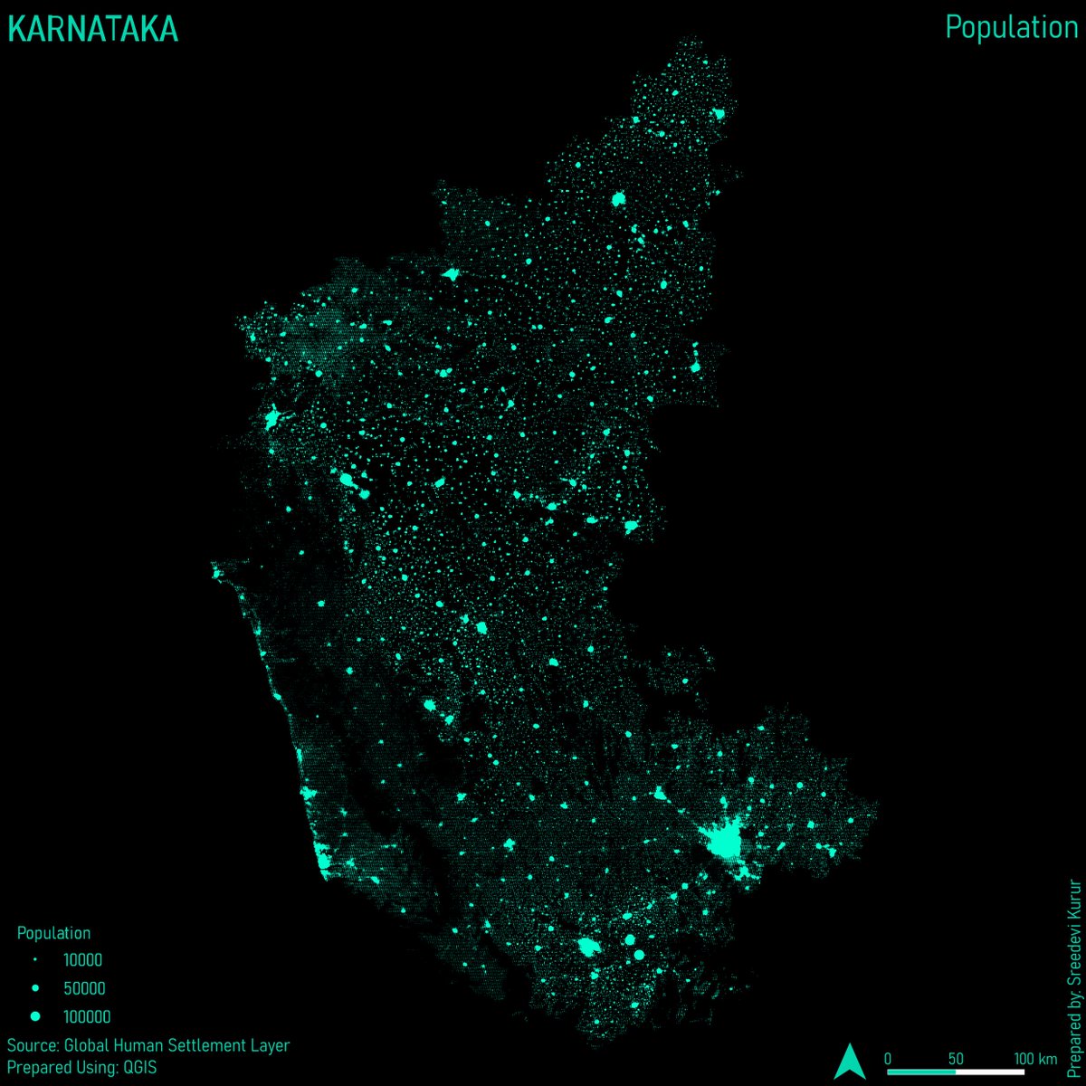
A QGIS version of a Joyplot!
Data: Global Human Settlement Layer
Tools: QGIS
Day 28: Is this a chart or a map? for the #30DayMapChallenge
Every year around Oct, the pollution level in Delhi skyrockets. The stubble burnings in Har and Pun are blamed for this. Mapped here: active fires in Northern India & parts of Pak during Oct 2014 - 23.
Data: NASAEarthObservations, Tool: QGIS
Day 27: Dots for the #30DayMapChallege
A last-minute map today! Struggled with this one, as I didn't know what data to represent.
Geolocation of where Emperor Penguins have been spotted near Antarctica in 2023.
Data: Global Biodiversity Information Facility, GEBCO
Tools: QGIS
Day 25: Antarctica for #30DayMapChallenge
Continuing my explorations with the GHSL data and new software, I used the Aerialod to represent the population of West Bengal in 3D, through simple colours of black and white.
Data: GHSL; Tools: QGIS, Aerialod
Day 24: Black and White for the #30DayMapChallenge
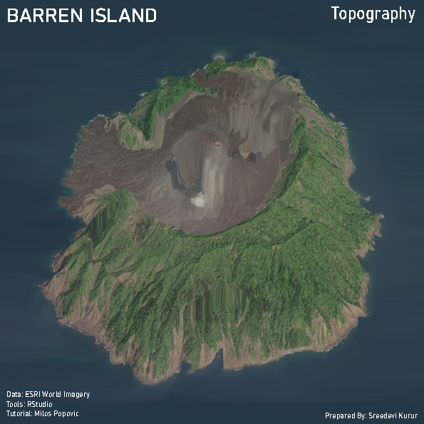
I have always been intimidated by coding and 3D, today's map attempts to tackle both. Realistic 3D render of the Barren Islands, the only active volcano in India.
Tutorial: @milos_agathon
Tools: RStudio
Data Source: ESRI World Imagery
Day 23: 3D for the #30DayMapChallenge
I wanted to make a map using the 'Spilhaus Projection' for Oceans for today's theme. That didn't work, so here's the backup! Bathymetry of the Arctic.
Where is North, at the centre!
Data Source: GEBCO, Tools: QGIS
Day 22: North is not always up! for the #30DayMapChallenge
When GIS was taught to me, vector analysis was always emphasised than raster analysis. Raster satellite data is often only used as a base. NDVI is one of the basic forms of Raster Analysis.
Data Source: Landsat 8, Tools: ArcGIS, QGIS
Day 21: Raster for the #30DayMapChallenge
WHO recommends 9sqm of open space per person. Delhi has 185.65 sqkm of green area (estimated from the OSM). When estimated with the 2011 Population of Delhi, the per capita green space is around 11sqm.
Data Source: OSM, Tools: QGIS
Day
20: Outdoors for the #30DayMapChallenge
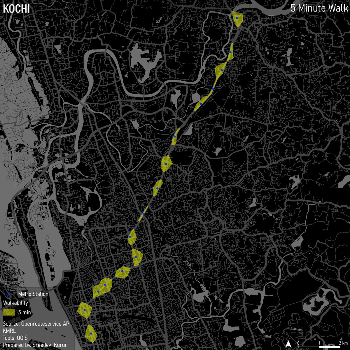
A map prepared in less than 5mins which shows how far you can walk in 5mins from the Kochi Metro stations. Cheated by using a layout which I had previously made.
Data Source: KMRL, OpenRouteServices; Tools: QGIS
Day 19: 5-minute map for the #30DayMapChallenge
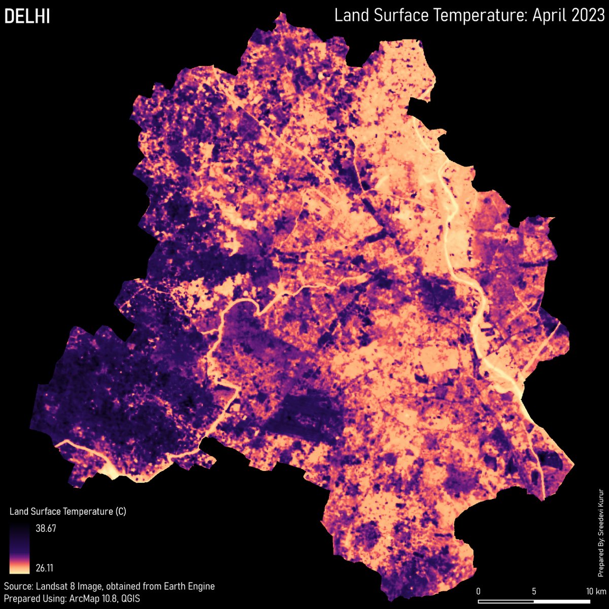
Urban Heat Islands are becoming increasingly common in Indian cities. The Land Surface Temp gives an idea of the temperature radiated from land and is used as an indicator for the UHI effect.
Data: Landsat 8 Data; Tools: ArcGIS, QGIS
Day 18: Atmosphere for the #30DayMapChallenge
This was my 1st attempt at GeoGiffery, inspired by @tjukanov, personally, I like this one better than the one I did for Day 1.
The colours show the lines and grey shows Rapid Metro.
Data: OpenTransitData, Tools: QGIS and GIMP
Day 17: Flow of the #30DayMapChallenge