Layers of Serenity
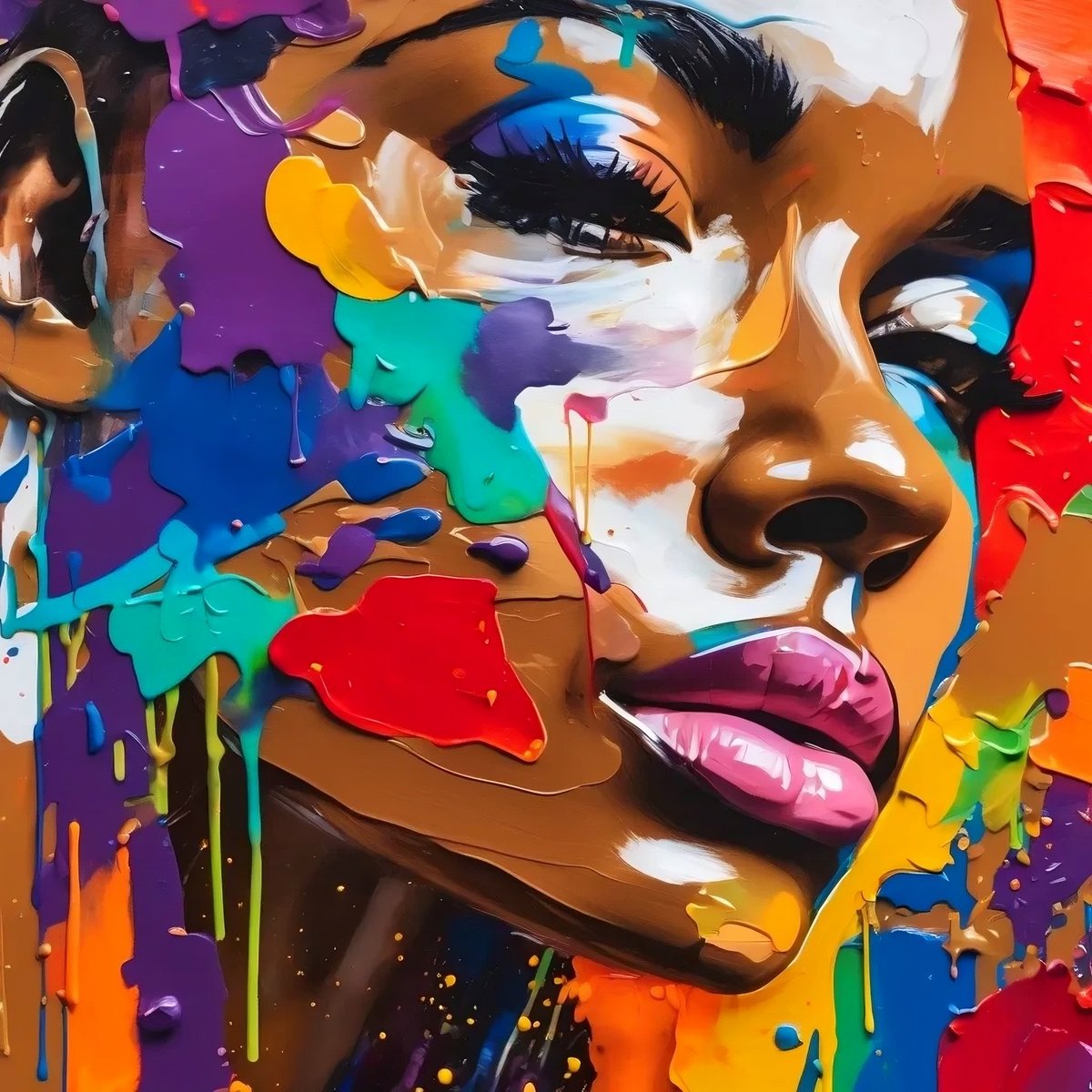
In Layers of Serenity, I aimed to convey a peaceful, contemplative state by focusing on the human face as the centerpiece, deeply textured with expressive brushstrokes. The layers of paint in soft blues, fiery oranges, and subtle reds are intended to evoke the ebb and flow of emotions, reflecting moments of calmness intertwined with the vibrancy of human experience. I wanted the viewer to get lost in the depth of each stroke, feeling the raw emotion yet being grounded by the serenity captured in her closed eyes. The striking color palette was chosen to represent a balance between external energy and inner peace.
Eyes closed in tranquil grace
Colors dance across her face.
A world of thoughts behind the veil
In every layer, emotions sail.
Blue like calm, red like fire
Together they speak of desire.
Yet here she stands in silent grace
A portrait of peace, a sacred space.
Story of Layers of Serenity:
Layers of Serenity came to life during a time when I was reflecting on how people process emotions internally. The idea started as a simple sketch of a peaceful face, and from there, I began layering on different colors to represent the complexity of emotions we often hold beneath a calm exterior. I sought feedback from close friends and family, asking them what colors best represented moments of peace in their lives. Through their insights, the final palette emerged—a mix of vibrant and tranquil tones, symbolizing the balance of the human spirit.
Inspiration:
This artwork was inspired by the quiet moments we experience when we turn inward. I wanted to capture that sense of calm while still acknowledging the energy that exists beneath the surface. The interplay of the blues and oranges represents that duality—how we can feel both serene and energized in those introspective moments. The texture of the paint was inspired by the works of modern abstract painters, whose bold brushstrokes convey a sense of movement and emotion even in stillness.
My Vision:
With Layers of Serenity, my vision was to create a piece that feels both powerful and calming. I wanted it to be something that draws the viewer in, making them pause and reflect on their own emotions. The goal was to create a visual representation of the balance between peace and energy—two forces that often coexist in our inner worlds. The use of thick, textured paint was crucial in achieving that sense of depth, making the viewer want to reach out and feel the artwork’s texture.
How It Was Created:
I began by digitally sketching the outline of the face in Procreate, focusing on the expression of calm in her closed eyes. Using a mix of Adobe Photoshop and ArtRage and a mix of AI, I layered on thick, textured brushstrokes in shades of blue, orange, and red, emulating the look of impasto oil painting. The texture was built up gradually, using a variety of digital brushes to mimic the feel of real paint. I spent time adjusting the interplay of colors to create a dynamic yet balanced composition. The end result is a visually striking piece that blends digital techniques with traditional painting textures.
What I Offer:
I offer unique, emotionally resonant digital artworks that combine abstract and figurative elements. Each piece is carefully crafted to not only be visually stunning but also to provoke thought and reflection. My collections are diverse, ranging from intimate portraits to bold, abstract compositions, all designed to connect with viewers on a deep level.
#art #NFTs #NFTdrop #ETH #NFT #Nftcollection #NFTart #nftart #Nft #NFTCommunity #NFTartist #artnft #NFTCollection @techbubble@VTRUSuite@vitruveochain@LinkedByArt@pamvoth
AVAILABLE HERE: 👇
https://t.co/NMfFmzuaeu