My go to channels on YouTube for Data Analytics contents:
9. Data With Ezekiel
8. Alex the Analyst
7. Kevin Stratvert
6. Leila Gharani
5. Luke Barouse
4. How to Power BI
3. AnalyzeWithAli
2. Pragmatic Works
1. Learnit Training
Don't forget to repost🔥
I built something and I'm giving it away for free.
𝗔 𝗳𝘂𝗹𝗹 𝗗𝗮𝘁𝗮 𝗔𝗻𝗮𝗹𝘆𝘁𝗶𝗰𝘀 𝗿𝗼𝗮𝗱𝗺𝗮𝗽. Interactive. Browser-based. No login required.
𝟭𝟮 𝘀𝘁𝗮𝗴𝗲𝘀. 𝟯𝟮𝟳 𝘁𝗼𝗽𝗶𝗰𝘀. 𝟮𝟴 𝘄𝗲𝗲𝗸𝘀. 𝟲 𝗿𝗲𝗮𝗹 𝗽𝗿𝗼𝗷𝗲𝗰𝘁𝘀.
Every stage has a description, a progress tracker, and projects linked to real GitHub repos. Excel. SQL. Power BI. Python. AI integration built in from stage one.
I built this because the question I get most is "where do I start?"
Now there's an answer.
𝗖𝗼𝗺𝗺𝗲𝗻𝘁 "𝗿𝗼𝗮𝗱𝗺𝗮𝗽" 𝗮𝗻𝗱 𝗜'𝗹𝗹 𝘀𝗲𝗻𝗱 𝘆𝗼𝘂 𝘁𝗵𝗲 𝗹𝗶𝗻𝗸.
𝘕𝘵𝘦 𝘋𝘢𝘯𝘪𝘦𝘭 𝘋𝘢𝘯𝘪𝘦𝘭 · 𝘋𝘢𝘵𝘢 𝘌𝘯𝘨𝘪𝘯𝘦𝘦𝘳 & 𝘌𝘥𝘶𝘤𝘢𝘵𝘰𝘳 · 𝘈𝘣𝘶𝘫𝘢, 𝘕𝘪𝘨𝘦𝘳𝘪𝘢 · 𝘚𝘘𝘓 | 𝘗𝘺𝘵𝘩𝘰𝘯 | 𝘗𝘰𝘸𝘦𝘳 𝘉𝘐 | 𝘋𝘢𝘵𝘢𝘣𝘳𝘪𝘤𝘬𝘴
#Datafam
Week 13 on Time Series Analysis & Demand Forecasting with @TDataImmersed, @DabereNnamani & @ThePSF.
This Week's Highlights
✓ Time series data structures and datetime operations
✓ Time series decomposition (trend, seasonal, residual)
✓ Moving averages and exponential smoothing
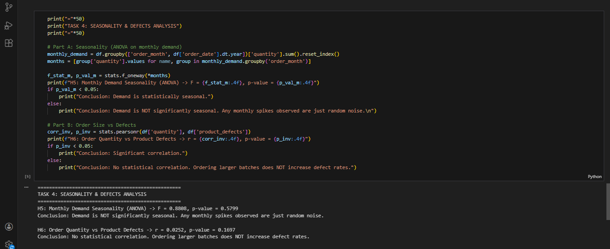
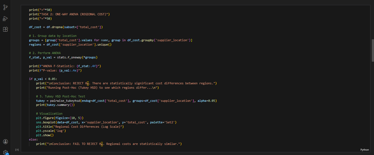
Week 12 on Descriptive Statistics & Hypothesis Testing with @TDataImmersed, @DabereNnamani & @ThePSF
Highlights:
✓ Descriptive statistics
✓ Hypothesis testing framework
✓ T-tests and chi-square tests for comparing groups
✓ ANOVA for multiple group comparisons
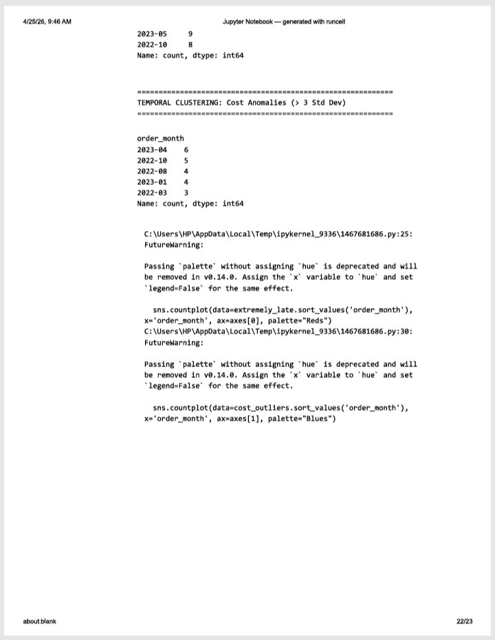
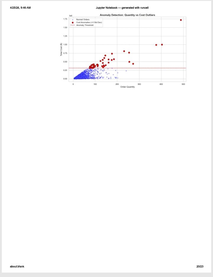
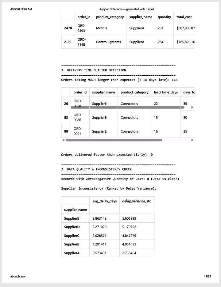
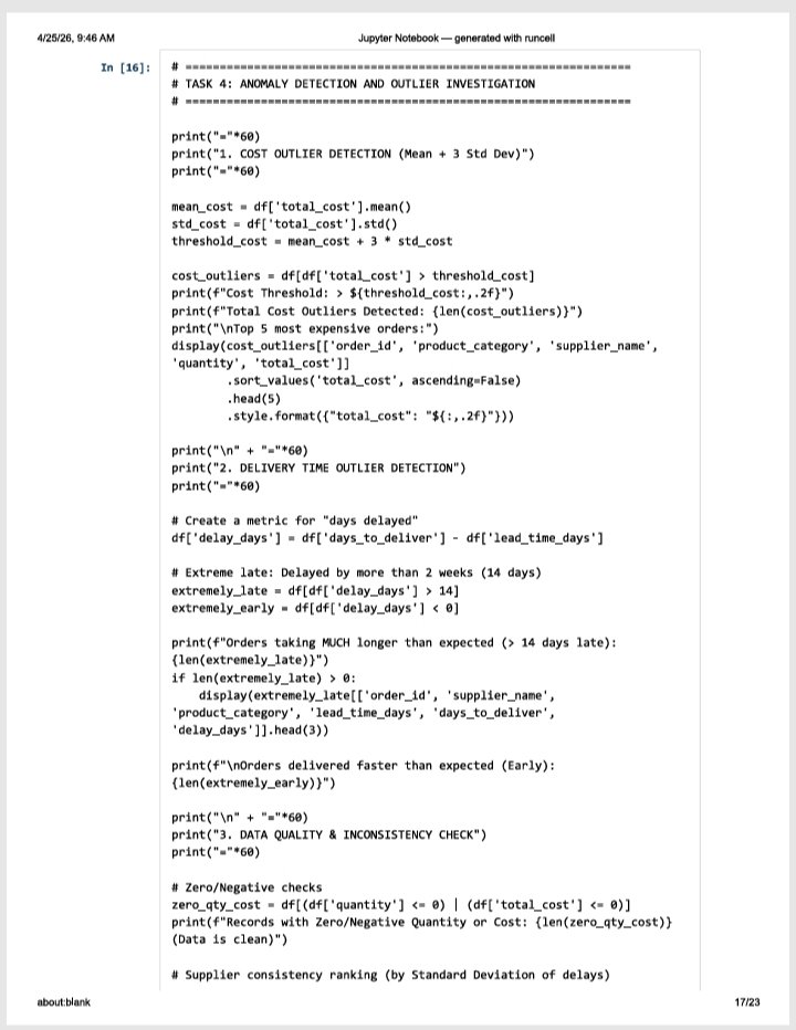
Week 11 on Exploratory Data Analysis with @TDataImmersed, @DabereNnamani & @ThePSF.
What We Learned This Week:
✓ Systematic EDA methodology
✓ Univariate analysis techniques
✓ Bivariate analysis and relationships
✓ Multivariate analysis and complex patterns.
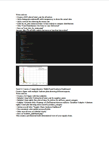
✓ KDE plots for smooth distributions
✓ Count plots for categorical frequencies
✓ Using hue parameter to add a third dimension
✓ Color palettes and styling
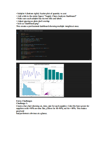
✓ Creating multi-panel dashboards
✓ Interpreting complex visualizations
#TheDataImmersed
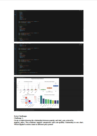
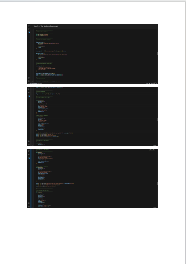
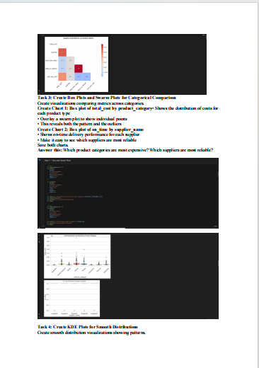
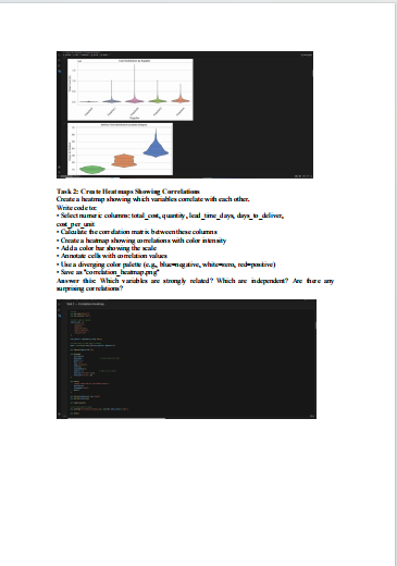
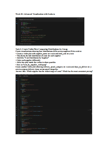
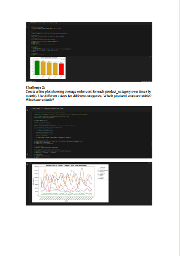
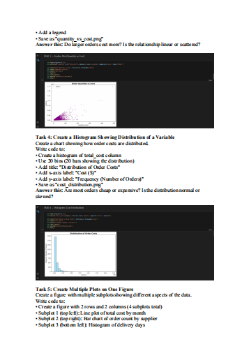
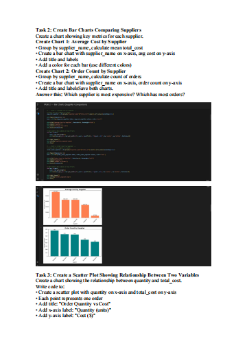
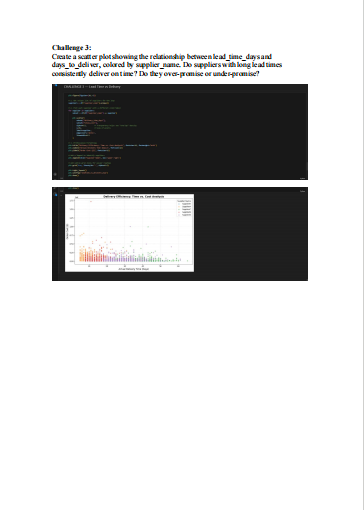
Week 10 on Advanced Visualization with Seaborn with @TDataImmersed, @DabereNnamani & @ThePSF
Highlights of this Week:
✓ Violin plots for comparing distributions across groups
✓ Box plots and swarm plots for categorical comparisons
✓ Heatmaps for correlation analysis
✓ Group ByHistograms for showing distributions
✓ Group ByCustomizing charts with titles, labels, colors, legends
✓ Group ByCreating multiple subplots on one figure
✓ Group BySaving visualizations as image files
#TheDataImmersed
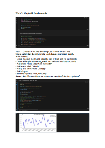
Week 9 on Matplotlib Fundamentals
@TDataImmersed, @DabereNnamani & @ThePSF
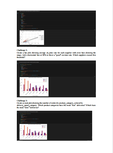
Highlights:
✓ Group ByCreating figures and axes in Matplotlib
✓ Group ByLine plots for showing trends
✓ Group ByBar charts for comparing categories
✓ Group ByScatter plots for showing relationships