Shopify conversion rate dropped? Don't panic and start changing your store.
It's most likely bot traffic inflating your sessions.
Filter human vs. bot traffic inside Shopify analytics. You'll see how bad the problem is, and the REAL conversion rate.
No store problem. Just Bots
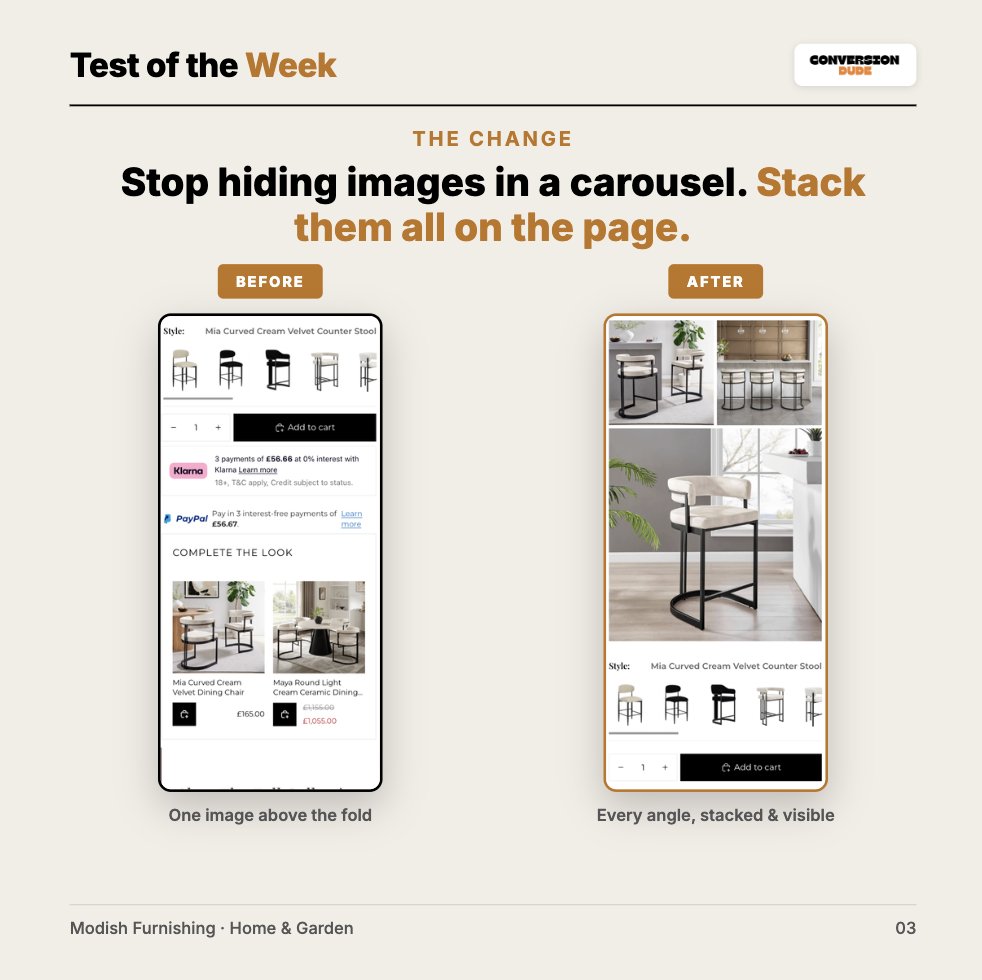
One layout change on a live furniture store:
→ Conversion +39.30%
→ Revenue/visitor +48.76%
→ Abandoned checkout −24.65%
We stopped hiding product images in a carousel and stacked them all on the page
In furnishing, images are the pitch. Same traffic, same product
Most stores guess their free shipping threshold. Don't...
Open your Shopify analytics, find your average order value, and set the threshold around it.
Too high = checkout friction.
Too low = lost AOV.
For this example we would set the treshold between $75-$100
Stumbled across this Shopify store yesterday 👇
Their upsell nails it, gets you to buy the whole fit. But the free shipping threshold is set too high, so even the full set lands short.
Convinced to buy… then hit with a shipping fee. Worst moment for friction. Most just leave
One layout change on a live furniture store:
→ Conversion +39.30%
→ Revenue/visitor +48.76%
→ Abandoned checkout −24.65%
We stopped hiding product images in a carousel and stacked them all on the page. In furnishing, images are the pitch. Same traffic, same product. 🧵👇
📈 Your path to more sales & conversions
https://t.co/7pcWuQ2hVb
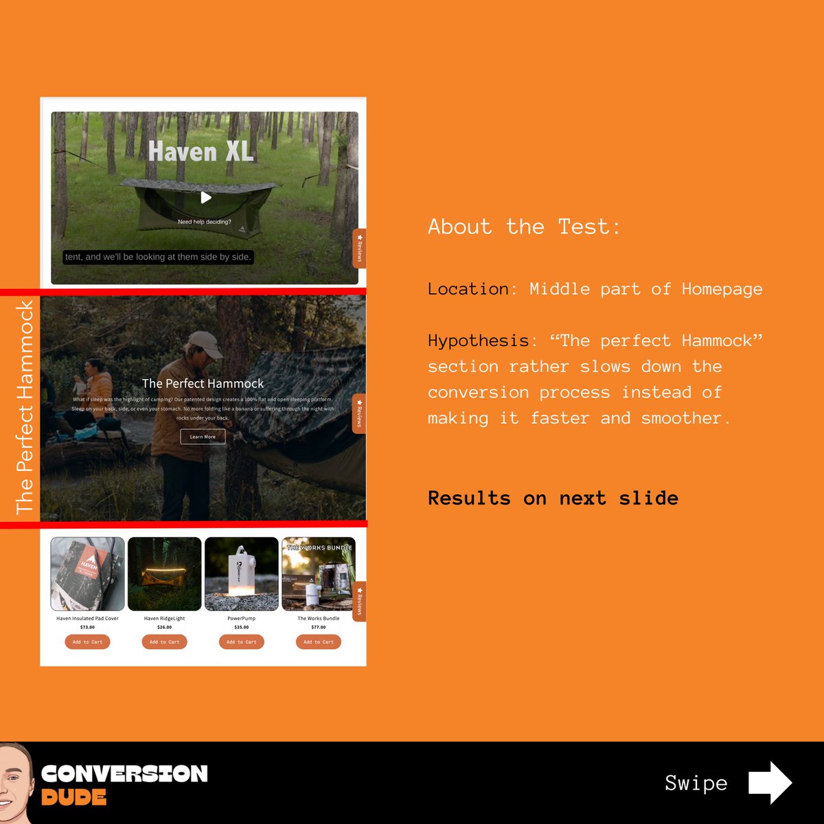
📍 Location:
Homepage | https://t.co/oQYCrrL4pt
💡 Hypothesis:
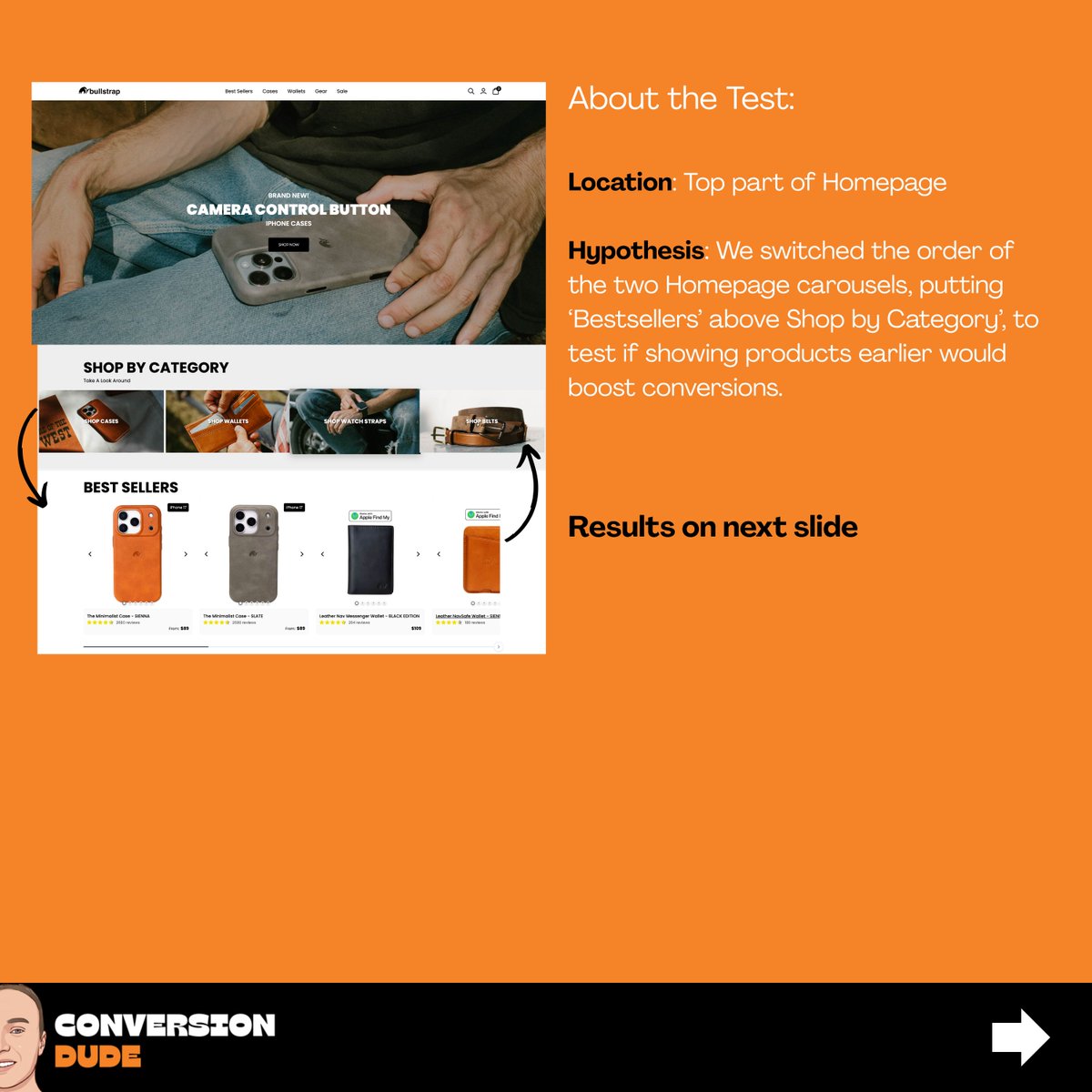
For this test, we again wanted to know if removing a section turns out to be positive for conversions and overall sales.
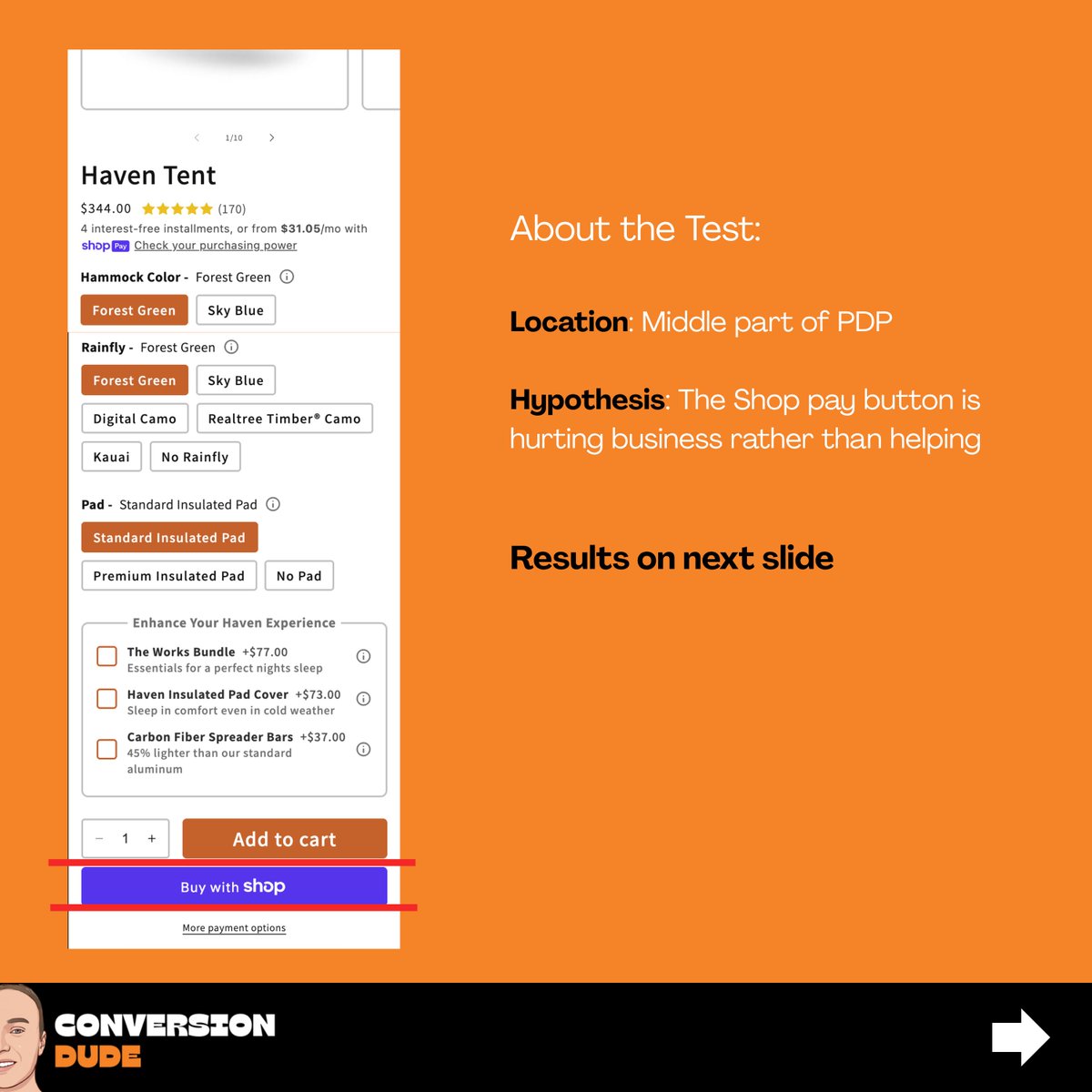
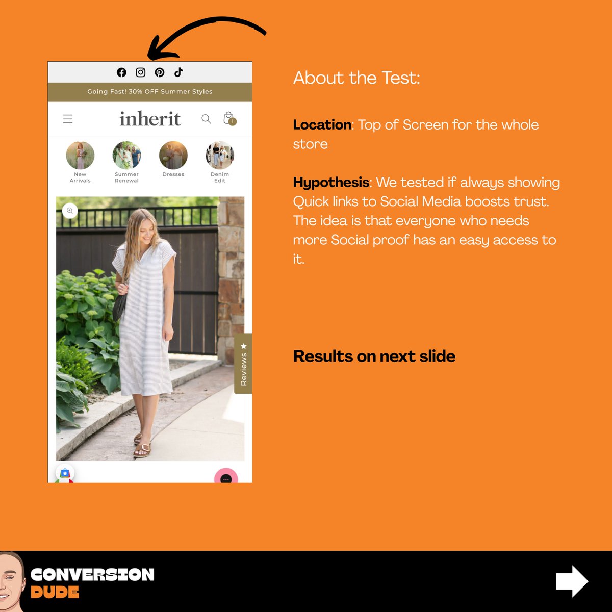
For this test, we wanted to know if the Shop pay button has an negative impact on https://t.co/oQYCrrL4pt.
Hypothesis: The buttons actually is bad for sales in general. Purple is not a color used in the' store, which can distract/disturb
Click the first link in my bio !
My last A/B Test:
-Removing extra text🧾from product pages
-see if users capture main selling points
Idea💡
↳ Users read the information instead of just scrolling past it
The results:
✅ CR increased by 94.6%
✅ RPV increased from $0.7 to $1.27
Link to full post in my Bio
Successful A/B test:
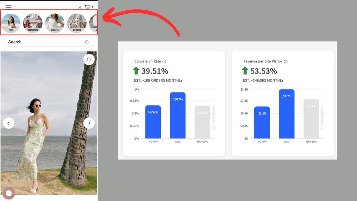
Implemented collection navigation bubbles on📱for a fashion brand
It saves the visitor a click and shows the menu without clicking the extra click
Results:
➕39.51% more conversions
➕53% more revenue per visitor
Every Click a visitor is one too much❗️
Shipping🚢information significantly influences visitors' decisions about whether or not to make a purchase.
Especially for Niches where products are often bought as gifts🎁.
Unfortunately, many stores only provide shipping information at checkout or not at all.
Easy Conversion increase📈:
To improve the product page for this brand, I would suggest the following:
🥇he picture should automatically change to match the selection.
🥈Put the "Chat" button somewhere else, hard to change pictures (only on Mobile📱)
NEVER❗️send paid traffic to your Homepage❗️
Your users need to see👀what they expect.
If they see an image of a model wearing a dress🥻 then they should get redirected to that very product and be able to purchase it.
Directing users to your homepage is a waste of ad spend❗️
How to boost📈sales and retain customers for this brand.
🥇 Add a "Notify Me" button for sold-out products, letting visitors sign up for alerts.
🥈Place it below the "Sold Out" button to optimize space.
This fills the page gap and grabs buyers' attention for restocked items.