CoreCharts is a Bitcoin-only on-chain analytics platform.
The goal: make Bitcoin metrics easier to verify, understand, and use in serious research.
Charts, definitions, methodology, and context belong together.
https://t.co/I3ie0WH8Va
New on CoreCharts:
Added Direct navigation. Zoom with the mouse wheel and pan by dragging. The default Ctrl + wheel / Shift + wheel controls remain available. Switch modes in Account settings.
The Bitcoin Price chart now marks historical crossovers: 1D SMA 50/200, 1W EMA 21/50, and 1W SMA 50/100.
New on CoreCharts: Bitcoin Supply Redistribution Heatmap.
See how BTC supply is redistributed across six address-balance cohorts, from <1 BTC to ≥10k BTC. Identify which cohorts are accumulating or distributing and how significant those flows are relative to each cohort’s own recent history.
Supply-neutral by design: the map shows only redistribution between cohorts — every gain in one cohort is matched by a loss in another, so general growth in tracked BTC supply is excluded.
https://t.co/NT4QRzEfRE
🧵 More than a static metric, it is an interactive analysis workflow:
New on CoreCharts: Spent Output Age Bands (SOAB).
Shows the age structure of spent Bitcoin outputs by output count, as stacked share bands with BTC price for context.
Band isolation keeps each cohort in its true stacked position.
https://t.co/PXvikTXyNw
New on CoreCharts:
Bitcoin STH Realized Price vs LTH Realized Price.
Short-term and long-term holder cost basis, on the same chart.
Shows where newer market participants sit relative to older coins, and how that gap shifts across market regimes.
https://t.co/knMyRzM8XW
Axis sync — new in CoreCharts.
On Realized Price, STH Realized Price, and LTH Realized Price the left and right axes now share a scale.
Price overlays line up directly. No manual rescaling, no visual mismatch between sides.
Try axis sync: https://t.co/dahDpYSb67
Bitcoin has one asset and one chain.
That sounds simple.
Then you try to define active, moved, held, profit, loss, cost basis, or volume.
The difficulty is not drawing the chart.
The difficulty is making the measurement clear.
Common mistake:
Asking whether an on-chain spike is bullish or bearish before asking what actually spiked.
Addresses, volume, spent outputs, fees, and coin age all describe different things.
The first question is always: what is being measured?
Coin age is observable. Holder identity is not.
When a coin hasn't moved for years, the chain shows dormancy, not conviction, not intent, not control.
HODL Waves, RHODL, Dormancy, and SVAB all use coin age in different ways.
They're useful, if read carefully.
Not all Bitcoin supply behaves the same.
Some coins move often. Some sit still for years.
Supply-age metrics help separate recent movement from long-term dormancy.
That distinction matters before making claims about "holders."
Price can move without coins moving.
Coins can move without telling you why.
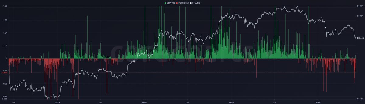
SOPR looks only at coins that were actually spent, then asks a narrow question:
Were they moved in profit or at a loss?
New chart: Bitcoin Supply in Profit and Loss.
Splits circulating supply into two cost-basis states.
Coins priced above their last-moved price sit in profit. Coins below sit in loss.
BTC price included for market context.
https://t.co/fWsQqkWuuM
Bitcoin price is easy to see.
The harder question is how far the market sits from its aggregate on-chain cost basis.
That is where metrics like Realized Cap, Realized Price, and MVRV become useful.
They do not predict by themselves.
They give price a cost-basis context.