If I ever post something that is wrong, feel free to let me know. While I have a decent foundation in statistics, my data science and programming skills are still on the rise.
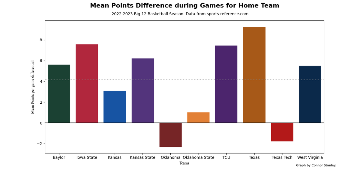
I think the main thing I could take away from this season by just the graphs is the Oklahoma and Texas Tech definitely had some struggles, while KU and Texas both had solid seasons.
#Big12Basketball#Big12
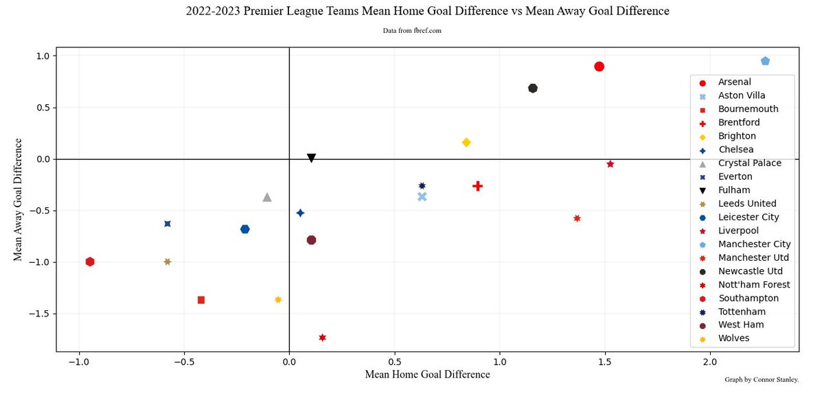
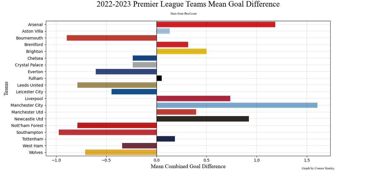
The following I made are graphs representing the mean point difference between each team and their opposition for each game. I made two new columns, one taking the home points minus the away points and the away points minus the home points.
Below is a bar chart made from the mean points scored for each respective Big 12 team during the most recent basketball season. The gray line is a mean amount of points with all teams means considered, while the 2 green lines are there to try to help determine what teams have the
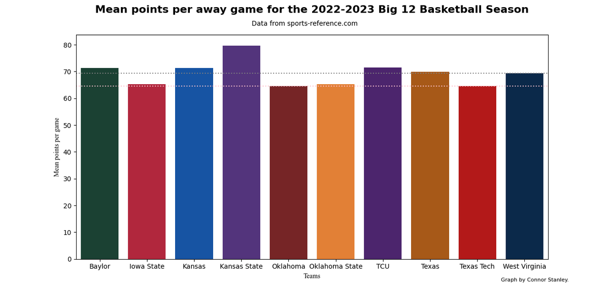
Here is a bar chart representing the mean points per game on average for each of the 10 teams during the Big 12 Basketball season (tournament included).
The dotted gray line represents the mean away points for the whole conference.
Data was from https://t.co/8bG1kKPtJE
(https://t.co/jnXMa7NSPI).
The colors for each graph were determined by looking at the following website for each respective school (https://t.co/lGjMIRsKoh)