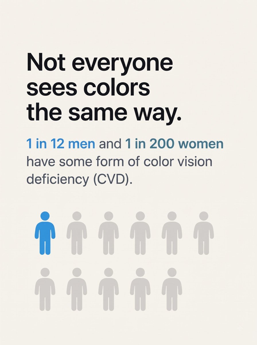
Making the visual world accessible for people with color blindness. 🌈
Building Daltonix software that transforms color-based information into something.
Most interfaces assume everyone sees color the same way.
We’re building Daltonix to make color easier to understand for people with color vision deficiency.
Designers & developers: what one UI pattern you think needs to be more accessible?
Quick accessibility test for UI/UX designers:
If your entire interface turned grayscale, would users still know what's an error, what's successful, and which chart line is which?
If not, color might be doing too much work.
What's the first UI component you'd check? 👇
@UiRahMan92 Dashboards can get visually dense very quickly. I think accessibility is especially important here, particularly for status indicators, charts and color-coded information.
@Maruf9390 Nice visual direction. Curious how you approach accessibility in dark UIs, especially text contrast and color-coded categories. Those details can be easy to overlook during the design process.
@mayuri_3015 UX, because speed, design and SEO don't matter much if people struggle to use the website. Accessibility should be part of that experience from the beginning, not something added later.
@Abmankendrick This is an important part of accessible UI design. Good contrast helps, but color-coded states and charts can still be confusing when hue is the only clue. Curious if you also test palettes under different color vision deficiencies?
@ClymInc Standards are a useful starting point, but I think the real-world testing matters just as much. An interface can pass checks and still leave users struggling with certain interactions.
@RodrigoSanchez Good reminder. Accessibility gets easier when it becomes part of the design process instead of something checked at the end. Even small details, like relying on color alone, can make a difference.
@GAKIKUKEKO This is a really interesting point. The colors that feel right to us aren't always how someone else will perceive them. Did you find a way to preview your palettes from different CVD perspectives?
@xlth This is easy to overlook when you're designing with your own vision. Labels and different line styles seem like simple fixes, but I still see charts relying on color alone. Do you recommend direct labels too?
Designers & developers:
Does your UI still work when users see color differently?
Red = error.
Green = success.
Blue = action.
We use color everywhere.
We’re building to change that. ♿️
What’s the worst color-dependent UI you’ve seen?
What if color wasn’t something you could see?
I’m building Daltonix, software to help people with total color blindness understand color-based info.
I’m building it in public sharing the experiments, failures, and progress.
What would you want Daltonix to help you see?
Day 1 🚀