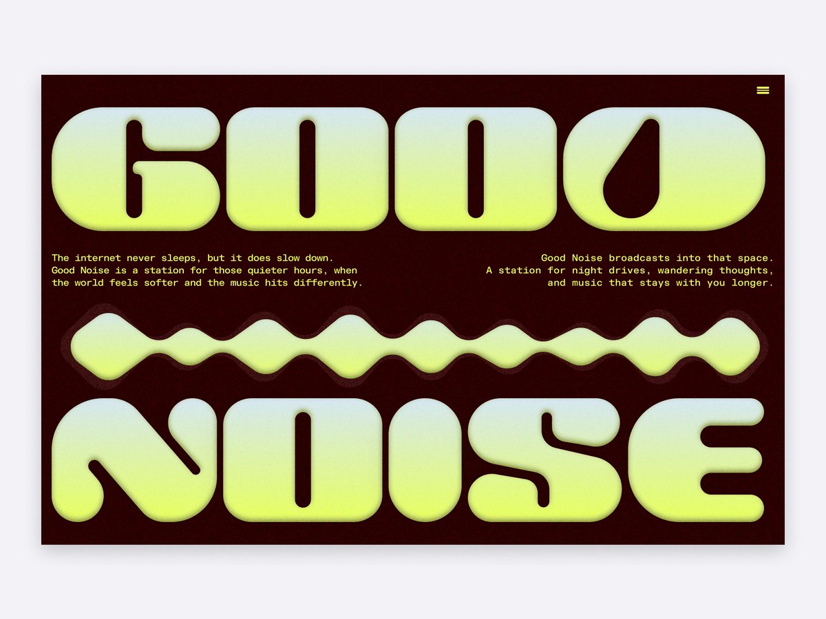
I've always loved websites that feel like they belong to a culture rather than just a product.
So I designed Noise Collective: a fictional underground music collective
From event discovery to merch and artist spotlights, everything was designed to feel energetic without sacrificing usability.
This will eventually become a free Framer template.
Check it out: https://t.co/gUXQW9awsa
Many exceptional GoLemon colleagues are now looking for their next opportunity.
We’ve supported ~20% of the team to secure new roles so far, and we’ve put together a list of people across fulfilment operations, engineering, product, growth, customer support, finance and other roles.
If you’re hiring, please reach out to [email protected] for access, direct introductions and recommendations 💚
Hi everyone 👋🏾
We’re bringing our operations to a close.
We started GoLemon because we believe grocery shopping can work better.
Over the past two years, you’ve trusted us with tens of thousands of grocery orders, invited us into your homes, told your friends about us, and given us the opportunity to build something we’re deeply proud of.
Thank you for every order and every opportunity to serve you. 💚🌱
Read the full update 👇🏾 https://t.co/MxriHbZWfy
A few days ago, I applied for a Contra project looking for a designer to create a website for a film production company.
I didn't get the project.
But the brief stayed with me.
So I decided to explore the idea anyway.
For this concept, I imagined a director-first experience inspired by production companies like Biscuit and Iconoclast. The homepage acts as a living directory of directors, allowing visitors to browse talent before diving into their body of work.
Selecting a director opens a curated archive of films, commercials, and campaigns, creating an experience that feels closer to exploring a film catalog than navigating a traditional website.
This video shows the hero section and the transition into a director's portfolio.
Not every application leads to a project, but sometimes it leads to something worth building anyway.
What do you think?
Built in Framer
Check out my contra: https://t.co/Dxnuo3gqie
Most banking websites try to explain everything at once.
For this concept, I wanted the homepage to do one thing well: create a feeling.
Bold typography. Playful motion. Floating financial stickers that react to your movement.
The "O" animation is inspired by Airborne Studio
Still refining, but I'm liking where it's heading 🚀
I worked on an hero section concept on Saturday.
I worked on 6 screens, same layout but different background colors, header font roundness, and color scheme.
What do you think of dark brown or linear?
Just wrapped up this website concept for Axion.
Designing + building in figma & framer
what do you think?
Website: https://t.co/7rbb6x5g7P
Contra: https://t.co/87zLjtcZ11
ChatHaus: house hunting, simplified. I designed this Framer landing page to make house hunting faster and more seamless.
Tools: Figma, Framer, and Jitter
Website Link: https://t.co/Oob7fTA6JK
Check out my Contra profile: https://t.co/NozaOhnKKe
Finally finished my portfolio 2.0: https://t.co/bR39hizvFD
Took forever prototyping the mobile and iPad versions.
Designed in @figma, @framer, & @jittervideo
@Adanneye It’s crazy! I got to the ticketing stand and the vendors are still selling tickets to people without informing them. It’s a new day and the stage has not been set up. So much for an unforgettable experience Victony.
What rubbish. 11:56pm and people are waiting to get access to a show because the stage is still being set up. Zero public apology has been made. Zero communication. And organizers are selling tickets outside without informing people.
Here against my own true free will.
Here because 1 million uncoordinated tweets won't solve our problems.
Please read this essay, fill the form if you can. We're all one bad policy away from disaster.
https://t.co/WI46V3VOYf