Creative Director & Visual Designer.
Student Architect exploring the intersection of spatial ideas, premium graphics, & video editing.
Inspired by nature.
I spent 4 hours on a restaurant design brief today.
For the first 2 hours, my mind was a total blank. I was this close to hitting Pinterest, hijacking a random layout, and calling it a day. 🧵👇 (1/6)
Where Luxury Meets Lifestyle. 🏙️
For Day 016 of the 21-Day Design Challenge, I tackled a luxury real estate brief for The Grand Meridian Residences.
Leaned into absolute monochromatic minimalism. Giving room for negative space and geometric order do all the heavy lifting.
The goal was simple: strip away unnecessary noise and create an editorial layout that feels expensive at first glance.
• High-contrast editorial typography pairing
• Smooth gradient blend to anchor the architecture
• Clean, balanced feature grid designed in PixelLab.
Day 12 of 21: BEYOND REALITY 🚌🌾
The goal today was pure creative compositing—taking a minimal, moody landscape and transforming it into a surreal visual story.
No shortcuts, no AI—just pure digital blending. 👇 (1/3)
I started with a solitary tree in an empty field.
To rewrite the mood, I integrated a retro travel van, background palm trees to shift the geography, and an explosive overhead light source to completely alter the shadow dynamics. (3/4)
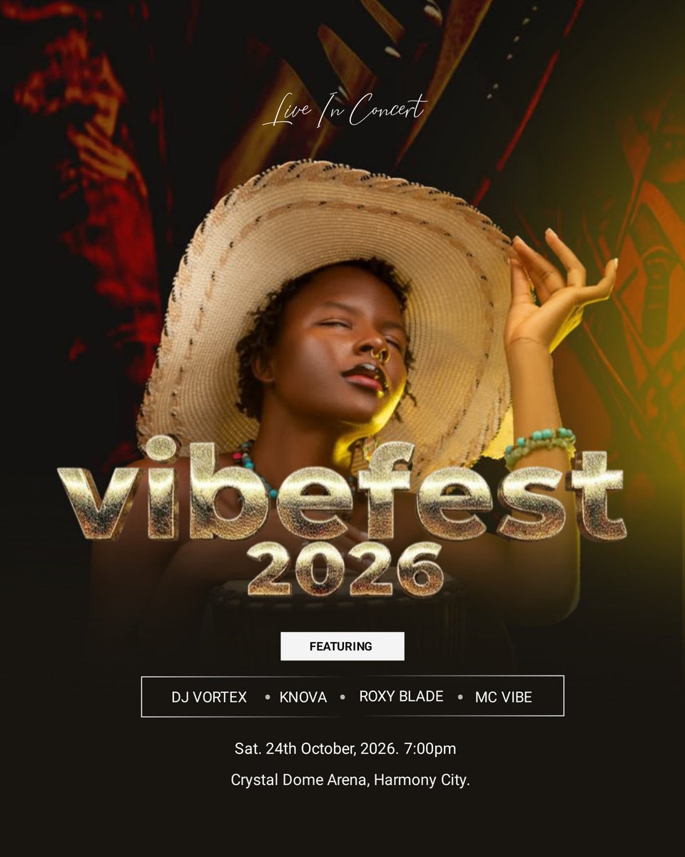
Most festival flyers are a chaotic visual overload.
For Day 11, I did the exact opposite. I stripped away the noise to let the raw, cultural soul of the event breathe.
Introducing VIBEFEST 2026. 👇 (1/3)
The goal was to fuse heritage with modern festival energy.
I paired a deeply expressive, atmospheric portrait with heavy, chiseled, hammered-gold typography to give the layout tactile, physical weight. (2/3)
A deep, textured royal blue canvas built to command trust.
Good design doesn't shout. It just gives you the quiet confidence that your journey is handled.
How do you approach travel branding—minimal or high-energy?
Tool: PixelLab (3/3)
Most travel flyers try to sell you the stress of transit.
They clutter the canvas with massive airplanes, floating boarding passes, and chaotic clouds.
But premium travel isn’t about the vehicle—it’s about the destination. 👇 (1/3)
For Day 10, I wanted to strip away the airport noise and focus on the quiet luxury of seamless travel.
The services card is a deliberate nod to a passport's visa page. It's designed to evoke that satisfying, clean feeling of a fresh official stamp before you board. (2/3)
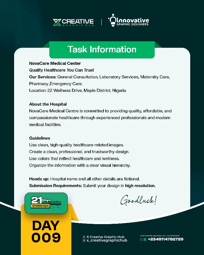
The goal was to build a visual system for NovaCare Medical Center that feels prestigious, calm, and deeply reassuring.
Mission accomplished.
How do you approach designing for healthcare—clean and editorial, or vibrant and high-energy?
Tool: PixelLab (3/3)
Healthcare design doesn’t have to shout to prove its capability.
Trust is built in the quiet details—the deliberate use of negative space, a soothing clinical color palette, and typography that reads with effortless clarity.
My approach to Day 009. 👇 (1/3)
By organizing the core services into a highly structured layout and balancing it with a soft, warm clinical image, the design gets room to breathe. It feels welcoming, and incredibly honest.Visual communication isn't about how much we can add, but how much we can strip away. (2/3
@_iamMrAwesome Most people look at camera and microphone permissions, but completely ignore the one tool that literally watches every letter we write.
A bad keyboard app is essentially a keylogger we willingly installed. Wild.
The goal was to build a visual system for Evergreen International College that feels prestigious, elite, and deeply established.
Mission accomplished.
How do you prefer your educational designs—classic and minimal, or vibrant and playful?
Tool: PixelLab (3/3)
Who said academic design has to be loud?
The unwritten rule of school flyers is that they must be cluttered with floating pencils, cartoon kites, and chaotic primary colors to feel "educational."
I wanted to challenge that. 👇 (1/3)
For Day 008, I stripped away the generic noise.
I leaned into structured geometry, generous negative space, and clean editorial lines that mimic the classic precision of a student's notebook.
Sometimes, the most expensive thing you can give a brand is room to breathe. (2/3)