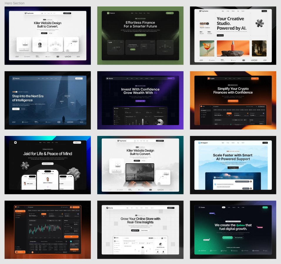
Designers 👀
I’m giving away 12 hero section designs for free.
To get Figma file:
• Like this post
• Comment "Hero"
• Follow me so i can dm you the file
• Repost (optional)
Clean. Modern. Ready to use for your next project.
🚨Giveaway Alert.
After a very long time, I’m giving away my recent Bento Cards Figma file for FREE!
It took me 8+ hours to design these cards, but you don’t have to spend that much time to create them.
Grab this file by following these simple steps.
To join:
- Like this post.
- Retweet so others can get this file too.
- Comment "Recent".
- Must follow so I can DM you directly.
Follow the steps above and I’ll send the file in a few hours.
Enjoy!
Don't miss it! 🎉🎉🎉
Get a @figma file with these 35 clean Mobile app designs for FREE.
How to get it?
1. Comment "Clean Mobile”
2. Must (Follow me) - So I can give you in comment
3. Repost (optional) - so more people can get the file
after 100 comments i will share the file in post comment. please check the post comments after 48 hours
Don't miss it! 🎉🎉🎉
Get a @figma file with these top-notch UI for FREE.
How to get it?
1. Must (Follow me)
2. Comment "Mobile apps”
2. Repost
after 48 hours i will share the file in post comment. please check the post after 48 hours.
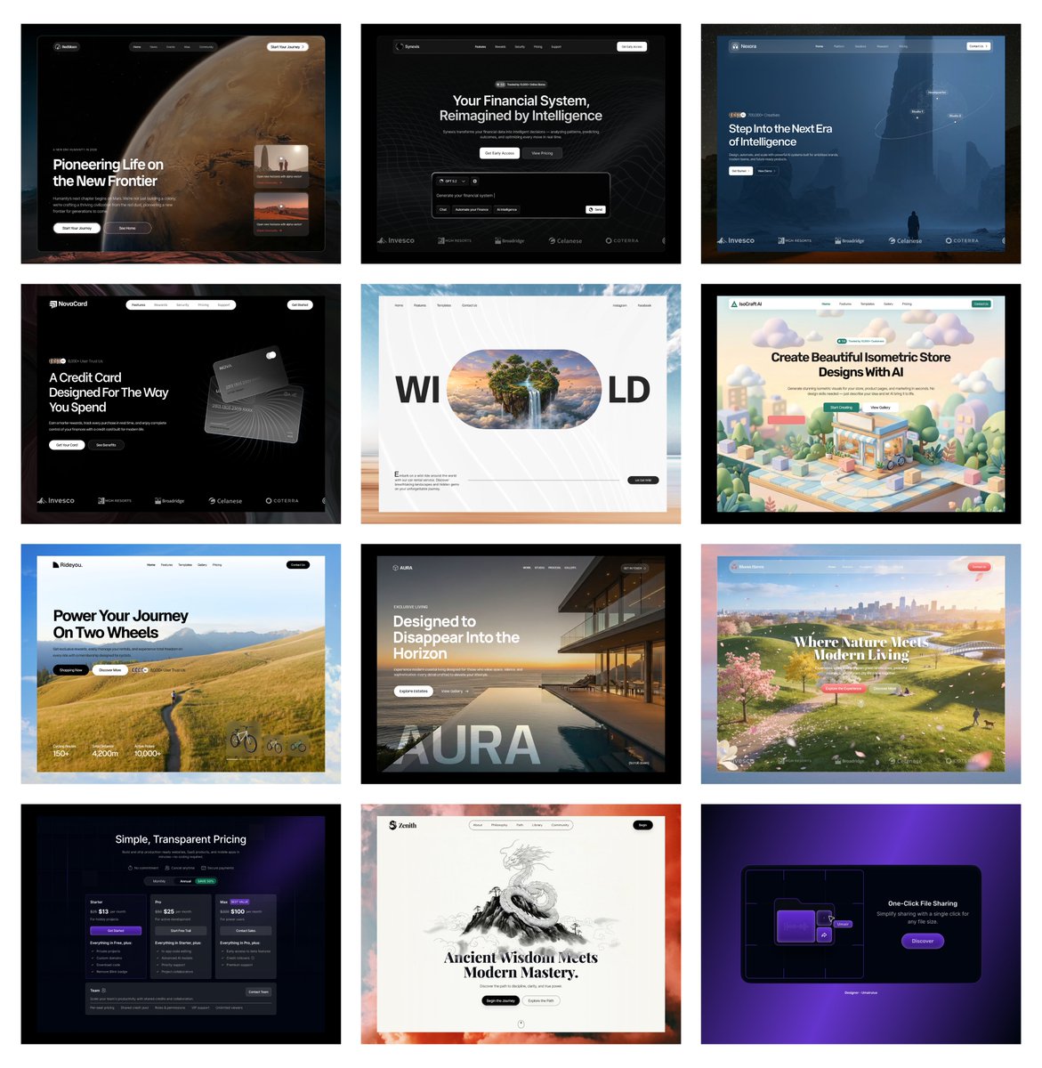
Designers 👀
I’m giving away 12 hero section designs for free.
To get Figma file:
• Like this post
• Comment "Hero"
• Follow me so i can dm you the file
• Repost (optional)
Clean. Modern. Ready to use for your next project.
Whitespace (or negative space) isn’t empty—it’s a crucial design element that:
-Enhances readability
-Creates a balanced layout
-Improves user focus
-Don't overcrowd your designs. Let your content breathe! 🌬️ #UIDesign#UXTips
🖌 Avoid these 3 common color mistakes in UI design:
❌ Low contrast (Bad readability)
❌ Too many colors (Lack of focus)
❌ Ignoring color blindness (Accessibility matters!)
A well-balanced color palette = Better user experience! 🎨 #UXDesign