If you want to see how helpful Data Analytics can be on your business improvement, then follow me @DarleneOlite and turn on your post notifications. Cause I would be sharing my tips and my journey experiences.
Yours Truly,
@DarleneOlite
@IkeVictor8190@_AsiwajuLerry Before you make a judgement, try and make the necessary research. Did you hear the part where lookman said the designated PK taker asked him to take it?
Moreover, even if he scored, dey was no guarantee of dem being back in the game. He gave the team the hope with his first goal
🗣| Khaldoon Al Mubarak in 2019:
“This is a well-run club. That’s a fact!
With success, there is a certain level of jealously, envy, whatever you call it – that’s part of the game.”
Exciting News!
We are pleased to announce to you that GIT Cohort 7.0 is here!!!
Are you a Young African Female between the Age of 16-40years with a passion for technology? Then GIT cohort 7.0 is the place to be.
You don’t want to miss this life changing opportunity.
I was experimenting on LinkedIn and changed my location to that of a different country.
And for the strangest of reasons recruiters just kept popping in from nowhere.
So this country really is holding us back.🧎🏽
Day 5 challenge
So guys we are gradually coming to the end of the 6days data analytics challenge and it’s been awesome.
So today I’d be working on my visualization.
Below, is my dashboard visualization of my analysis.
If you want to see how helpful Data Analytics can be on your business improvement, then follow me @DarleneOlite and turn on your post notifications. Cause I would be sharing my tips and my journey experiences.
Yours Truly,
@DarleneOlite
Both PivotTables and PivotCharts enable you to make informed decisions about critical data in your enterprise.
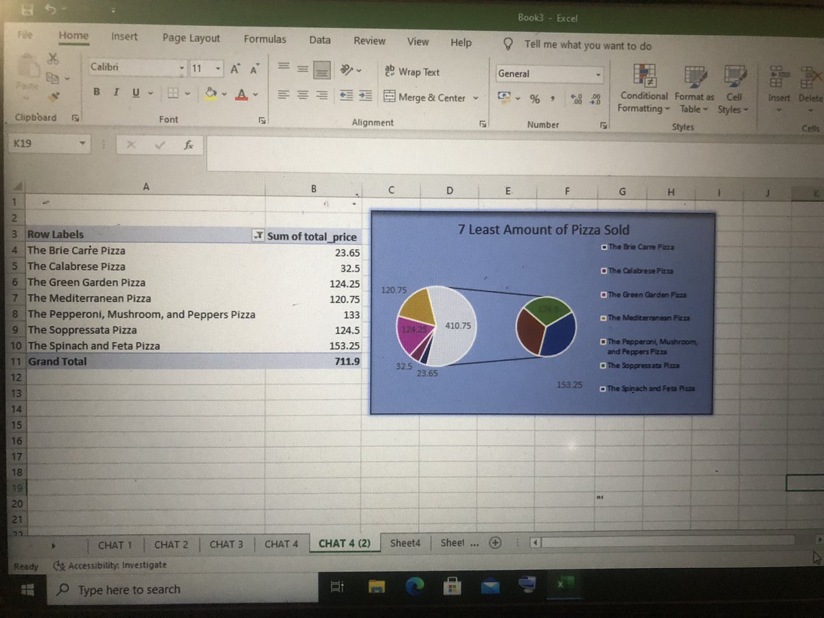
The following are pivot tables and pivot chats were created to help answer questions raised on the project objective.
The columns and rows represent the your data dimensions while the values are the numerical data to be analyzed.
PivotCharts complement PivotTables by adding visualizations to the summarized data in a PivotTable, it also allows you to easily see comparisons, patterns, and trends.
Analyze and draw insights from a large numerical data summary in a detailed and meaningful way.
A pivot table allows you to work on a dataset with multiple rows and columns to a summmarized and concise table. This concise table consist of rows, columns and values.
It is commonly used in Microsoft Excel. It is called a pivot table because it simply “pivots” or turns the data to view it from different perspectives.
A pivot table is an interactive way to explore and present summarize large amounts of data,
Let me quickly give a simple overview of what a pivot analysis is all about.
A pivot table is a statistics tool that summarizes and reorganizes selected columns and rows of data in a spreadsheet or database table to obtain a desired report.
Challenge Day 4
So guys, it’s been an awesome journey so far on how to analyze a dataset. Thanks for staying glued to all my social media channels.
So today, I’d be doing a pivot analysis and luckily, i’d be sharing the pictorial view of my pivot analysis.
Challenge Day 3
So today I’d be doing statistical and Regression Analysis on the selected variables on my dataset. The mean, standard deviation and regression analysis willl be used for my today’s analysis.
Let’s quickly dive into a short meaning of the terms mentioned above
Regression Analyses: This is a powerful statistical technique used to examine, model determine the relationship between one or more independent variables and a dependent variable.
In my analysis today, the mean and standard deviation will be on chicken unit price,