I found this Canva video on the Principles of Design super helpful while creating my #whereindisney marketing campaign. It breaks down the basics in a way that’s easy to apply. Worth a watch for everyone in class! 🎨✨
#su2412#graphicdesign https://t.co/ZOlBswPmLc via @YouTube
✨ Test your Disney Parks knowledge! ✨
I created this visual marketing campaign for my #whereindisney daily guessing game as part of our Visual Social class. This is an easier one. Think you can guess it?
#su2412#DisneyParks
@ryansu31686988 This campaign worked so well because Coke has always used nostalgia as part of their brand. They cashed in on personalizing this campaign with individual names. The pictures for their ads are solid. You can’t help but focus on the cans. Great use of depth of field. #su2412#coke
Nike’s “Just Do It” campaign is one of the most successful marketing campaigns of all time. Both the image and slogan are so simple, it makes it all the more memorable to the audience. This campaign made Nike a global name, resonating with athletes and civilians alike. #su2412
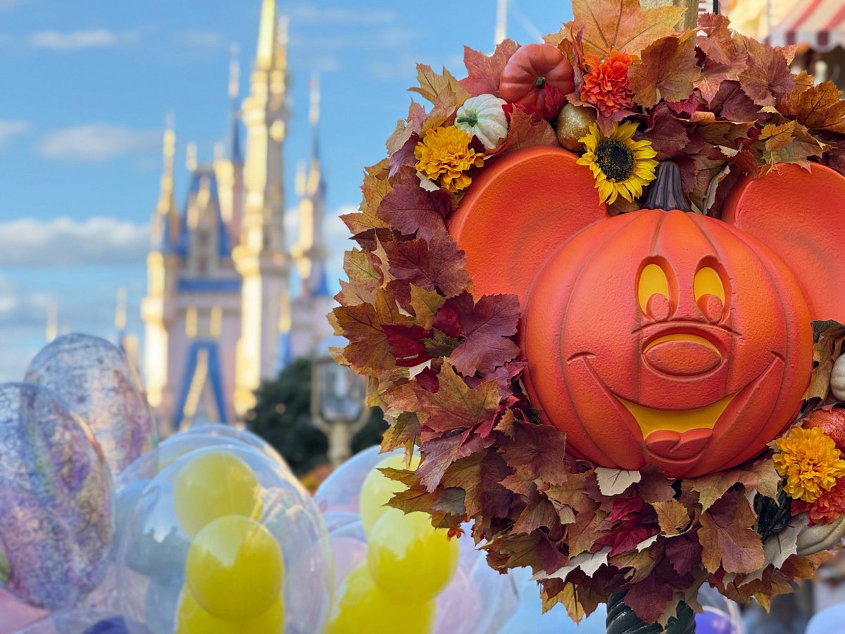
I used the Rule of Thirds to position the Mickey pumpkin along the right third of the frame, creating balance while still highlighting Cinderella Castle in the background. The soft blur adds depth and guides your eyes through the image.
#su2412#ruleofthirds#disneymagic
The #Disney100 campaign uses simple and elegant visuals like this, Mickey banner, to honor Disney’s past while looking toward its future. The sparkle motif perfectly captures “100 Years of Wonder.” #su2412
Disney isn’t just for kids to have their imagination come to life, every movie created has its own meaning to life and can really have an impact on some people even if one isn’t a Disney world fan I believe in the movies story line #su2412