CSS allows you to build any layout you want. Unfortunately, we still don't care too much about preventing CSS issues upfront. So at Summit @shadeed9 will outline defensive CSS, a term he coined to describe CSS that is future-proof and defensive.
https://t.co/t9EqGViVEn
Hello 👋
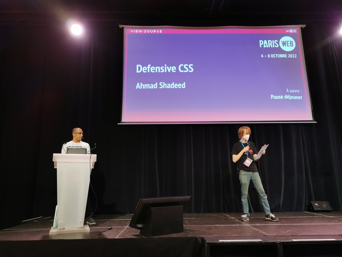
I got back home today from my trip to @ParisWeb! It was a great experience for a first-time speaker! I learned a lot, and glad that I met @mmatuzo, @klohFR, and @ffoodd_fr in person ��
Photo credit: the amazing @mmatuzo
Designer et développeur front-end, @shadeed9 nous fera l'honneur de partager son expertise #CSS pour la toute première fois en France. Et ce sera à #ParisWeb le 7 octobre prochain ! https://t.co/k44x1ol2ts
Inscrivez-vous pour assister à sa conférence : https://t.co/jps45H8zHE
I have updated https://t.co/BlJWxoJnPx and added a speaking section. It's amazing how quickly a simple idea can take off! 🤩
I am so excited for what is to come for @DefensiveCSS 🔥
🌟 New Tip
When working with multilingual websites, make sure to account for short content lengths by setting a minimum size.
In this example, the button "Done" become too small in Arabic. We can fix that by setting a min-width in CSS.
Read more: https://t.co/8CfL2FpLYU
💡 In CSS grid, we can choose between auto-fill and auto-fit for how a grid item should behave. The keyword auto-fit is risky, specially when we don't know the number of grid items.
Read more in this defensive CSS tip:
https://t.co/yXjpJUVxzN
It was an honor for me to give a talk on Defensive CSS to the @Supermetrics development team in Helsinki, Finland.
This is a great experience for me and looking to spread the word even more about @DefensiveCSS 🤩
It's a common mistake to use display: flex and forget about it. When the content gets longer, flex items will stretch to fill the parent.
That's what happened to the image here. The fix is to use align-items or align-self depending on the use case.
🔗 https://t.co/tVoqUZKQJW
Have you ever tried using position: sticky with CSS grid and it didn't work? You need to override the default behavior of CSS grid by applying align-self: start to the aside.
✍️ Find out more in this defensive tip: https://t.co/BSf4B5bwpL
A little late and sorry for that, but here are all the links mentioned during @shadeed9's talk:
Slides: https://t.co/3ma4rWEJJv
https://t.co/bH7URE9gMg
https://t.co/Xic0SrA6CU
https://t.co/Hu9NZWAIRL
https://t.co/tli8k5OTmb
https://t.co/1M0wCQ6guW
⚠️ By default, flexbox will let its child items take up as much space as the content. This can lead to overflow issues.
Learn more about how to prevent that.
https://t.co/X7qud1i2da
Want to get an idea of what "Defensive CSS" 🛡 exactly is? This Thursday would be *the* opportunity as @shadeed9 will be presenting his thoughts and ideas around it at our next online event! 🥳✨ 👇🏻
https://t.co/88lhfiOjr6
Hello world, I’m happy to publish Defensive CSS! 🥳
It's a resource explaining how to write CSS defensively, and how it can be used as a strategy for every front-end project.
✍️ More content is on the way!
https://t.co/8cc8lNxDpb


