Just added 2 new checklists:
« 5 rules of logo design » by @MashCreative / @SocioDesign
« 4 things mine had to be successful at Portfolio Design » by @JulienRenvoye
→ https://t.co/uFLtzUroWg
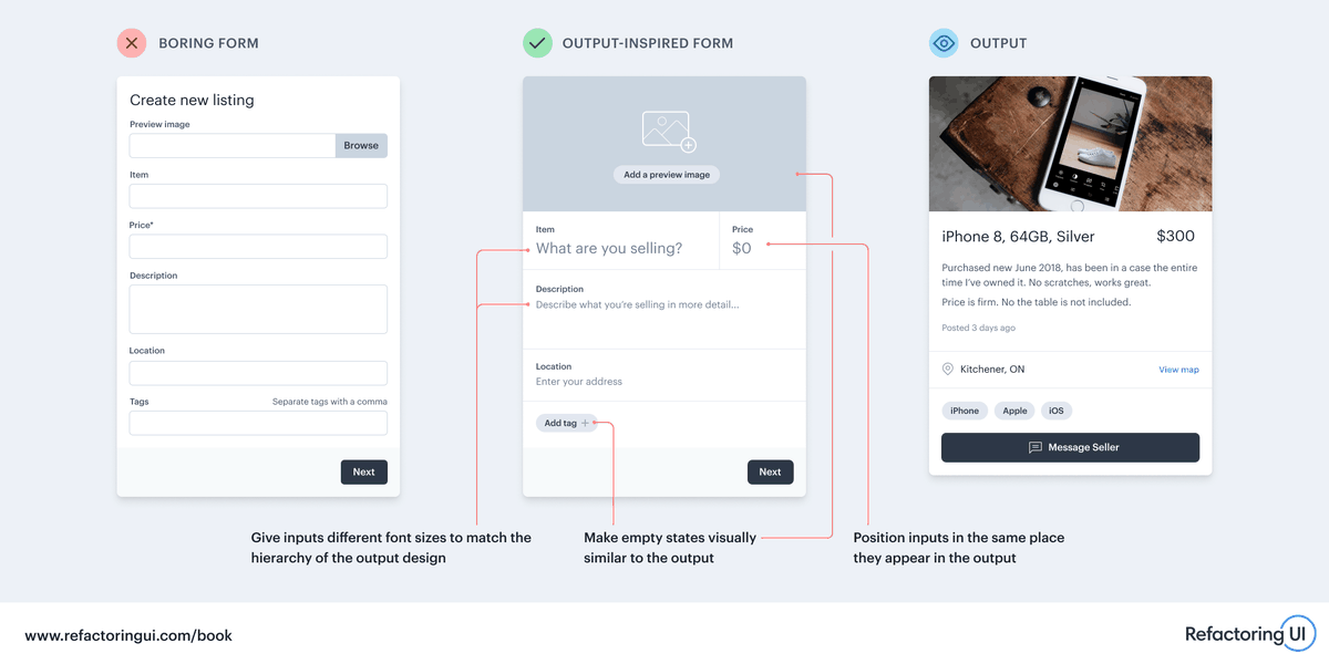
🔥 One way to make a boring form look more interesting is to draw inspiration from how the output of the form is designed.
Here are a few ways you can reuse your existing design decisions to make a form more exciting:
"[Clients], when you talk to a studio about working together, the question you shouldn't base your decision on is 'have you done this job before?'... Creative problem solving does not lie in repetition," says designer Bonnie Siegler #AdobeMAX
Some advice for clients from designer Bonnie Siegler at #AdobeMAX: "Tell us the problem not the solution. A proposed solution from a client is hard to forget and might limit our thinking. Tell us a problem, your hopes and dreams, and we'll do the rest"
GESTALT PRINCIPLES THREAD!
Gestalt is the idea that we see the whole of something before the individual parts.
PROXIMITY (1/8)
When objects are close to each other, they tend to be perceived together in a group. Use white space to separate groups. Reduce it to group elements.
@hellobont Hey man. Love your design approach and advices. Can we see some real website in production? How the developers implement that golden ratio approach?
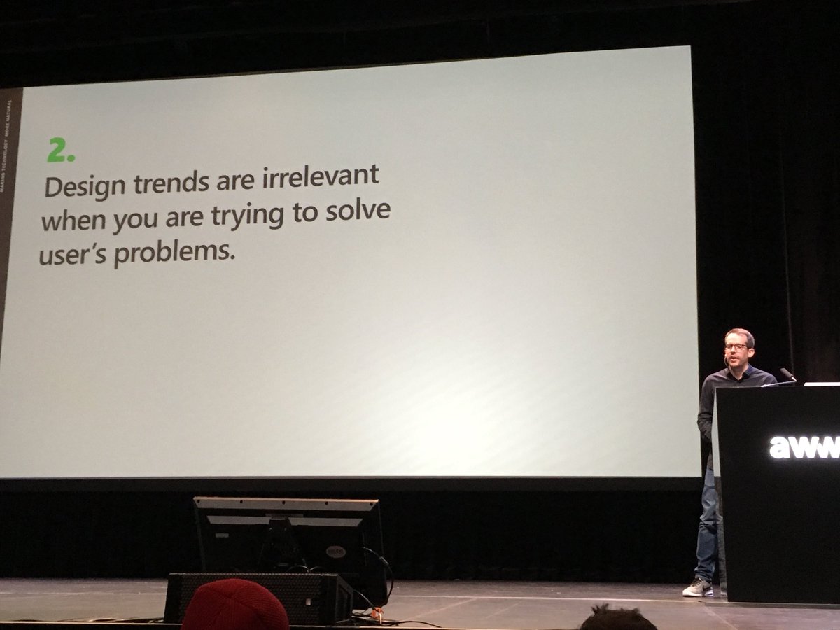
Adobe is streaming LIVE from @AwwwardsConf with the leading lights of #UX design all in one place on the 8th and 9th of February. More info here: https://t.co/dyDL40AD7E #AwwwardsBerlin#AdobeLive