Around the world brands are taking over historic buildings, warehouses & former industrial spaces, then layering contemporary retail into them. A good read on the relationship between adaptive reuse and retail design 🏛️✨ Read here: https://t.co/aMDRXBHp2w https://t.co/cwdYCVI3W0
At Bailey Nelson Willis Street, the detailing was part of the fit-out: restrained, with a black finish, integrated shelving, and clean product zoning- giving it plenty of presence without overwhelming the space. 👓🛠️
https://t.co/OihfpTadtv
#DimensionShopfitters#BaileyNelson
For Craggy Range’s tasting room, the joinery needed to feel refined without becoming decorative.
Dark timber shelving, integrated lighting, and deep shadow lines give the wine room a quieter, more grounded feel that suits the brand properly 🍷🪵
🌐 https://t.co/OihfpTadtv
This one’s actually interesting because it gets into how brands are using retail fit-outs now to keep people in-store longer — cafés, lounges, art, service spaces becoming part of the build.
Less “shop”, more environment 🔗 https://t.co/NjzStom20z
🌐 https://t.co/OihfpTadtv
Mecca’s Melbourne flagship literally had people lining up from 4am and shut down part of the CBD when it opened last year. Not just because it’s big, but because retail spaces are turning into full experiences now rather than just stores.
🔗 https://t.co/ffQaGNFdH8
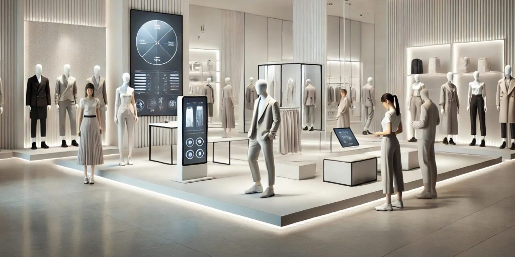
One New Plymouth was designed to feel more like a connected tech environment than a standard telco store.
Large glazing panels keep the space open, while the display joinery stays low-profile so the product and digital screens do the heavy lifting📱✨
🌐 https://t.co/OihfpTadtv
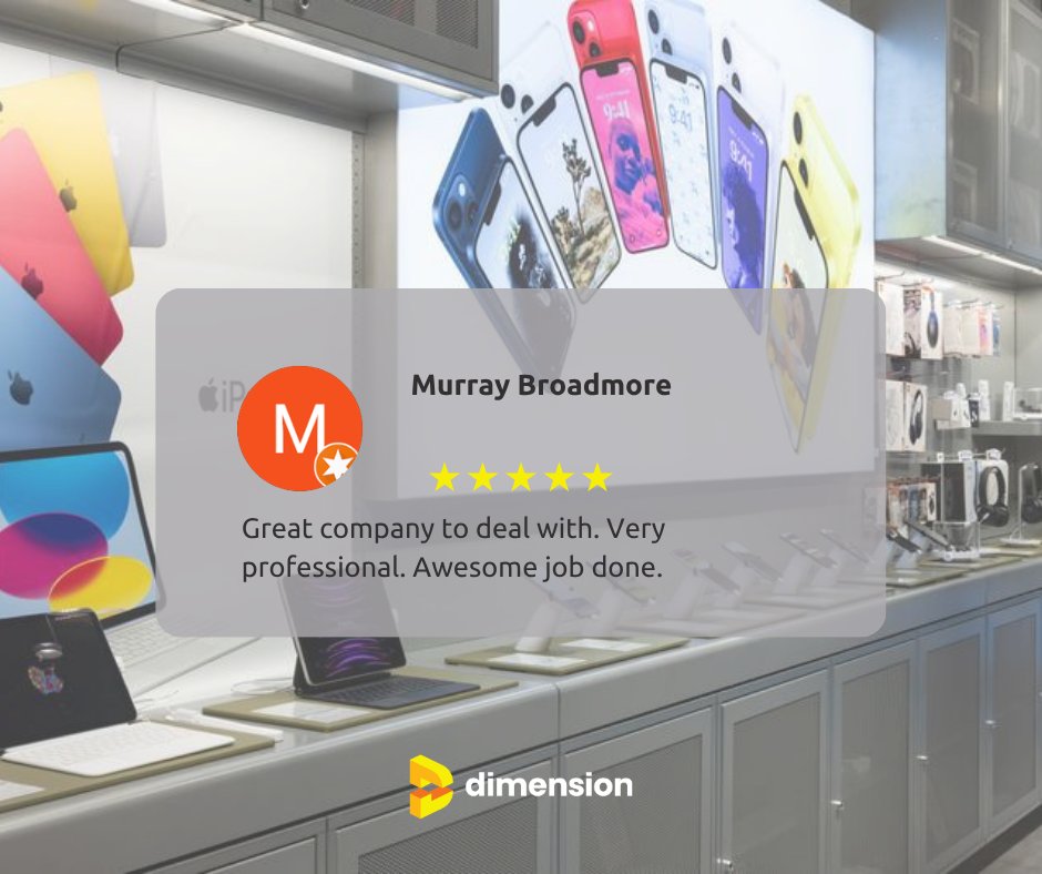
Good feedback means more when it comes from people who know the process from the inside.
Projects like these take coordination across design, manufacture, install, and site — good to see the finished result landed the way it should 🙌
🌐 https://t.co/OihfpTadtv
Superdry Sylvia Park — layered materials, darker ceiling treatment, timber display units, and that worn-in retail feel the brand’s known for internationally. 🧥🪵
🌐 https://t.co/OihfpTadtv
#DimensionShopfitters#RetailFitOut#Superdry#SylviaPark
Bailey Nelson’s Riccarton store had to feel considered without overdoing it.
The layout keeps everything clear — frames run either side and the counter holds the centre, so the space reads straight away.
🌐 https://t.co/OihfpTadtv
#DimensionShopfitters
Stolen Girlfriends Club - not a standard retail fit-out & it wasn’t treated like one 👽
Curved forms, raw metallic finishes, & lighting pushed right into the shelving so the product sits sharp against it - holding the identity the brand’s known for.
🌐 https://t.co/OihfpTadtv
For a house like Balenciaga, the brief is restraint.
Placed in Newmarket’s premium retail strip, the frontage is intentionally understated — full-height glazing, a restrained frame, and a layout that captures immediately from the outside.
🌐 https://t.co/OihfpTadtv
For Lululemon Newmarket every detail had to sit within their spec.
White on white keeps the wall tight, the recessed unit doesn’t interrupt the surface, and the timber wrap gives it just enough warmth so it doesn’t feel sterile.
🌐 https://t.co/OihfpTadtv
Let's talk about this setup 👌🏽
Arch opening pulls people through to try-on while the recessed bay handles caps without pushing into the walkway. Lighting’s built in so it’s consistent across every row.
Looks great, works better.
https://t.co/OihfpTadtv
#DimensionShopfitters
🧐 Retail can be a relatively conservative sector to design for, especially when the focus is on revenue and creating a space with high returns. These four retail spaces take a risk to ensure a lasting impression instead. https://t.co/RDvJnqoIuL
#DimensionShopfitters
Good balance of open space and defined zones, with materials doing enough to give it character without overcomplicating it. It’s the kind of layout that works just as well day-to-day as it does in photos. 🔗 https://t.co/2R2SVk0SsJ
#DimensionShopfitters
Front counter is doing a bit of heavy lifting here.
It’s handling checkout, display, and tying the whole front of the store together without feeling bulky. It sets the hierarchy of the space perfectly. 😎
🌐 https://t.co/OihfpTadtv
This is how you anchor a space. The curved bar sets the flow, the booth seating builds rhythm, and everything around it supports how people actually use the space — sit, stay, move, repeat.
🌐 https://t.co/OihfpTadtv
Open frontage, steel framing, clear zoning — you’ve got display, circulation, and feature pieces all working without getting in each other’s way. It’s been thought through from a build and layout point of view, not just how it looks.
🌐 https://t.co/OihfpTadtv