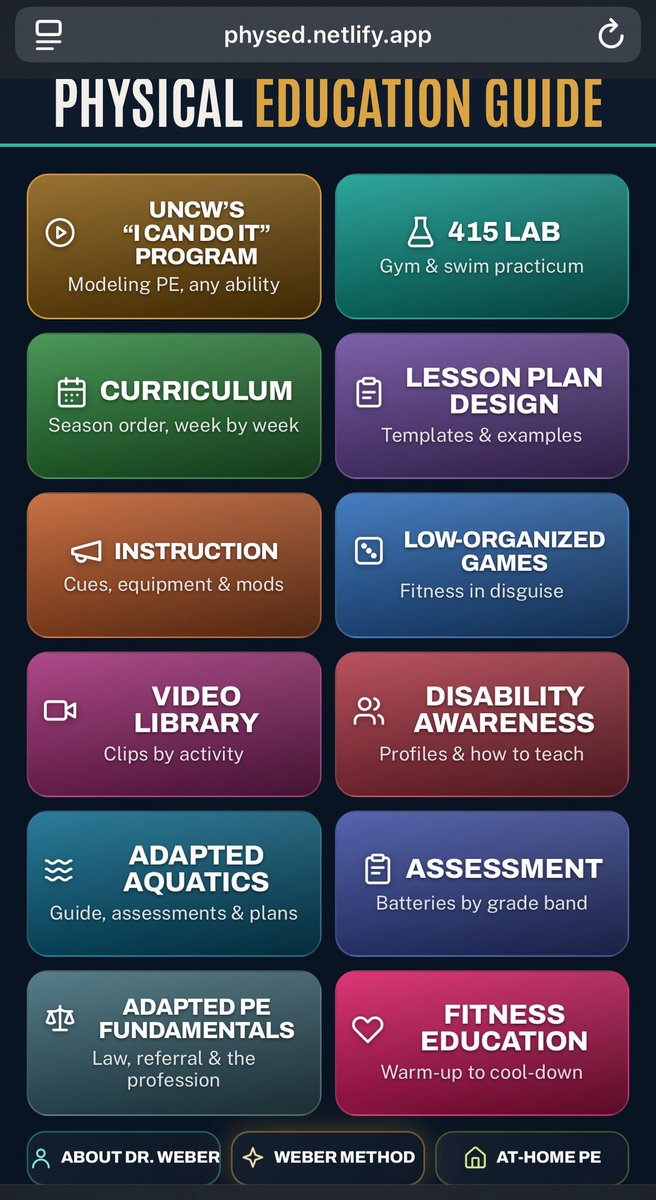
For my fellow #physed teachers, I created a free app for lesson plan design in physical education. It’s loaded with PDFs, videos, instructional cues, assessments, curriculum, sport development and fitness education. Check it out here: https://t.co/2F423qGuZw
We have many aspiring fitness influencers who are under educated, using other avenues to create wealth with having no real world experiences teaching, training, or coaching real people like: youth, adults, athletes, older adults, and people with intellectual and developmental disabilities.
Social media should be more like AI, when you’ve doomscrolled too much you should reach a usage limit. The younger you are, the lower the usage limit for each app or for all apps except messages/phone calls.
Then you should be cut off just like I’m cut off from Claude right now because I’m over using its HTML codes 😐
New research shows that high-load (8–12RM) and low-load (20–30RM) training performed to failure produced similar increases in biceps tendon thickness. These findings challenge the common belief that heavy loads are necessary for tendon adaptation and instead support the idea that intensity of effort—not load magnitude—may be the key stimulus for tendon remodeling. Nice work from the lab of @jploenneke
https://t.co/ewTBPEL5oR
The prompts I give Claud Ai are ridiculous: Does this look off? Are there better more sophisticated to the eye, simpler or better layouts to express the front page using creative ai design but keeping our rigor and integrity we’ve built? Can you provide me with 5 visual options to examine as renderings and then we can decide if we want to change the front page. Its white background seems boring and the two circles approach might seem off. Could we add a cool design that nullifies us in that white background. Overall prompt is designing a better looking start page which may involve changing words and titles. Don’t change the actual html. Just provide me with some 5 renderings that could work with a rational why like you’re an art director