@GreenBlackHeart with sickles surrounding a hammer which didn't make it radically symmetric. I don't know why they created an ugly symbol instead of just using the red star for their edits. Anyways, the overlap between mappers and online political communities being a circle leads to this.
@GreenBlackHeart Especially when they aren't radially symmetric. This originated in wignat edits that had the black sun spin. This was appealing because they were radically symmetric. Leftist editors, taking their aesthetic prompts from wignats, created an ugly "leftist" verison of it
@GreenBlackHeart They’re updating the Canadian one too but I’m not a fan that they’re taking inspiration from the 30s when the 20s were better with their Sam brown belts
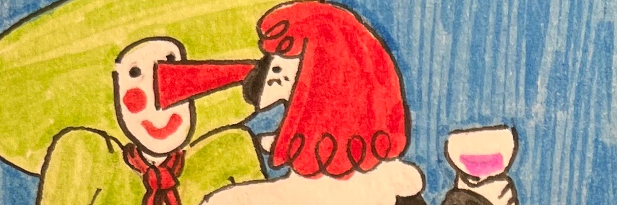
A sentry of the Yukon revolutionary army near Tagish Lake, 1920, for the fictitious history of a revolution in the Yukon.
Une sentinelle de l'armée révolutionnaire du Yukon près du lac Tagish, 1920, pour l'histoire uchronique d'une révolution au Yukon.
those of reddit fame. They reconfigure the original flag, placing it on the hoist and adding a large red fly. I would even say it "breaks" the 2001 Good Flag Bad Flag commandments, especially that about colour. (5/5)
That's all, rare thread over.
Honestly it isn't exactly Reddit itself that did the damage. It's really one man to blame: Roman Mars. In 2015, he issued a fatwa against all flags after misunderstanding Good Flag Bad Flag and ignoring NAVA's 2014 Joint Commission on Vexillographic Principles' report. (1/5)
flags. Lastly, I think a cocurrent trend of the mid 2010s aided in cementing these users by giving a use to their designs: Hearts of Iron 4.
I will add, I think the flag of OP is alright. It takes from an actual 19th century flag while the new elements aren't (4/5)