✨ GIVEAWAY! ✨
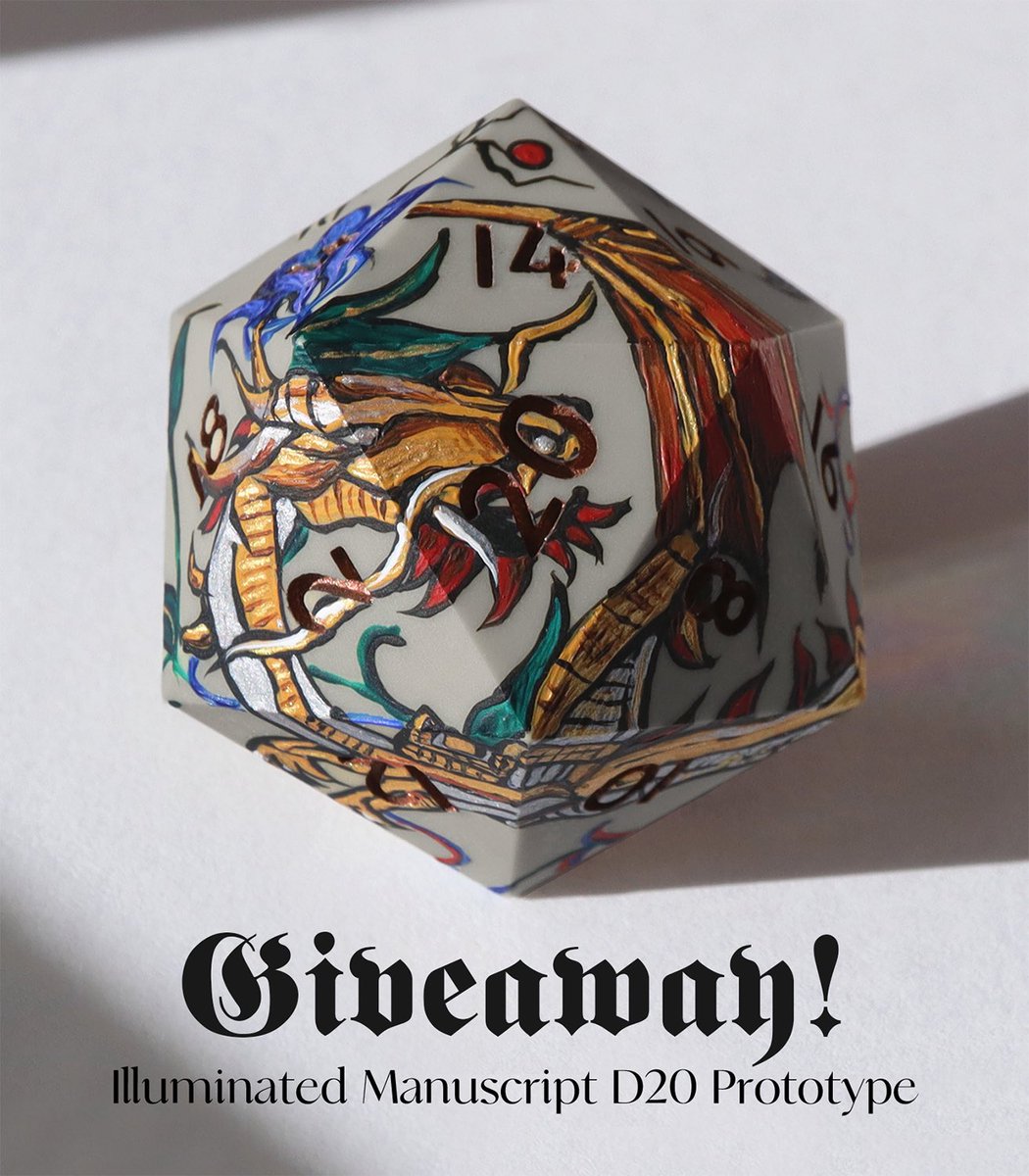
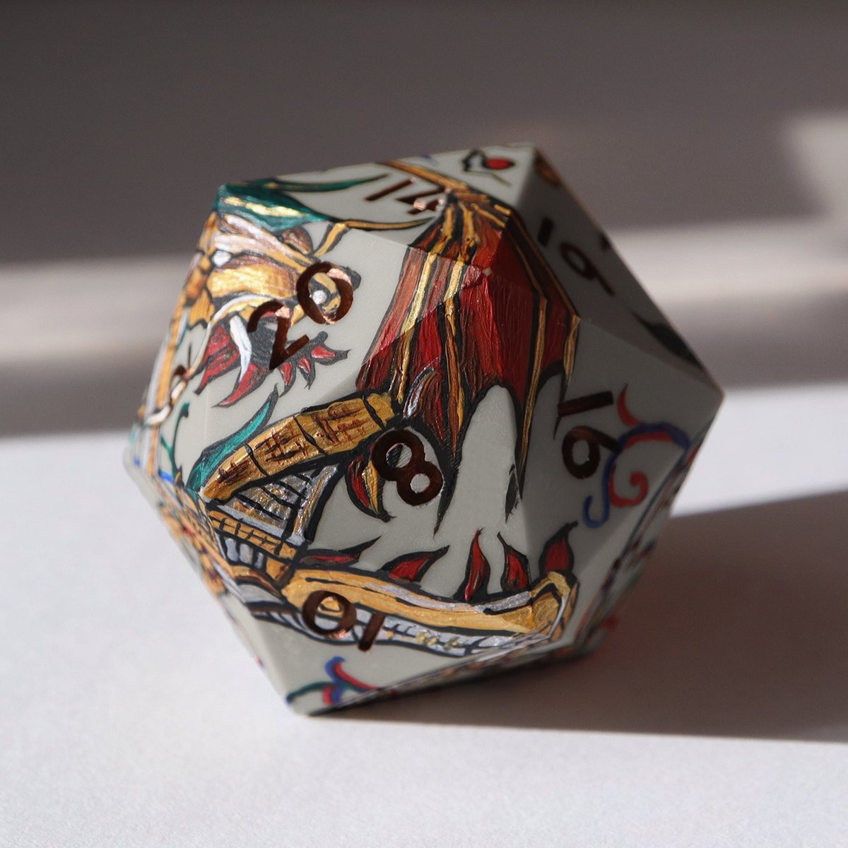
We're holding another holiday giveaway! This round is for a prototype of our 40mm Illuminated Manuscript D20 🐉 Ends 12/13!
To Enter:
📜 Like + RT this post
✨ Must be following!
#dnd#ttrpg#dice
@CarioLui@Chillveon@artisticVulpes Look man I'm gonna stop replying after this but you need to accept the fact that some people are simply not going to like the minimalist aesthetic being applied to so many logos. We don't need to be professional logo designers to say that we don't like the new logo as much.
@CarioLui Dude. I know a lot more work goes into designing logos than initially seems. This is just a weirdly angry-seeming argument with some rando who simply didn't like the removal of the two overlapping Ps
@CarioLui I literally do not understand what there is to be so mad about here? It's a joke at the expense of a large corporation who changed their logo from having something recognizable to being a slightly stylized font (also the font is likely just bolded Futura fyi, nothing special)
@CarioLui Bro it's a joke about how the new "logo" is just the name of the company on a colored background and loses all instantly recognizable elements.
The arts are in a terrible state because nowadays art is made by people with no stories and no problems. Everybody is depressed. Everybody's anxious. All for reasons they won't reckon with. Everybody is on drugs to make them feel nothing. Nobody feels guilty about anything important. Nobody struggles with themselves. Art is bad now because nobody knows how to suffer.