@nicktheriot_ New geo is the cheapest scale test once shipping's live there. Local currency and real delivery times on the landing page help it hold up.
@alex_momeni December is the one most stores get late. The cutoff banner should go up a few days before the real carrier cutoff, not on the day itself.
@oliverkenyon The returns line does more work than people expect. "Free 30-day returns" right under the button calms the size worriers better than any badge row.
@neilpatel Branded search is the one I'd watch in a test like that. When social goes quiet fewer people google the brand name, and it shows up as an SEO dip even though social caused it.
@dave_stickland Easy one to forget. Old landers from last month's ads keep getting clicks for weeks, and nobody wants to land on a full-price page mid-sale.
@Br3ntGbs Curious how many of those 90 are truly different angles versus the same hook reshot. That ratio usually explains a jump like this more than the ad count.
@TaylorSicard Hard call but the right one. Merchants remember the app that broke checkout in BFCM week way longer than the one that was missing for a few days.
@alex_momeni A code in the ad and a different 35% in the pop-up is such a common trip-up. Half the time it's just two teams setting up promos without seeing each other's.
@ecomchasedimond Price objection is sneaky because it's rarely about the price. It's usually "is this better than what I already have", and a side-by-side answers that better than a discount.
Black Friday week, your offer page gets more traffic than any other page all quarter.
What I'd check on it now:
1. Offer, amount and end date above the fold
2. End date in the shopper's time zone
3. Holiday shipping cutoff right next to the price
4. Bestsellers first, not new arrivals
5. Sold-out variants hidden or clearly marked
6. Discount applied automatically, no code
7. Returns explained in one line
What would you add to this list?
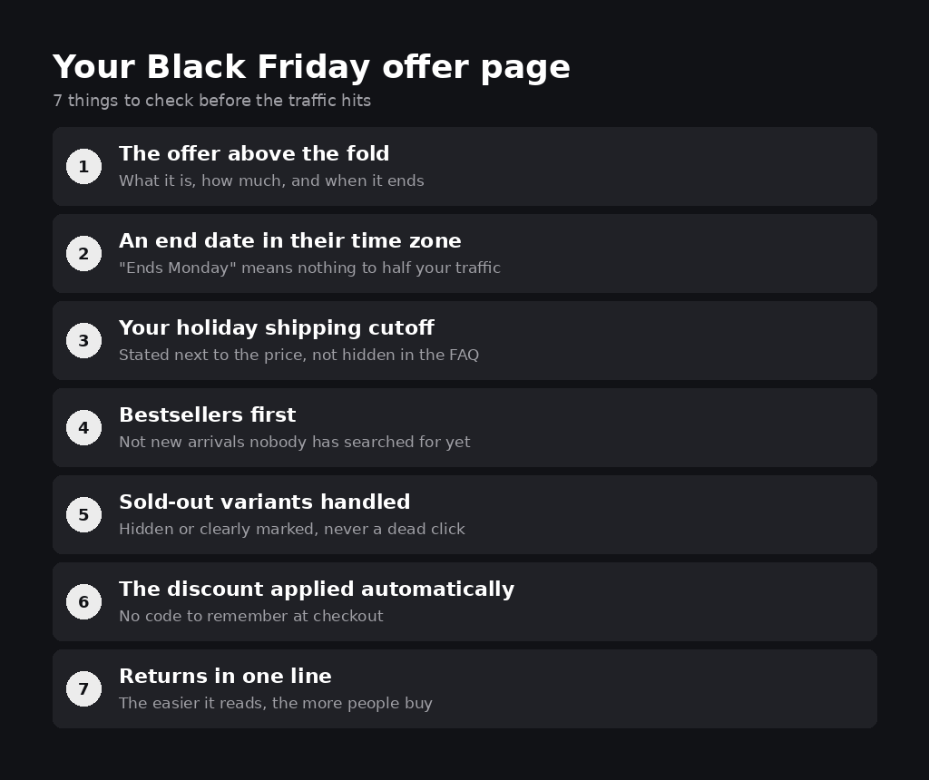
Your Black Friday offer page will get more traffic in 4 days than in the rest of the quarter.
7 things I'd check on it this week:
1. The offer above the fold: what, how much, when it ends
2. An end date in the shopper's time zone
3. Your holiday shipping cutoff next to the price
4. Bestsellers first, not new arrivals
5. Sold-out variants hidden or clearly marked
6. The discount applied automatically, no code to remember
7. Returns explained in one line
Which one would fail on your page right now?
@harleyf@LandoNorris@Quadrant@Shopify Programming the space instead of just stocking it is what makes people stay. A panel and a coffee meetup give fans a reason to come back on day two.
@alex_momeni That summary box is basically the product page for skimmers. Most people decide on the first screen, and the 10 reasons are there for the doubters.
@TaylorSicard@gochomps Smart for brands with real retail. Plenty of people trust a brand more once they see it's on a shelf they already walk past, even if they end up buying online.
@nicktheriot_ "Sleep divorce" is such a good example of naming the problem in the customer's own words. Two words and the viewer already knows if it's about them.
@vilobatirkedis Opening with the "you've tried this before and felt nothing" reason earns so much trust. People relax once the page says what they're already thinking.
@adamtaylorl Calling the losers fast matters as much as finding winners. The pricey lesson is usually the test left running another week because nobody wanted to kill it.
@kamil_sattar Starting from reviews of the stuff people already own is the step most skip. The complaints usually hand you the headline almost word for word.
Every year I see the same thing: a new app or theme tweak goes live in mid November and on Black Friday it turns out the cart breaks on one phone model.
So from about two weeks out I freeze the store. No new apps, no theme updates, no checkout changes. Tests wait until December, and the time goes into load testing, checking every discount and fixing what's already live.
Do you freeze your store before BFCM, or keep shipping changes right up to the day?