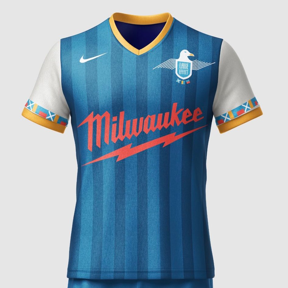
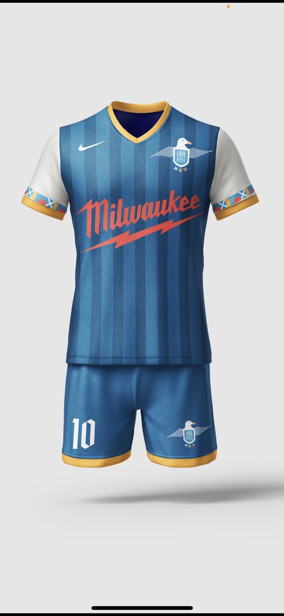
While waiting for an update from @MKE_ProSoccer I took matters into my own hands and made some merch for @MikeTkachuk13 of the logo we designed in ‘23.
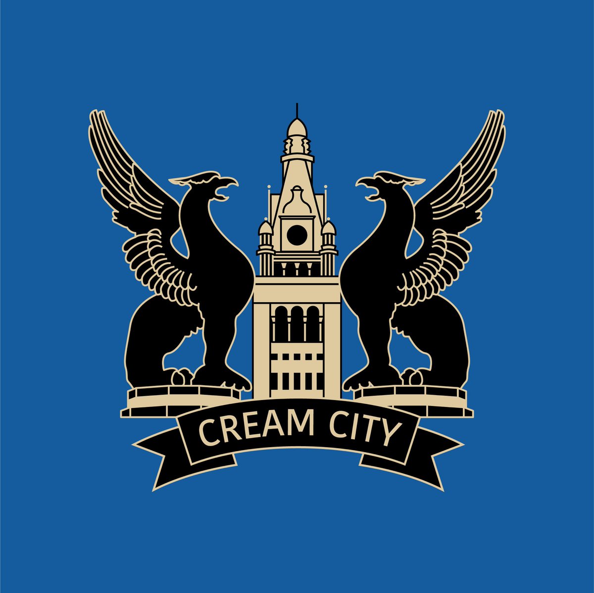
City Hall to represent MKE as a whole and griffins from the Mitchell Building to represent protection for our city and team.
Brigade / The Black Hats
Crest: Black Hardee hat troops wore in Iron Brigade during Civil War led by Rufus King, swords to lead our attack, 11 pinstripes (1 for each player on the field), blue tassel outline to symbolize the tassel on the hats #MKEProSoccerKit@MKE_ProSoccer
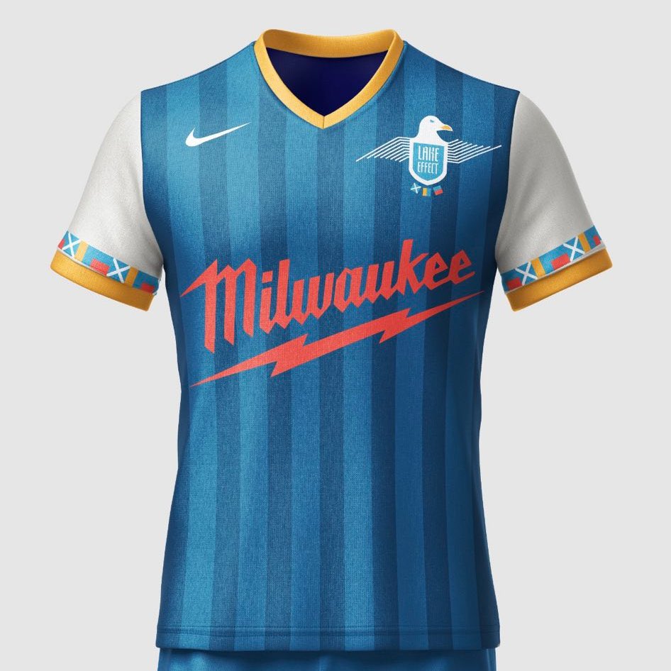
Lake Effect - Kit: blue of Lake Michigan, local company sponsor, trim on sleeves are from the sailing flag alphabet and spell out M K E. Crest: seagull, wings of art museum #MKEProSoccerKit
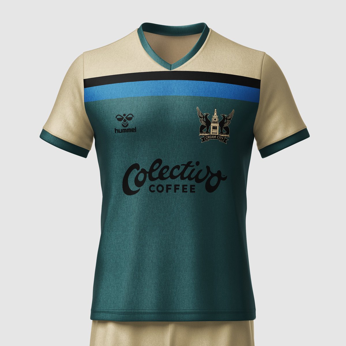
Cream City -
Crest: City Hall to represent MKE as a whole, griffins from the Mitchell Building represent protection for our city/team.
Kit: teal color represents the green of land and the blue of Lake Michigan mixing together. #MKEProSoccerKit@MKE_ProSoccer
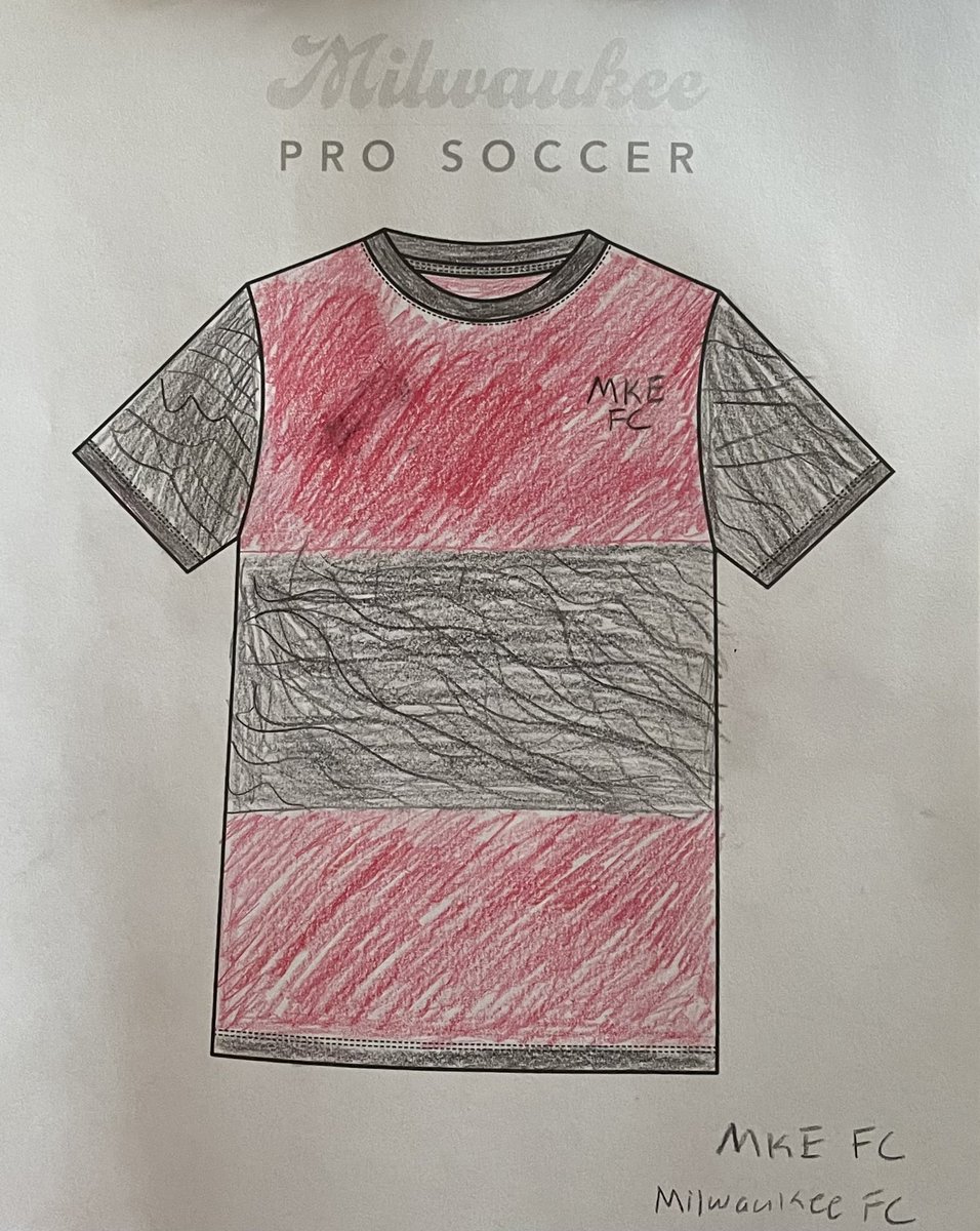
@JoeEmer @MKE_ProSoccer Agreed! I know there’s been a lot of debate on whether or not it should be ‘FC’ or ‘SC’ but I think adding ‘MKE’ still gives it the proper soccer naming convention without us having to decide if it’s football or soccer 😅