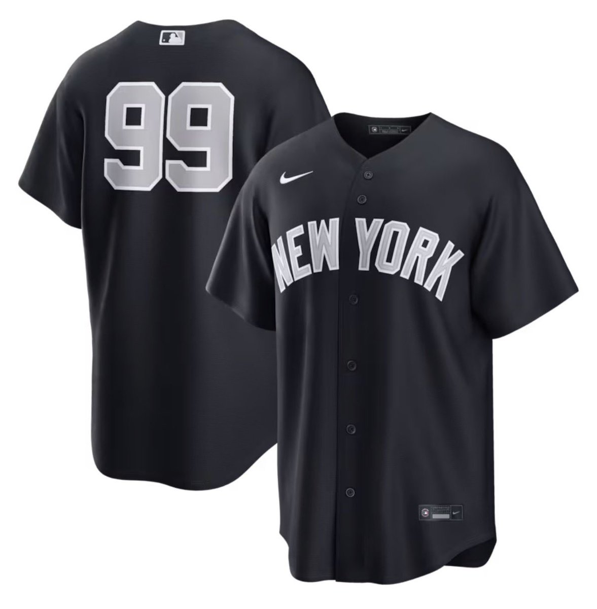
The gray lettering + white piping just looks wrong. Especially for the numbers. Should be plain white.
Reeks of a fast-tracked decision with no design effort.
Not worthy of being called a Yankees uniform.
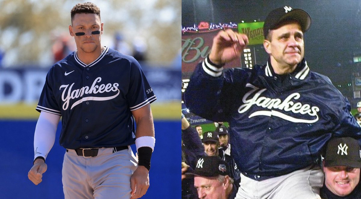
If the Yankees are gonna have a navy alternate uniform, this should be the design.
I’m still against any third jersey. But at least this one evokes tradition and winning.
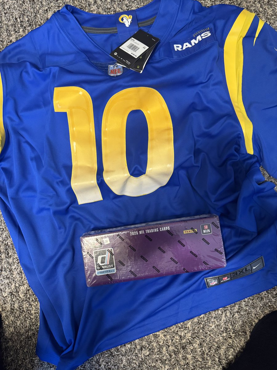
Has anyone seen this before? I ordered this cooper kupp jersey from the Fanatics clearance sale and for some reason I also got a box of donruss that I did not order ???? @CardPurchaser
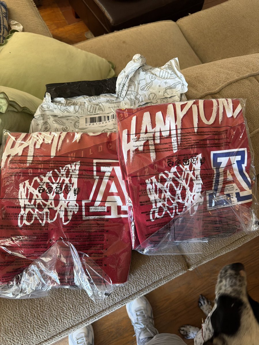
@MelvinIzzoIII@NickStevenson76 That would’ve been incredible instead of going all the way to Fort Lauderdale for spring break with a bunch of friends, getting kicked out of the air bnb and not getting refunded anything 😂
A major sports team asking fans for feedback and listening is pretty crazy. They listened to the countless cries to bring back the devil rays design, even bringing back road greys. We need more teams and companies to follow suit, this is incredible
YOUR Tampa Bay Rays 🫵
Playing as the visitors in Tampa tonight got us thinking about putting Tampa Bay back on our regular season road jerseys, and you get to help choose how. Which version of the away grays would you want to see take the field in the future?
@Philly_Kid08 I like number 2 jersey but I love number 3s hat. Me personally I think the rays should adapt the new and sprinkle some old, number 3 all together perfects that imo