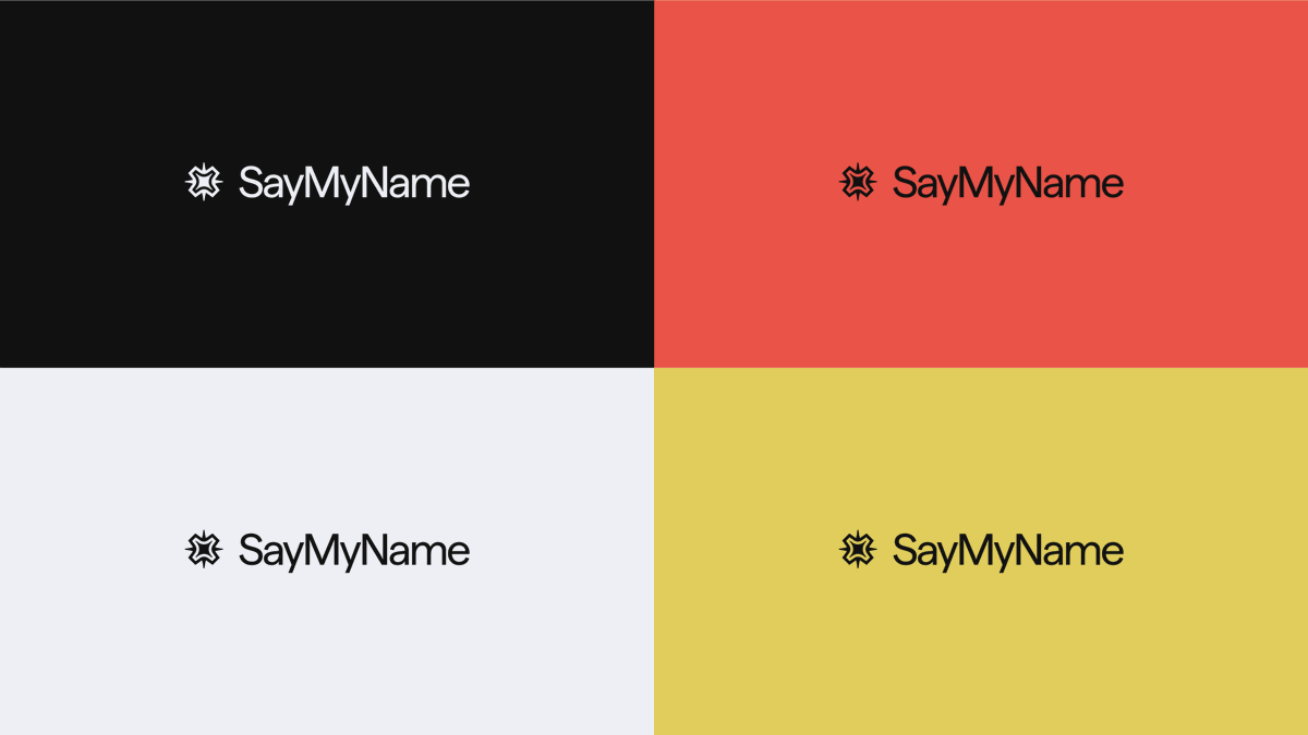
Striking the balance between rigid geometry and organic flow. 📐✨ My latest brand identity case study.
I focused on developing a powerful symbol on a technical grid, juxtaposing it with clean typography and a saturated, yet sophisticated color palette.