I used different colors for these categories while building a weekly schedule for a busy entrepreneur.
The goal was simple:
Open the calendar and understand the shape of your week without reading every event.
What categories would you give their own color?
One thing I think is underrated in calendar management:
Color coding is not decoration.
When done intentionally, it helps someone understand their week at a glance.
Meetings.
Focused work.
Admin.
Personal time.
Breaks.
That's why I included buffer time, focused work blocks and breaks when building a weekly entrepreneur's calendar.
A calendar should reflect capacity, not just availability.
Do you deliberately schedule buffer time?
If every free space in your CEO's calendar becomes a meeting, you've created another problem.
Meetings need preparation.
They create follow-up work.
People need time to transition between tasks.
And sometimes, something unexpected will happen.
It should also answer:
"When am I supposed to actually get the work done?"
Good calendar management is about protecting time, not filling it.
What would you protect first on a busy founder's calendar?
A full calendar and a productive calendar are not the same thing.
When I built a weekly schedule for a busy entrepreneur, I deliberately left space for breaks, focused work, personal time and buffer periods.
Because a calendar shouldn't just answer:
Where am I supposed to be?
I thought I was just being the bossy first child. Turns out, I was learning something useful. 😂
Growing up, I was always assigning tasks to my siblings and checking if everything got done.
If your spreadsheet needs a 10-minute explanation before someone understands it, something is probably wrong
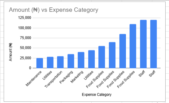
I recently built an expense tracker for a fictional restaurant owner
Instead of leaving the data as rows and columns, I added a bar chart to make spending patterns easier
to see.
That's something I'm paying more attention to in operations:
The person using the information shouldn't have to do all the thinking themselves
A good system should make the important information easier to see.
Would you rather receive a spreadsheet full of data or one
One thing I'm learning about business reporting:
Don't collect data just because you can.
Before adding a column to a spreadsheet, ask:
What will this information help me understand?
What decision could it support?
Who actually needs to use it?
I applied that thinking while building an expense tracker for a fictional restaurant owner.
The sheet tracks expenses, calculates totals and averages, counts entries and visualizes spending by category.
The formulas organize the numbers.
The visualization helps tell the story.
One thing I've learned from working on business documents:
Good formatting is functional.
Headings aren't just decoration.
Lists aren't just there to make a page look less empty.
Spacing isn't wasted space.
They help the reader understand where they are, what matters and what
to look at next.
I recently built a customer-facing fintech document with that in mind.
The goal wasn't to make a document that looked professional.
It was to make something that communicated professionally.
There's a difference.
What's one document-formatting habit you