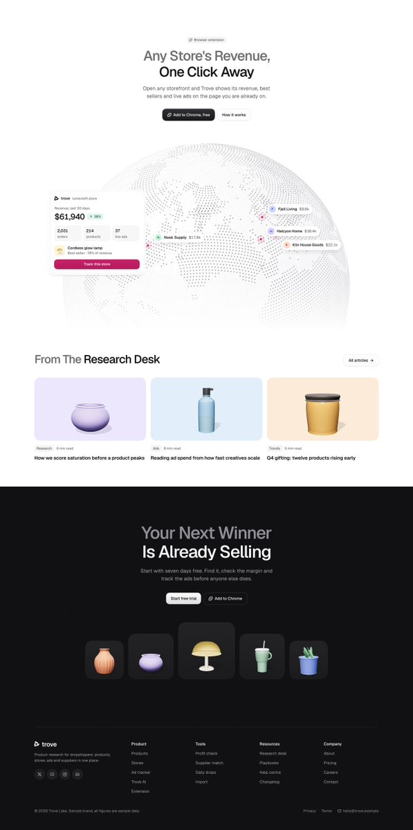
Imagery vs branding for Sorna.
The orange gradient works as both background and light.
Everything else stays neutral so the product remains easy to read.
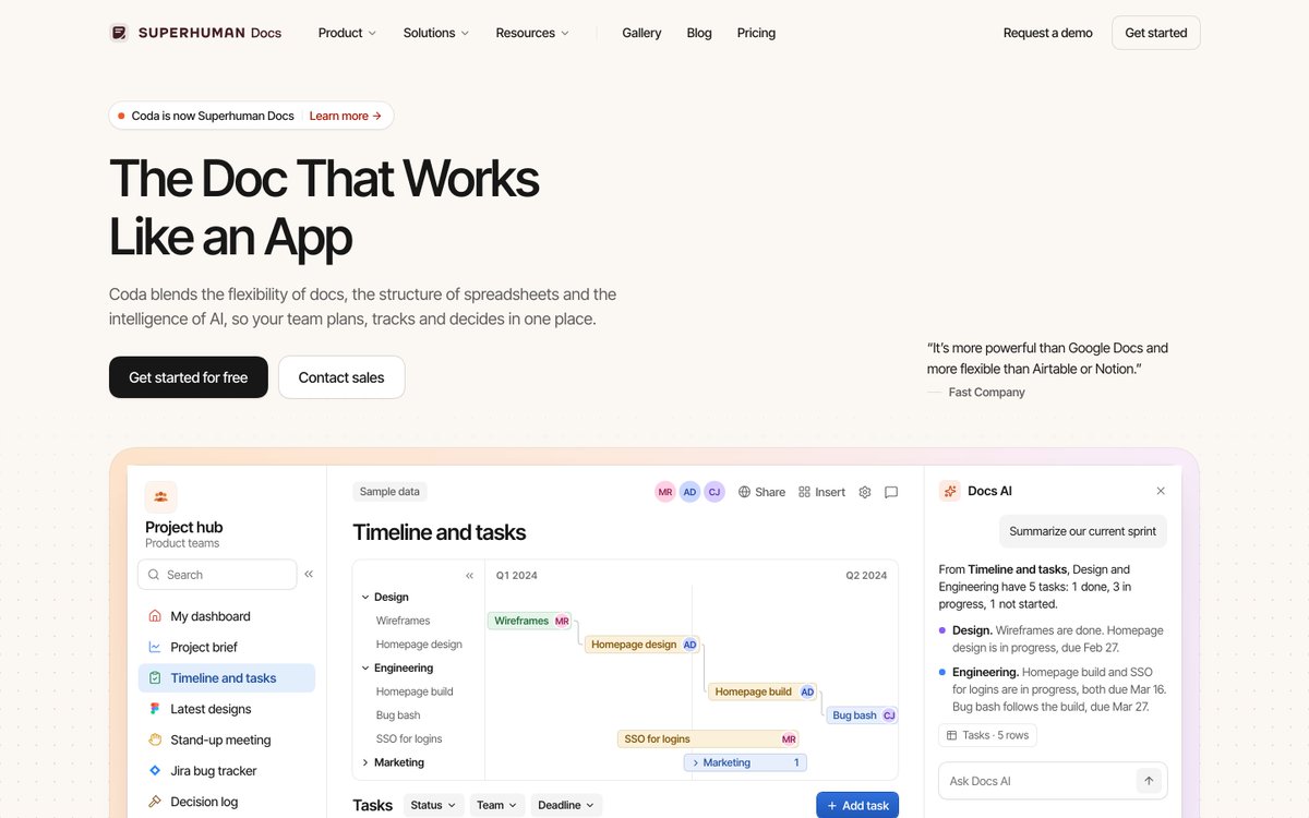
I redesigned Coda’s hero.
The real headline started 669px down under two rebrand banners. The signup button was cut off and no product showed.
I moved the headline, both buttons, and a live doc into one view. Rebrand stays as one line.
Visitors should know what it does in 5s.
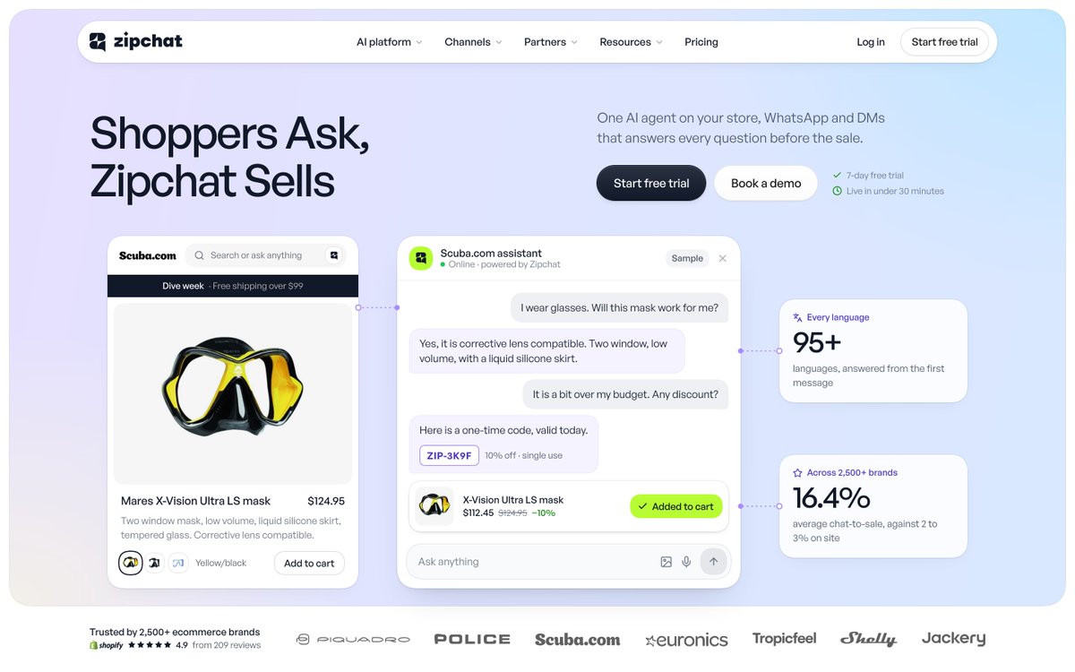
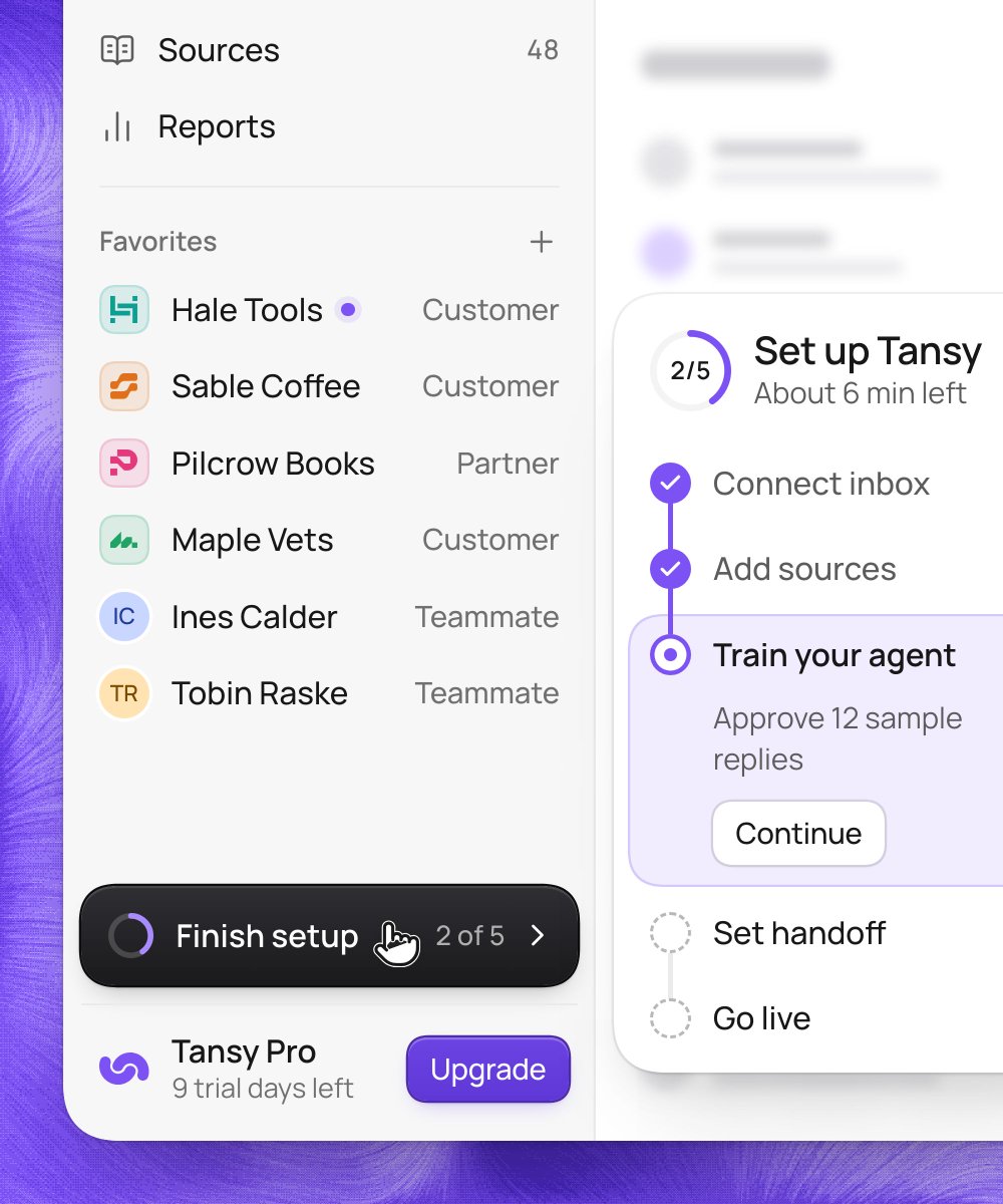
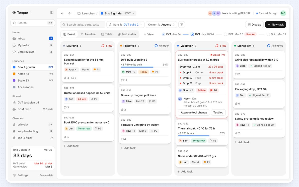
3 bright SaaS heroes. 1 clear action.
Each one leads with a specific outcome instead of a vague feature.
The product is the hero, not the design around it.
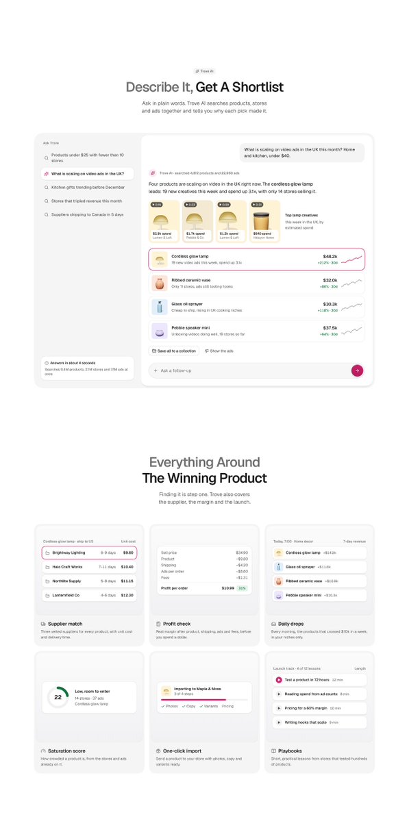
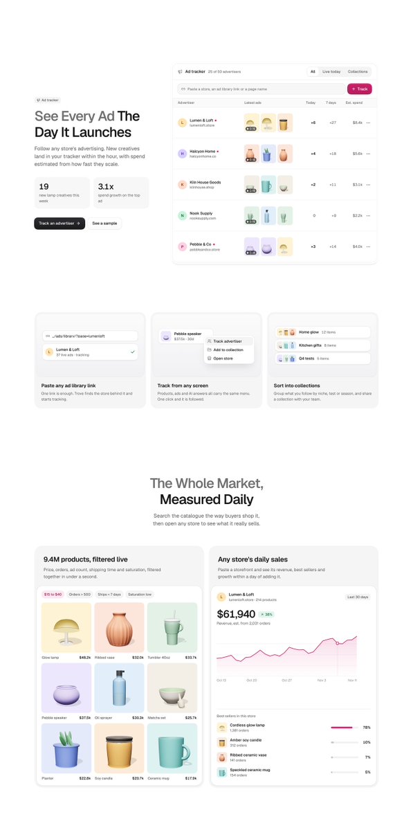
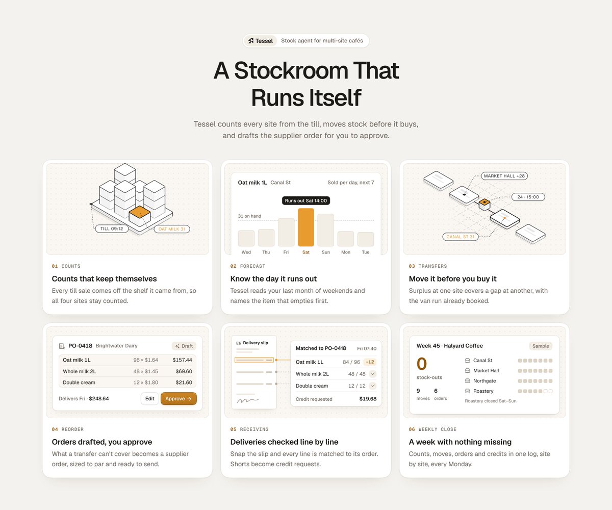
What makes a bento grid work:
- Real product UI, not icons
- Headlines you can read in a glance
- One line of subtext, max
- Illustrations that show the feature
Save this for your next build.