The chart depicts the number of US repo fails, which are essentially instances where a party in a repurchase agreement is unable to deliver the collateral (usually US treasuries) on time. The chart shows that there's been a significant increase in repo fails since early August...
This chart shows the weekly amount of US$ Repo Fails, which indicates the amount of collateral issues in the market. The trend in repo fails aligns with the unwinding of the Yen carry trade, highlighting potential collateral disruptions and difficulties in the market.
The chart shows the difference between the 5-year swap rates for the LIBOR (London Interbank Offered Rate) and the SOFR (Secured Overnight Financing Rate). The widening spread indicates that the market is expecting interest rates to fall, despite the Fed’s hawkish stance in Ju...
The chart shows the 10-year SOFR swap spread over time. It suggests that the market is expecting lower interest rates over the longer term, despite short-term fluctuations in the economy and Fed policy. The market is already priced for lower rates, even though recent economic ...
The chart shows the average weekly hours worked by all employees in the US. It shows that the average weekly hours worked has been relatively flat for the past few years. However, the hours worked have been declining slightly in recent months, which is consistent with the rece...
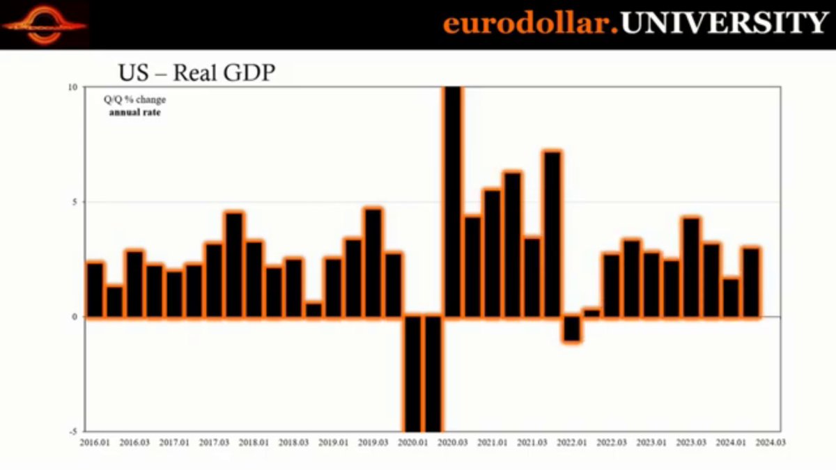
The chart shows the quarter-over-quarter (QoQ) change in the real GDP growth rate of the US from 2016 to 2024, highlighting the impact of the COVID-19 pandemic and the subsequent economic recovery. It demonstrates that although output grew in 2023, employment growth may have ...