Most indie apps don’t have bad features.
They have bad screenshots.
Introducing StoreBuddy:
→ Turn raw screenshots into polished App Store slides
→ AI-generated copy & layouts
→ Fully editable
→ One-click localization
→ One-click push to App Store Connect
Link below ⬇️
You don't increase your conversion rate by building new features
You increase it by gradually testing different icon & screenshot variations
Keywords = getting seen in the App Store
Screenshots = getting installs from those views
Learn about ASC's built-in A/B tests
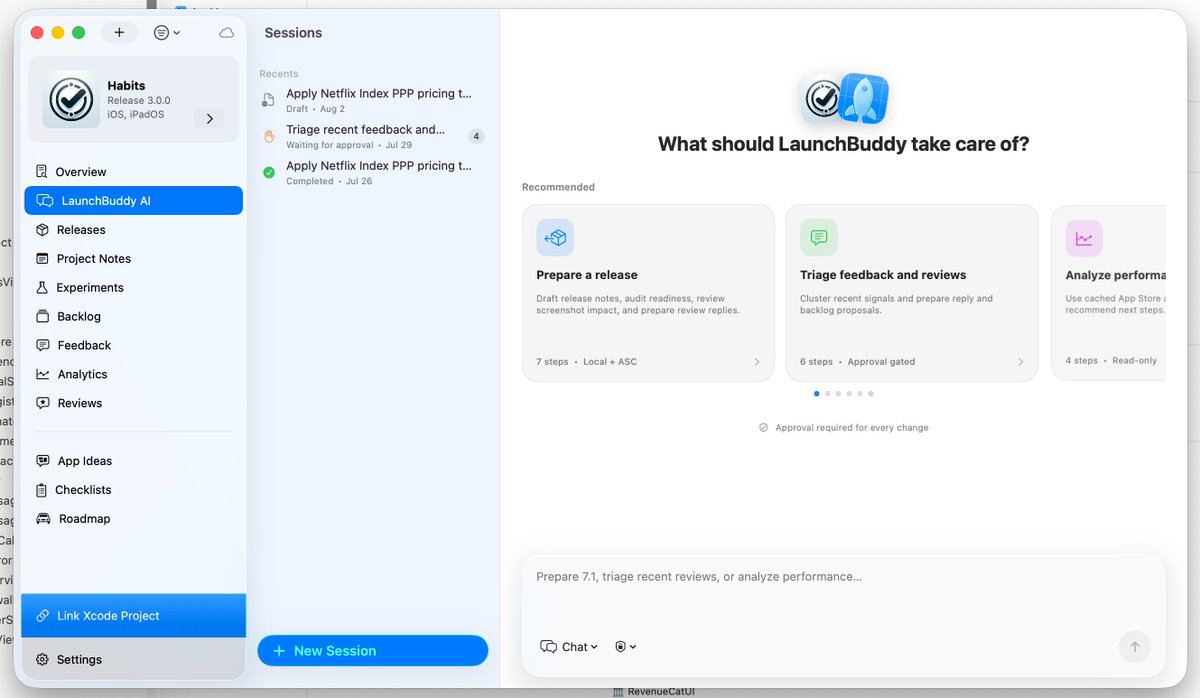
The next version of LaunchBuddy will be able to do Purchase Price Parity for you!
Just ask LaunchBuddy AI, the new agent with lots of capabilities in LaunchBuddy and App Store Connect.
Available soon!
The new Product Page Header image in the App Store will not matter.
First you need users to actually want to enter your App Store listing.
And the reality is that a lot of users NEVER enter the listing.
They search for something, see the app in the search results and download it directly from there.
So the important update here is the new Search Results image.
It's an app banner inside the App Store search results.
And you should think about it as a persuasive ad.
COPYWRITING will be what matters.
Not the fancy "branding".
Users are searching because they want an answer to something.
Your creative needs to give them that answer immediately.
And this becomes even more important with Apple Ads.
You can pay to appear for the keyword, but your creative still needs to convince the user that your app is the answer they were searching for.
🚨 Apple released guidance for the new App Store product page headers. A few quick thoughts:
0. Do this!
1. Don't focus on features - Show the one thing that will make users go "wow! I need this". It's usually not a feature but a set of them (aka a solution).
2. Less is more - less colors, less elements, less clutter.
3. Show social proof - but don't exaggerate or fake it. Real or nothing.
4. Don't half a$$ this - It's the first thing users will see. If it's ugly they won't download
I'm going to experiment with headers in the coming months and will have more thoughts to share then.
I love the "open in side chat" feature in @cursor_ai
I only wish these sidechats would somehow be saved "inside" the main chat in the sidebar so I could access them again after closing
Apple's new App Store creative assets land this fall.
Things Apple says to keep out of the artwork:
❌prices or discounts
❌website URLs, copyright symbols
❌awards you can't verify
❌logos from other app marketplaces
❌Apple's own awards and recognitions (❗️)
➕ every asset has to suit a 4+ audience, even when your app is rated higher. Dating, horror, health, and games: check your concepts before design starts.
@anumness@twostraws Having a competitor is good. It pushes you forward and validates the market. Don't get discouraged! There are Meta and Google Ads, but people use both!
Been seeing lots of people wait 7+ days on app submissions. We've went into review within 24 hours (+ reviewed within <60min) 4 times in the last 9 days.
We don't do anything magically different. We mark every update as a bugfix submission (truthfully) and include a demo video walking through the app's main features + login flow.
@emin_builds Looks so good! RE your question yesterday, I majorly prefer liquid glass. Anything else looks super outdated imho, especially since system controls use liquid glass. I'd go all in for sure!
(e.g. the "1 leak" card and the one next to it, but also the little % change pills)
Here's how I made the @cursor_ai announcement video:
I built the scene off a real Wii Menu - I used Dolphin Emulator to run an emulated Wii on my mac that I screen recorded in 4k
I used Cursor with Grok 4.5 to dig around in the Dolphin system files. This allowed me to modify the look of the Wii menu - add custom channels and create arbitrary messages
From there, I broke down the scene:
- I wanted a custom message in the messages folder to start the video
- I wanted a "Cursor" channel for the announcement
The channel art presented some challenges - Wii uses obtuse formats for system graphics (TPL, BRLYT, BRLAN), this meant I couldn't just drop in MP4s / PNGs
Rather than struggle with that, I reverse-engineered the tile by installing Homebrew - a tool for modding the Wii - and duplicating all of the custom Homebrew assets
It was much easier to ask Cursor to modify existing assets rather than create new ones. Then, I replaced the logos with a high-quality Cursor image obtained from our brandkit
The fun part was the Channel preview (below) - I used Playwright to extract the raw HTML assets from Cursor dot com, and manipulate them into a format supported by the Wii
That allowed me to create a high-fidelity preview - the video felt like visiting the Cursor homepage.
Finally, clicking "Start" loads the dynamic Cursor graphic.
I bugged a teammate for that asset, then used a video editor to patch it in along with some stock music I sourced from @epidemicsound
Finally, I added a CRT effect with @remotion to give some extra nostalgia and synced up the track to key transition moments... voila!