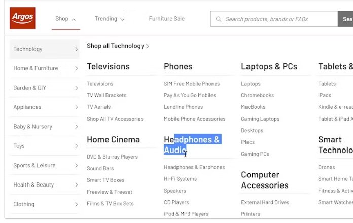
Every main menu category should be clickable.
Users expect “Shop”, “Men”, or “Home” to open the dropdown and lead to a full category page (“Shop All”).
When it’s just plain text, they click, nothing happens → frustration.
A simple link adds clarity, consistency, and trust.
I redesigned the PDP of a product from Balmbare.
The old page had potential but too many blockers:
– Way too much text.
– Focused on why other products fail instead of why this one works.
– Users had to scroll forever to reach the actual offer.
– Font choice too generic.
My version simplifies the story, builds trust faster, and gets users to the product sooner.
CRO is clarity + focus, not chaos in paragraphs.
This PDP had too much friction.
So I decided to redesign it for conversion.
This is what I did:
– Removed the first image (it repeated in the infographics, redundant).
– Moved the CTA above the fold. Users shouldn’t scroll to buy.
– Removed the quantity selector (adds friction, not value).
– Added reviews & proof to build trust.
– Simplified layout → clear, credible, conversion-driven.
CRO isn’t about “pretty design”.
It’s about clarity, trust, and frictionless action.
Professional photos impress.
User photos sell.
User photos crush professional product images in conversion power.
They win because they show real people actually using and enjoying your products.
Products featuring customer photos see conversion increases of 40–60%.
When browsers see authentic images, their uncertainty vanishes and their confidence soars.