Big news: we now offer free Trial versions of all our retail fonts! Preview any style from our library in your mockups and proposals.
Download now!
https://t.co/7Kc6ZcsjcR
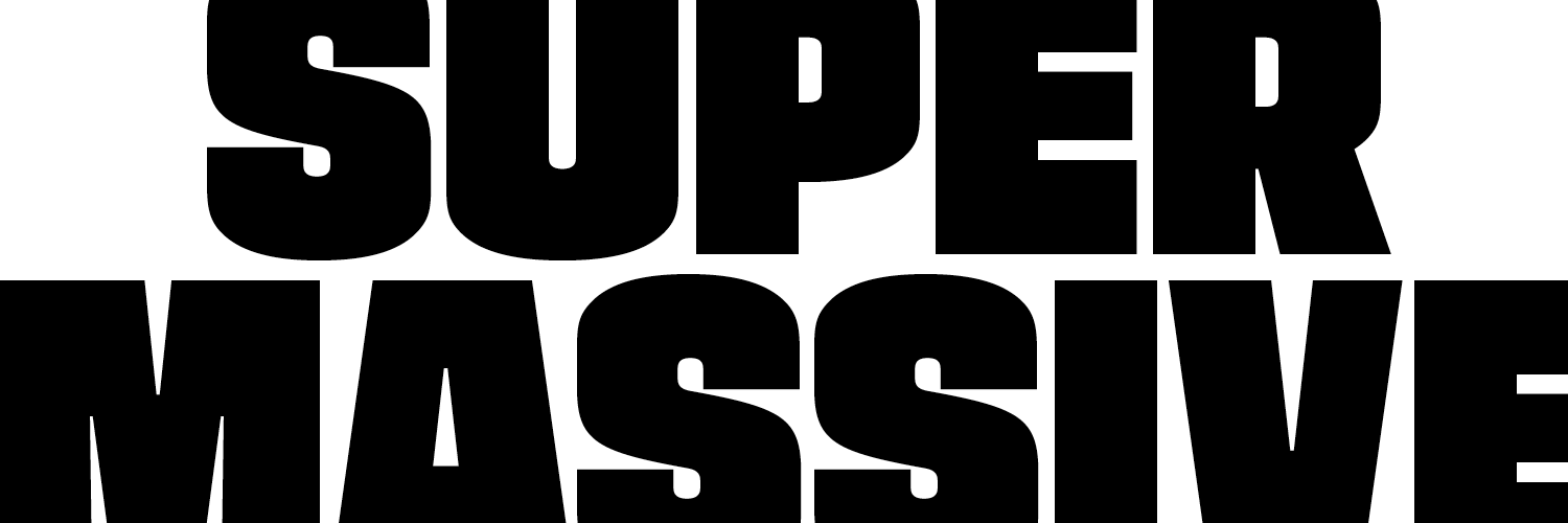
EXHIBIT: Tobias Frere-Jones' Supermassive type family explores visual stability with heavy strokes, designed for impactful headlines, influenced by 1960s handlettering, and balances density with delicacy. https://t.co/0J8cS24a21
In three cap-only styles drawn for headline sizes — and larger! — Supermassive is not quite stable, but always forceful.
Design: Tobias Frere-Jones
Contributions: Rosie Ma
@ninastoessinger@fredshallcrass
New Release: SUPERMASSIVE
Hefty and idiosyncratic, Supermassive squeezes maximal weight and density out of the available space without sacrificing subtlety or soul.
Responding to themes from 1960s handlettering styles, Supermassive presents long superelliptical curves and a teetering balance of vertical and horizontal weights. Minimal negative spaces push mass to a precarious extreme.
Ben Fehrman-Lee designed our new library specimen, showing our retail library with its newest addition, Community Gothic. A new approach: no waterfalls! It’s gorgeous; 60pp, printed on four paper stocks, lots of type & full-color images. Get your own: https://t.co/G0tOedkah6
Our friend @Yotam designed this newsprint specimen of Community Gothic for Typographics. “A Bed of Eels” uses collective nouns to showcase this family of fonts, & includes @domesticetch ’s essay about the design. Extra copies available in our shop: https://t.co/G0tOedkah6
In this second installment: Archer followed in Surveyor’s footsteps, created to combine and contrast with it. Learn about its story, recorded by @realdougwilson — https://t.co/R9p9TTbFA2
Several type families that I designed are now owned by Monotype; I want to ensure that their stories are accurately recorded. —Tobias
Introducing a series of posts by @realdougwilson — in this initial article, learn about the design process of Surveyor: https://t.co/RuPjTzSkME
Intel One Mono breaks from convention by prioritizing linespace & extender lengths over an inflated x-height to help readers differentiate better between letter shapes.
The family contains four weights with matching italics. Try them for yourself! https://t.co/DbkpLEvSEV
Introducing Intel One Mono, an expressive monospaced font family that we designed for @intel with clarity, legibility, & the needs of developers in mind.
Intel One Mono is available under an SIL Open Font License. Download the fonts & use them for free: https://t.co/DbkpLEvSEV
Working with the Intel Brand Team & @VMLYR our design process (design lead: @FredShallcrass ) was guided by feedback sessions with low-vision & legally blind developers. Centering this underserved audience led to clarity & legibility improvements that can benefit all developers…
New on the blog: we asked Elizabeth Goodspeed @domesticetch to help tell the story behind Community Gothic. The family sums up two decades of experimentation, and the strands of type history that inspired it are more intricate than they may seem: https://t.co/Eg8TlPRH1n
The story of Community Gothic begins with the sans serif “jobbing” typefaces of the 19th century: clear and durable, though often coarse, even awkward. Our family revives the gritty forms of that genre, and the patchwork sets such designs came in. https://t.co/5vp4lgQb1E
Community Gothic — the newest release by Frere-Jones Type @frerejones — was designed by Tobias Frere-Jones, Fred Shallcrass @FredShallcrass & Nina Stössinger @ninastoessinger with contributions by Julia Ma @pointlesstars
In conventional families, features and themes are planned and negotiated, so they can be sustained across all, or most, styles. In Community Gothic, the view is entirely local. https://t.co/5aeRgBcF4K
We asked Devin Washburn and Philip DiBello at No Ideas @_noideas to illustrate our new Community Gothic family. With the concept of a public bulletin board, they perfectly capture the family’s themes of layering and noise.