Two static ads. Same serum. Two completely different jobs.
→ Left: soft, curious, built for the scroller still asking "why?"
→ Right: bold, direct, built for the buyer already saying "yes."
Most brands try to do both in one ad. That's why nothing converts.
Static design isn't decoration. It's your offer, dressed for the moment.
If your ads look beautiful but don't sell, my DMs are open.
#StaticAds #CRO #AdDesign #DTC #Ecommerce #BeautyMarketing #ConversionDesign
Most beauty ads look pretty. Few make people buy.
I redesigned this skincare static to sell in 3 seconds:
Problem → transformation → benefits → proof → clear CTA.
If your ads look good but don’t convert, you don’t need “more design.”
You need conversion led creative.
DM “REDESIGN” and I’ll audit yours.
#CRO #AdDesign #DTC #Ecommerce #CreativeStrategy
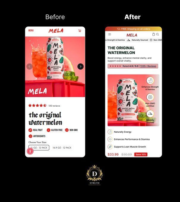
I redesigned a Shopify homepage and the "before" is a masterclass in everything killing your conversion rate.
Old version:
→ Generic "Welcome to our store"
→ Two headlines fighting each other ("Find Everything" + "Browse our latest products")
→ A stock photo graveyard of random clutter
→ Zero trust signals
→ A popup AND a chat bubble competing for attention
The "after" fixes the actual problem: it sells.
1. Announcement bar with a real offer
2. Clean navigation + visible cart
3. Star rating + "4.8/5 from 12,000+ customers" above the fold
4. ONE clear headline that says what you actually sell
5. A subhead that explains the value in one breath
6. A single, obvious CTA (not three)
7. Trust badges: quality, freshness, easy returns
8. A lifestyle shot people can see themselves in
9. "As seen in" press logos for instant credibility
The first version asks people to browse.
The second version gives them a reason to buy.
Conversion isn't about more, it's about removing every reason to leave.
Need this done to your store? My DMs are open.
#CRO #Shopify #Ecommerce #ConversionRateOptimization #WebDesign #DTC #LandingPageDesign #UXDesign
Most skincare brands waste money on ads that look pretty but sell nothing.
Here's a Tatcha concept I designed that actually converts:
Left panel hooks you with the promise (Repair Your Glow). Right panel closes you with proof (the before/after split that makes the product feel inevitable).
That's the formula. Desire on one side, undeniable proof on the other.
Pretty ads get likes. Structured ads get sales.
Swipe through any feed and you'll see the difference instantly. Brands that understand buyer psychology vs brands that hired a designer who just makes things "look nice."
I build the second kind.
If your product is great but your ads aren't pulling their weight, that's a design problem, not a product problem.
DMs open.
#StaticAds #AdDesign #SkincareMarketing #EcommerceMarketing #GraphicDesign #DTCBrands #SocialMediaMarketing #CreativeStrategy #PaidAds #BrandDesign
Most supplement brands lose the sale in the first 3 seconds.
Not because the product is bad. Because the ad makes the customer work to understand it.
Look at this one. Two frames. Zero confusion.
Frame 1 stops the scroll with one bold promise: Daily Gut Balance. No clever wordplay. No hidden benefit. The buyer knows what they're getting before they finish reading.
Frame 2 does the quiet work. Stomach. Immunity. Wellness. Body. Four icons, four reasons, scannable in the time it takes to swipe.
That's the whole game in paid social. The hook earns the second of attention. The structure closes it.
Brands obsess over the formula inside the bottle and forget the design is what actually sells it.
I build static ads that do both jobs at once: stop the thumb, then move the buyer.
If your product is better than your ads are making it look, that's a design problem, not a product problem. And it's fixable.
DM me "STATIC" and I'll send you my breakdown of what makes a scroll-stopping supplement ad.
#StaticAds #AdDesign #DTCMarketing #PaidSocial #EcommerceMarketing #SupplementBrands #CreativeStrategy #PerformanceMarketing #GraphicDesign #BrandDesign
Most brands think a static ad is just a product on a background.
It's not.
It's a silent salesperson. It either makes the scroll stop or it doesn't.
Look at these two. Same product. Same serum. Two completely different buyers.
The first one sells protection. Clean, clinical, water splashing, every benefit spelled out. Built for the shopper who needs proof before they trust.
The second one sells a feeling. Warm light, soft botanicals, "Limited Offer" doing the heavy lifting. Built for the shopper who buys on vibe and acts on scarcity.
Neither is wrong. The mistake is running one ad and expecting it to convert everyone.
Your audience is not one person. So why is your ad design treating them like they are?
I build static ads that match the buyer, not just the brand. Funnel-aware. Conversion-first. Made to stop the scroll and move product.
If your ads look pretty but aren't selling, that's the problem I fix.
DMs are open.
#StaticAds #AdDesign #GraphicDesign #EcommerceMarketing #ConversionDesign #SocialMediaMarketing #DTCBrands #PaidAds #CreativeStrategy #DesignThatSells
Most fashion brands design homepages like billboards.
Storefronts convert. Billboards don't.
Here are 5 silent conversion killers I fixed in this Miss Sixty redesign:
1. The "X" on the announcement bar Customers were closing the free shipping offer before they ever saw a product. Removed it. Now the €250 threshold stays in their head the entire session.
2. "Bella Hadid Summer 2026 Campaign" as the H1 Tells me nothing about what I'm shopping. Replaced with: "YOUR NEW DENIM ERA." A headline should sell a category, not announce a campaign.
3. No subheadline. No positioning. Added: "Italian-retro silhouettes made for the city." Now the visitor knows who the brand is for in under 2 seconds.
4. Zero CTA above the fold You can't convert what visitors can't click. Added "SHOP NEW ARRIVALS" — high-contrast, action-led, single destination.
5. The hero showed branding, not product Bella sells the vibe. The jeans sell the jeans. Swapped a campaign portrait for a full-body shot where the product is the subject.
Your homepage has 3 seconds to make a €250 AOV feel worth it.
If yours still looks like the BEFORE → my DMs are open.
I redesign DTC storefronts for conversion, not for awards.
#CRO #DTC #Shopify #EcommerceDesign #ConversionRateOptimization #WebDesign
This Shopify homepage was leaking revenue above the fold.
I rebuilt it. 7 surgical CRO fixes:
1. The announcement bar: Added "SHOP NOW" so it stops being decoration and starts being a clickable lever.
2. Pinned social proof up top: "Denmark's #1 rated cluster lashes" earns trust before the pitch — not buried under it.
3. Killed the model selfie hero: The headline now leads: "Premium Clusters for Soft Glam." Benefit-driven. Outcome-led. You know what you're getting in 2 seconds.
4. Added a subhead that sells the ease: "Create your custom lash look in minutes." Speed = objection killed.
5. Replaced the "SHOP NOW" text link with a real CTA button. Buttons convert. Hyperlinks pray.
6. Trust badges got icons + branded background. 14-day returns and "Since 2019" are now seen, not skipped.
7. Swapped the selfie for the product in use. Eye. Lashes. Packaging. Application. People buy what they can picture using not what a stranger is wearing.
The "before" sold a vibe.
The "after" sells the product.
If your homepage looks like the BEFORE, your ad spend is doing the heavy lifting your design refuses to do.
I redesign DTC stores like this for a living. DM me "AUDIT" I'll tear yours apart for free.
#CRO #Shopify #DTC #Ecommerce #WebDesign
This lingerie brand had a "sexy" homepage.
It converted like a wet napkin.
Here's the 8-move teardown that turned it into a sales engine:
1. Shipping bar reframed as a benefit - not banner noise
2. Social proof above the fold: 4.9★ • 2,205 reviews • real faces
3. Headline that positions instead of poses: "Luxury That Feels Personal"
4. Subhead naming what people actually came to buy
5. Trust badges killing the #1 objection: Discreet Shipping
6. Hero selling the GIFT — not just skin
7. Outcome-driven CTA: "Find Your Perfect Set →"
8. Subtext pulling them deeper: bestsellers, new arrivals, luxe sets
Sex sells the scroll.
Clarity + trust sells the cart.
If your Shopify homepage still looks like a magazine ad, you're bleeding revenue every single day.
Reply "AUDIT" and I'll tear yours apart this week. On the house.
#CRO #Shopify #DTC #Ecommerce #ConversionRateOptimization #WebDesign #ShopifyExperts #LandingPageOptimization #DTCMarketing #UXDesign
You can spot a lazy supplement ad in half a second.
Same green. Same flat-lit bottle. Same bullet list.
I redesigned a DIM Complex concept to break the pattern:
Moody product photography so the bottle reads premium, not pharmacy-shelf
Benefits formatted as pills you can scan in under 3 seconds
Paired frames. One for cold traffic. One for retargeting.
Static ads are still the cheapest CRO lever in DTC. Most brands just under-design them.
Open for redesign and CRO work. DMs open.
#CRO #StaticAds #DTC #ShopifyDesign #AdDesign #SupplementMarketing #ConversionDesign
I redesigned this tennis store's mobile homepage. Here's what was killing their conversions and what I changed:
BEFORE problems:
1. Hero was a random close-up of a racket. No one knew what they sold or why they should care
2. "SHOP HEAD" headline communicated nothing about value
3. Zero social proof above the fold
4. Trust signals completely absent
5.A floating WhatsApp button as the loudest CTA on the page
AFTER fixes:
1. Announcement bar with free shipping threshold and secure shipping. Sets expectations instantly and pushes AOV up.
2. Social proof bar. Faces, 4.9/5 rating, "2,000+ players trust us." This is the single highest-leverage thing you can put above the fold.
3. Benefit-driven headline. "Pro Stock Rackets. Match-Ready Performance." Tells them exactly what they get in under a second.
4. Subheadline that speaks to identity. "For players who demand more." People buy who they want to become.
5. Three value props with icons. Selection, shipping, curation. Removes friction before they even scroll.
6. One clear CTA. "Shop Pro Stock" with directional arrow. One job, one button.
7. Trust bar at the bottom. Authentic, secure, confidence, support. You close the sale with the same energy you opened it.
Same brand. Same products. Completely different conversion story.
Most stores lose money not because of traffic but because the page doesn't sell in the first 3 seconds.
If your store looks like the BEFORE, your homepage is leaking revenue right now.
I redesign and rebuild ecommerce stores for conversion. DMs are open.
#CRO #ConversionRateOptimization #Ecommerce #Shopify #WebDesign #UXDesign #DTC #LandingPageDesign #ShopifyExpert #EcommerceGrowth