I had the pleasure of sitting down with @Fuad9510 to talk about his #IronViz entry and the prep needed to produce soccer heatmaps in Tableau #SportsVizSunday
https://t.co/XwZeYHpXr3
Well, 2022 is a wrap, so with that comes @flerlagekr and my favorite ten vizzes of the year. It was really close and there could have been 30 vizzes in this list. But, we were able to whittle it down to just 10. Check it out. https://t.co/NADFDBCmNT
New business dashboard! Focusing on PostgreSQL data and the engagement that is driven by reporting. Something that's often overlooked. Built with mock data.
Inspired by @pradeep_zen@SParsonsDataViz@SimonBeaumont04
🔗 https://t.co/XmOHksvvGL
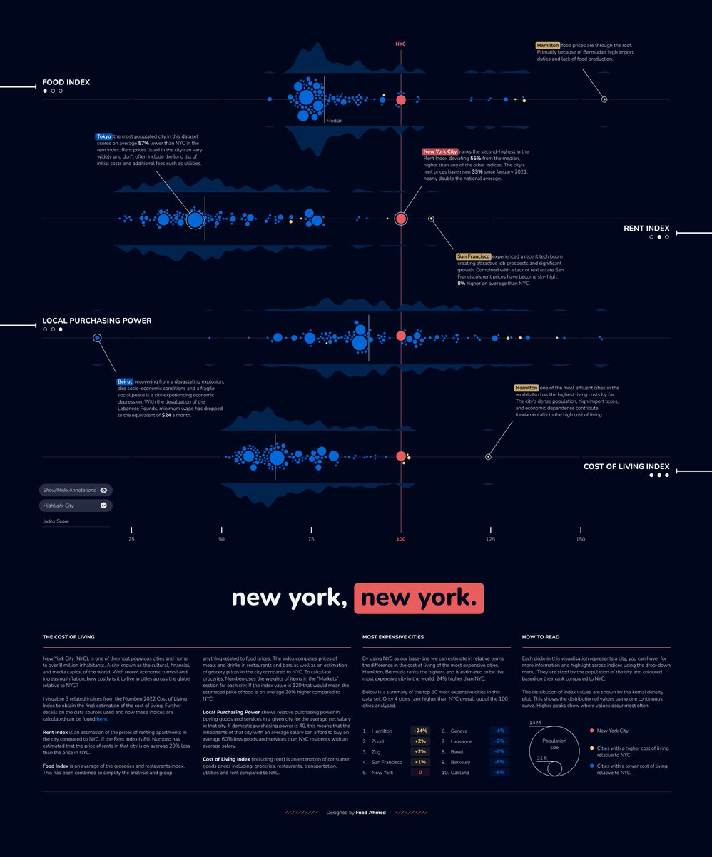
Lovely designed Tableau dashboard about the Cost of Living in NY versus other (world) cities.
The layout, typography, use of colors (accent vs non) are 👌 I also always love beeswarm plots showing each datapoint 🐝
https://t.co/270medr7Vo
#dataviz
via @infobeautyaward