CyberDefend started with one question:
Can a security dashboard feel powerful, clear, and instantly usable?
A real-time globe.
Threats visible before you search.
Severity shown through shape and color.
Less thinking. Faster action.
Security UI doesn’t have to feel sterile.
At stadium scale, networks don’t fail gradually. They drift under pressure.
📡Real-time monitoring
🌐 Live venue awareness
⚡ Signal-focused alerts
🎯 AI-guided decisionsBuilt for live environments.
#UIDesign#UXDesign#AI#DashboardDesign#DataVisualization
We built a single interface that brings it all together:
• live crowd flow
• network load & device spikes
• early warning signals before impact
No switching screens. No digging through dashboards.
Just clarity, exactly when you need it.
#AI#MachineLearning#NetworkMonitoring
In this Stardog AI concept, analysis becomes fluid -
where motion replaces charts, and interaction reveals meaning.
A single interface.
Multiple layers of understanding.
⚡ Designed to be seen, not decoded.
#ConversationalAI#InterfaceDesign#ExperienceDesign#DesignSystems
What if your dashboard could think with you?
AI-driven interfaces turning complex financial data into real-time insight.
Less noise. More meaning. Smarter design.
#AI#DataVisualization#UXDesign
Stardog Voicebox is a conversational AI assistant that transforms complex data into clear, explainable insights.
Users interact naturally while AI generates contextual views with full traceability. The result is faster analysis, easier comparison, and confident decision-making.
With Exwalt, we turned complex traffic data into a clear, actionable story.
🌆Cities never sleep — our motion design reveals their heartbeat through dynamic maps, guiding smarter decisions, less congestion & sustainable planning.
#MotionDesign#SmartCities#DataVisualization
Why do some startups take off while others stall at MVP?
Because design isn’t decoration - it’s the engine.
Real feedback, clear flows & rapid iteration = faster launches, happier users, scalable growth. 💡
How do you prioritize UI/UX in your startup?
https://t.co/m6EzRGjTJB
✨ Crafted by Fuselab Creative, this motion design turns scattered health records into clarity. From fragmentation → unification, data overload → insight: interoperability, precision, and care impact, all built on trust and transparency in digital health.
Smart UX for Smarter Factories
We designed a thinking interface for machines that never sleep.
Every animation. Every flicker. Every micro-interaction.
Built not to impress - but to inform, alert, and guide in real time.
Because in a factory, hesitation costs.
Not just 3D — a live, thinking replica of your system.
Predict. Monitor. Optimize.
💡 Smarter decisions. Fewer risks. Faster results.
Dive into the full story:
👉 Read the article https://t.co/WjNDMcEl3V
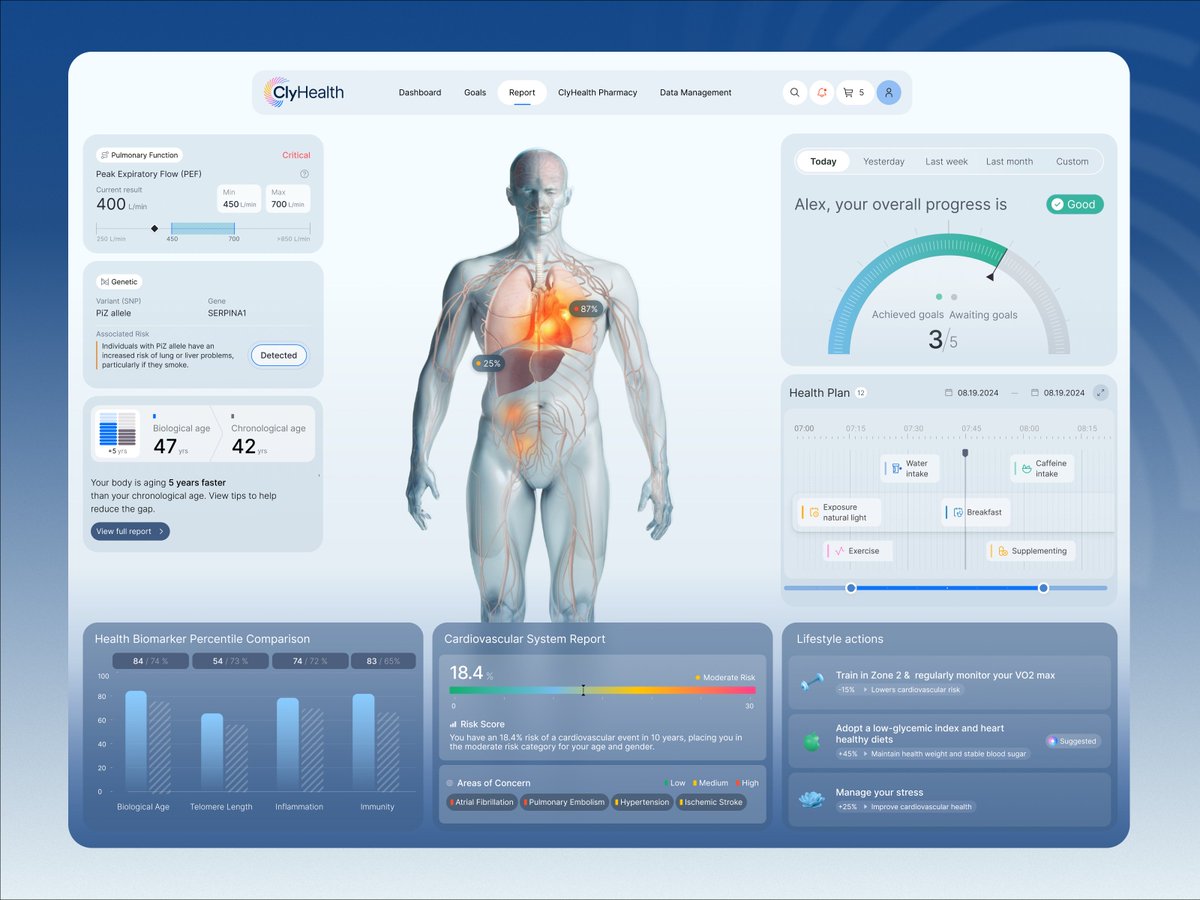
What should a health report look like in 2025?
Not just numbers—a smart, visual, personalized dashboard.
🧬 See your real vs. bio age
❤️ Predict risk
🧠 Get insights + habits that matter
✨ Health that makes sense.
Let’s design that future.
This is not a dashboard in the traditional sense - it’s an operational environment designed to reflect the reality of industrial systems in motion. Built not just for monitoring, but for understanding.
With a 9,900% ROI, UX research is the smartest investment you can make. Skip it, and you’re building on assumptions. Embrace it, and you’re designing for real people, real needs, and real results.
Read the full guide: https://t.co/MJSPC5P7D1