We made the final in the #AI awards!
Absolutely delighted that the team have been recognised for their ongoing brilliance - well done all!
#innovation#transparency#recognition
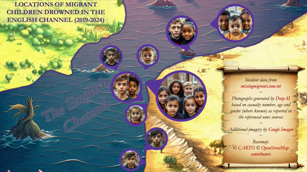
🗺#30daymapchallenge🌎
Day 30: The final map
Wrapping up 2024 with a creation from Christoph - a powerful map that combines an important message and AI. This image speaks volumes, conveying more than words ever could.
🗺#30daymapchallenge🌎
Day 29: Overture
Our Data Team have tagged up #Overture data into different categories to make this fantastic #OpenData more manageable and meaningful.
Lou has picked 4 cities across the world to show the spread of different #POI.
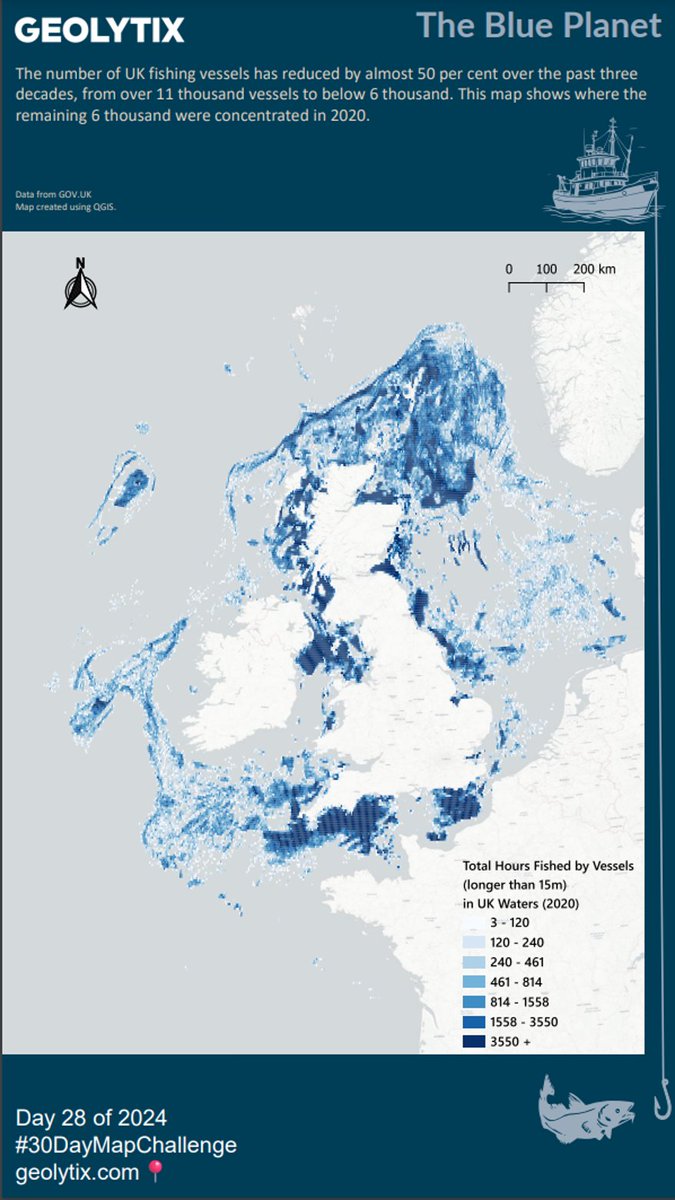
🗺#30daymapchallenge🌎
Day 28: The blue planet
The number of UK fishing vessels has reduced by almost 50% over the past three decades, from over 11,000 vessels to below 6,000. This map shows where the remaining 6,000 were concentrated in 2020.
#Fishing#Vessels#UK
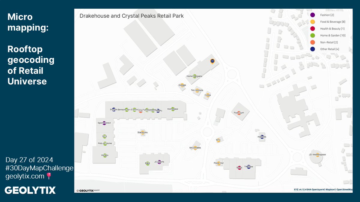
🗺#30daymapchallenge🌎
Day 27: Micromapping
Rooftop geocoding accuracy is foundational for making well-informed, data-driven decisions for #LocationPlanning. It reduces errors, identifies exact competitor locations and ensures accurate demographic and geodata analysis.
#Retail
🗺#30daymapchallenge🌎
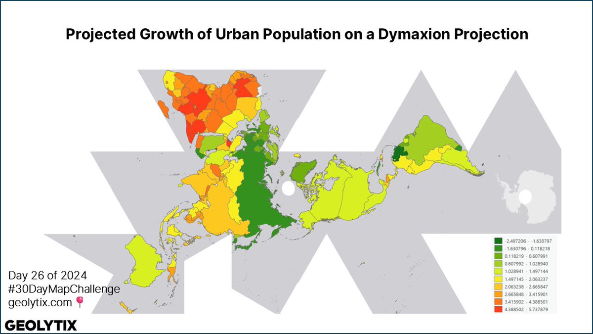
Day 26: Map projections
Blair has used the #WorldBank projected growth or decline in urban population by country on a Dymaxion Projection.
In Blair's words: "You can tell a lot about someone from their favourite map projection."
#Projection#Population
🗺#30daymapchallenge🌎
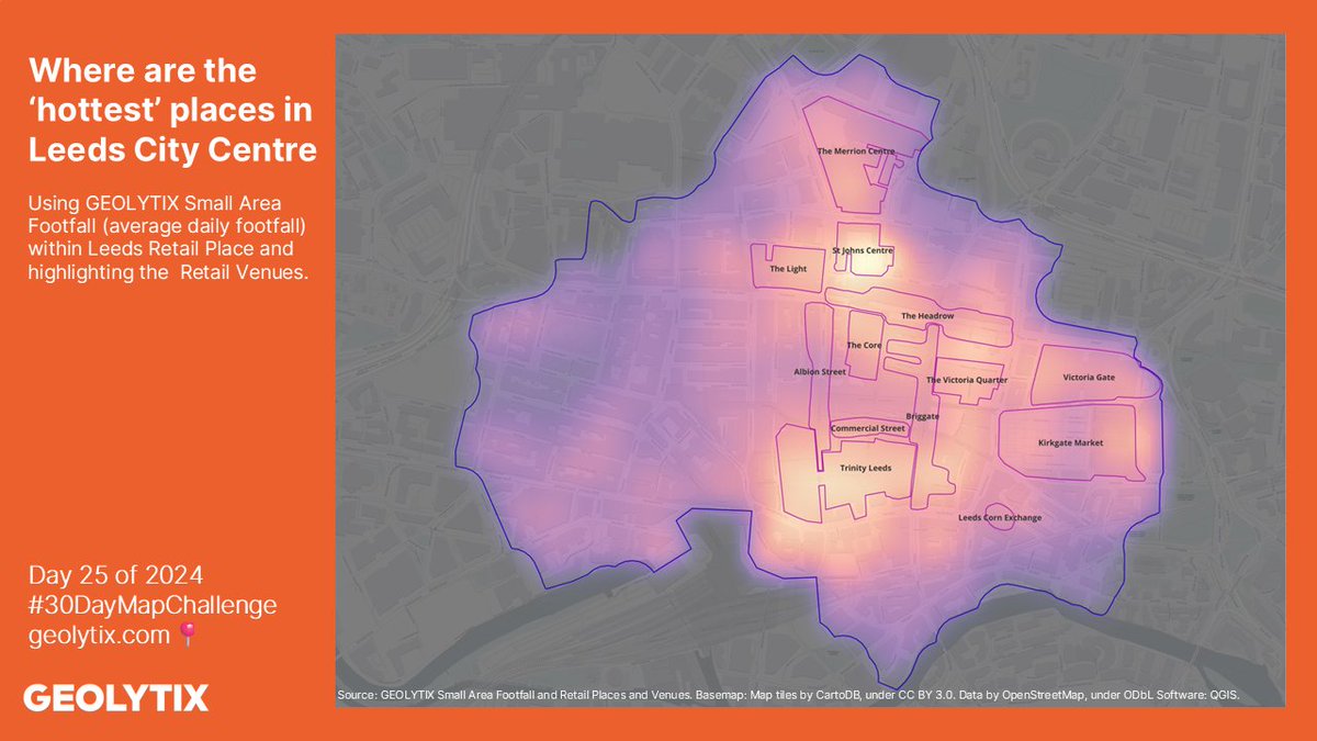
Day 25: Heat
Where are the ‘hottest’ places in Leeds City Centre?
Chloe has used our Small Area Footfall data (average daily footfall) within Leeds Retail Place and highlighted the Retail Venues in the city.
#Footfall#Leeds#Retail
…
Finally calculate the radius from the area and return a circle geometry feature with a similar area on the centre of mass coordinate. https://t.co/T3Zv8T4f2o
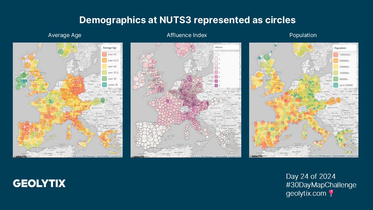
🗺#30daymapchallenge🌎
Day 24: Only circular shapes
Demographic data at NUTS 3 represented as circles:
📌Average age
📌Affluence index
📌Population
Details of process and links in the comments 👇
#Circles#turf
Dennis created a small plugin https://t.co/XJunXiPxQl which uses the turf-js library.
Used turf to calculate the centre of mass of the geometries. https://t.co/zYj5M3JumR
Calculated the geodesic area of the feature geometries. https://t.co/fDsx2ljNdF
…
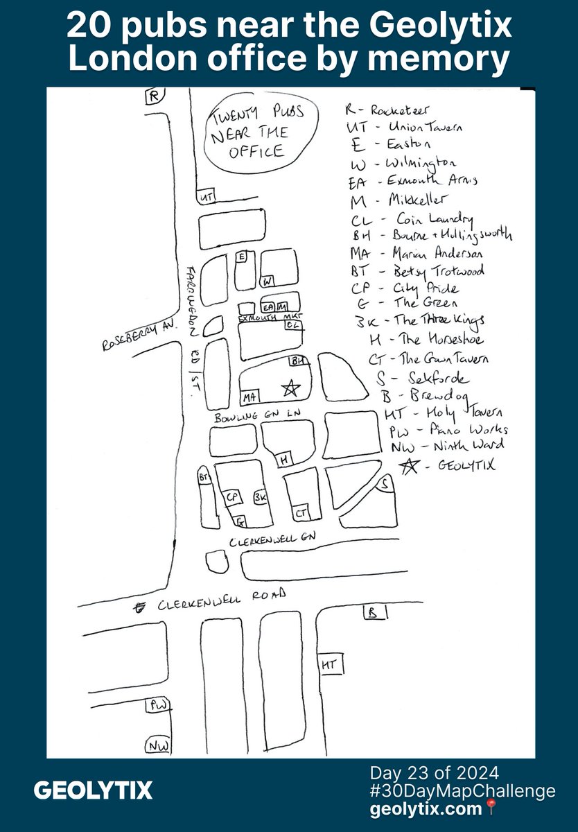
🗺#30daymapchallenge🌎
Day 23: Memory
Hand drawn map of 20 pubs around our London office by Simon's memory.
Plenty of choice!
We are very impressed by how accurate this is, and maybe a little worried 😉
#London#pubs#Office
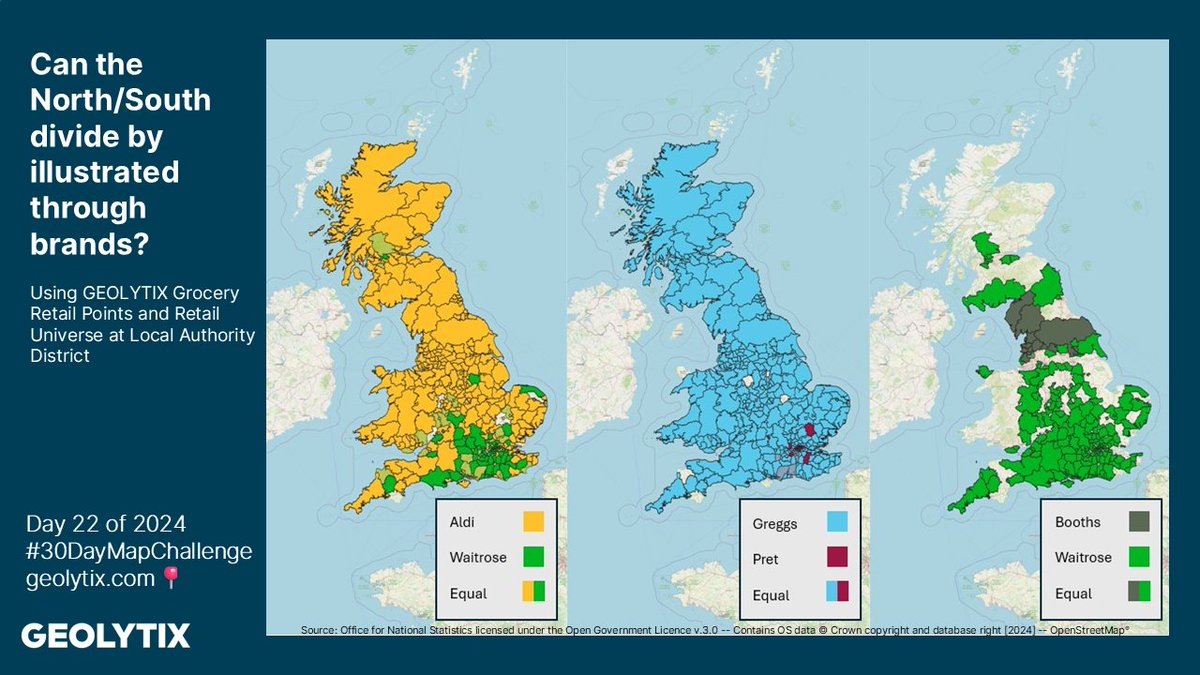
🗺#30daymapchallenge🌎
Day 22: 2 colours
Can the North/South divide be illustrated through brands?
Owen has used number of our Grocery Retail Points and Retail Universe at Local Authority District in Great Britain for todays theme.
#LocationIntelligence#OpenData
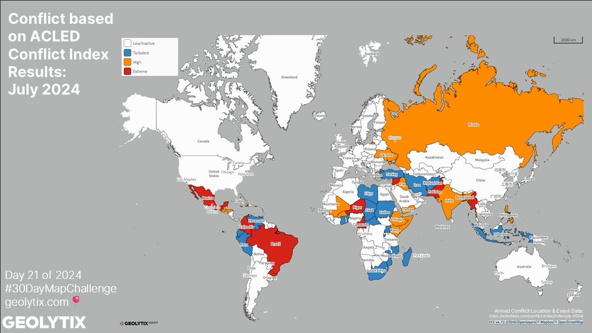
🗺#30daymapchallenge🌎
Day 21: Conflict
Will discovered the global conflict mapping using conflict indexing - a score ranking a nations "deadliness" through its danger to civilians, geographic diffusion, and armed group fragmentation.
#ACLED#Conflict
🗺#30daymapchallenge🌎
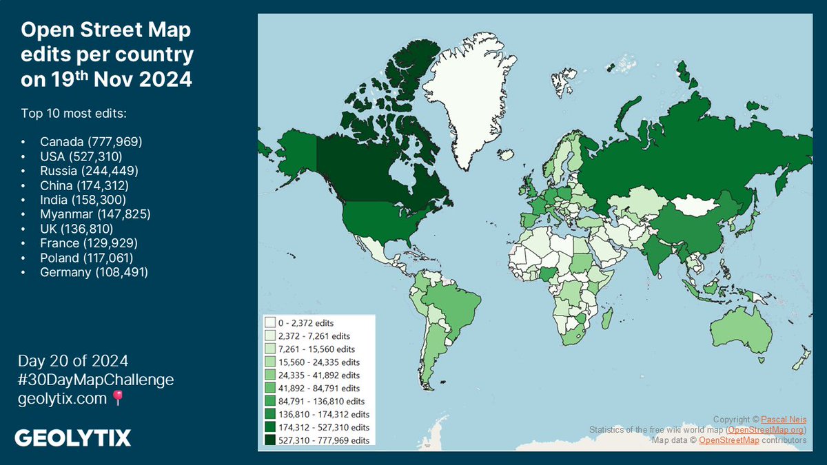
🗓️ Day 20: Data: OpenStreetMap
For todays theme there was too much brilliant data to choose just one topic so Lou has used QGIS to map the number of OSM map changes made by country on Tuesday 19th November 2024. Thank you #OSMstats for the data 📈
#OSM
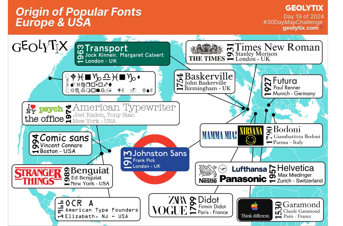
The name listed is the recognised lead typographer, but most font families have had many men and women work on them over time.
The Geolytix wordmark uses the FF Mark font, which was designed in Berlin by Hannes von Döhren and Christoph Koeberlin.
🗺#30daymapchallenge🌎
Day 19: Typography
Josh has plotted the cities in Europe and the USA where some of history's most well known fonts were designed, along with the year and some recognisable uses in recent times!
#Typography#Fonts#Logo