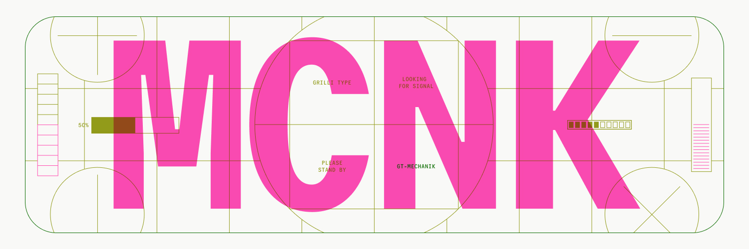
◾GT Mechanik is the message ◾
Built on a monospaced foundation with rhythmic spacing, our newest typeface invites designers to find the tone that suits their message.
◾ Visit → https://t.co/Ik6vnDtKCg
Designed by Noël Leu, Reto Moser, @shiva__n
◻Out Now◻
#GrilliType
GT Walsheim → De Dépendance, a Rotterdam-based platform that brings together diverse audiences to discuss social issues.
Designed by @StudioSpass using GT Walsheim, the bold graphic language communicates these often complex subjects in an engaging format.
#GrilliType
GT Flexa → La Nave School in Buchs, Switzerland. 🐳
The visual identity was designed by Studio A, using GT Flexa for its playful and versatile personality. A perfect fit for the school's ethos: letting kids be who they truly are.
#GrilliType#GTFlexa
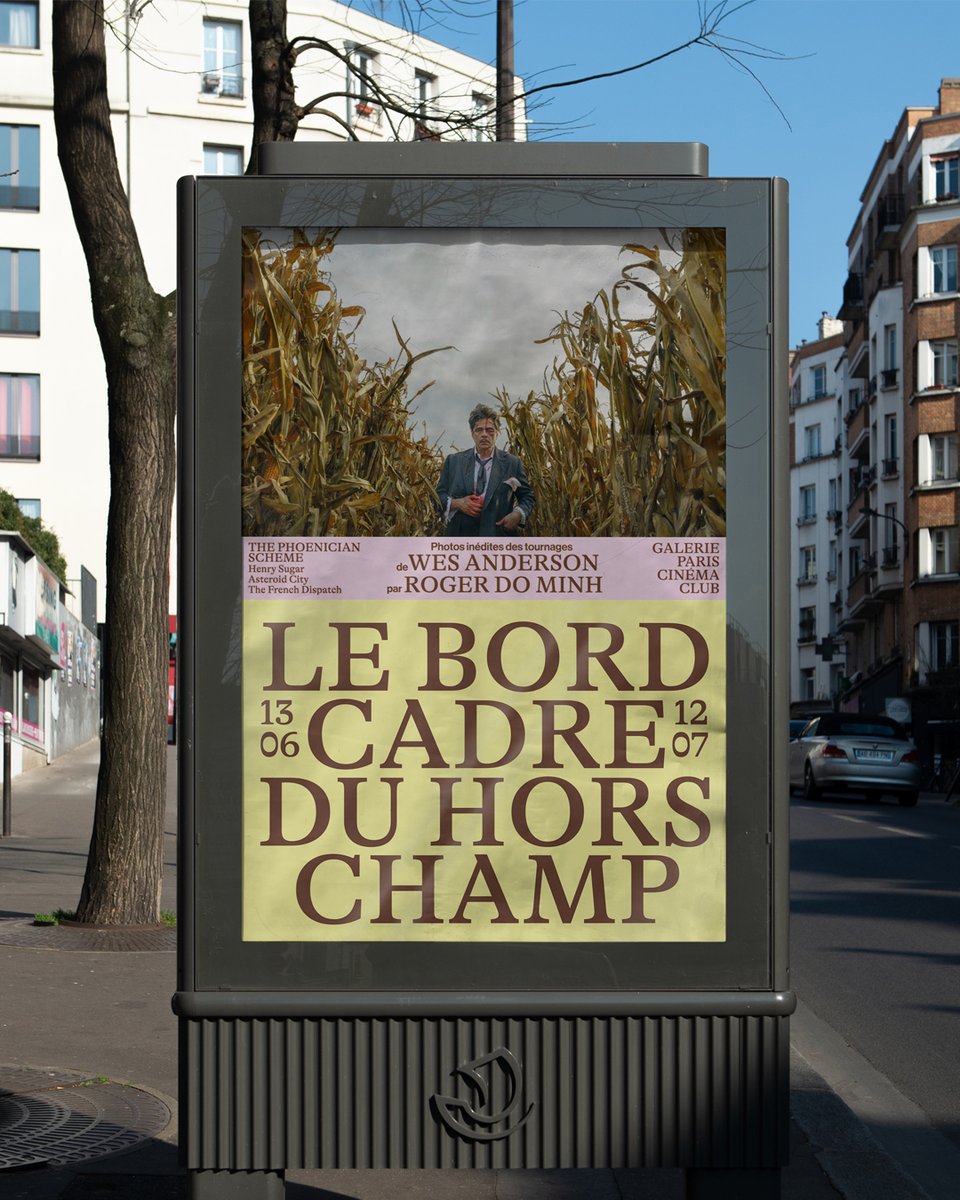
GT Alpina → “Le Bord Cadre du Hors-Champ”, an exhibition featuring Roger Do Minh's photos from Wes Anderson's films.
Silvia Dore designed the visual identity, choosing GT Alpina to lead it for its expressive contrasts, which evoke a cinematic language.
#GrilliType
GT Planar → “La maquette un objet modèle?” An in-depth study of the architectural model as an autonomous work.
Designed by Paris-based studio E+K, with GT Planar as the lead typeface, the book's layout plays with the concept of the model applied to the spread,
#GrilliType
Skip neutrality, embrace high contrast. 💎
With tapered curves and unexpected ink traps, GT Zirkon is a heavy-duty sans serif with exuberant details.
Take a closer look→ https://t.co/c7xgrZ7pD0
#GTZirkon#GrilliType
GT Ultra → Washington Square Park Conservancy
Centered on the iconic arch, the Conservancy received a new identity by @pentagram.
Paired with a series of illustrations capturing the people visiting the park, GT Ultra mirrors the joyous spirit of the visuals.
#GrilliType
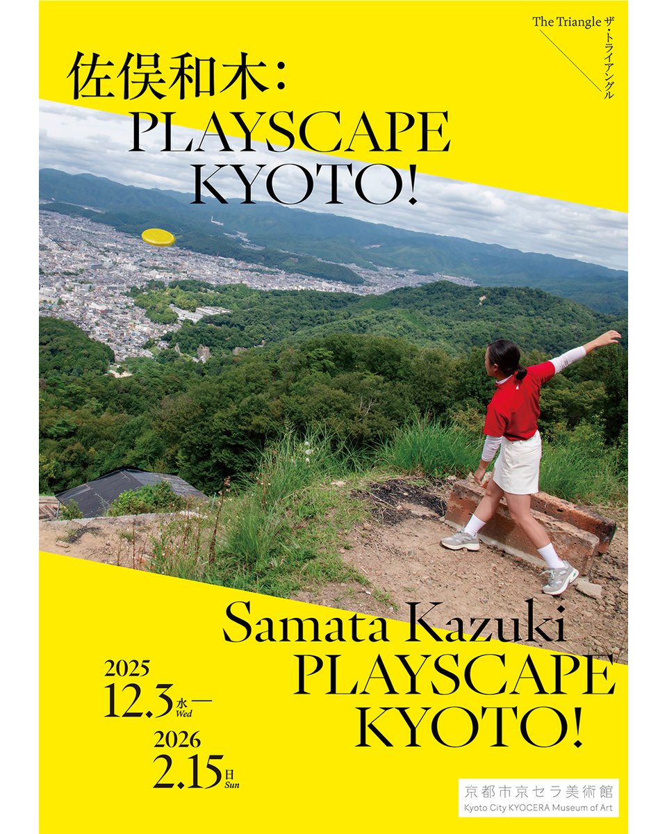
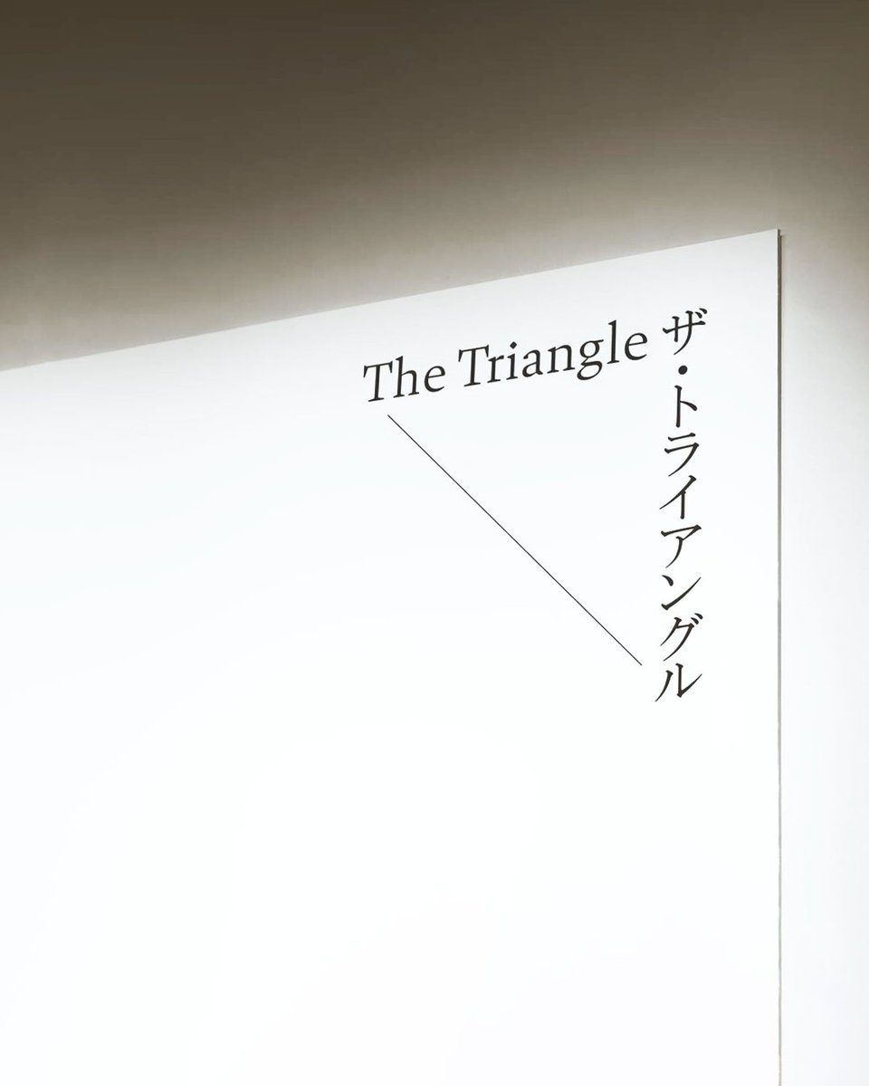
GT Pantheon → The Triangle at Kyoto Museum of Art.
The visual design of the exhibitions is by @otsuki_chihiro. GT Pantheon was chosen for its sharp, refined forms, providing a strong foundation for the work of emerging artists as they develop and move forward.
#GrilliType
GT Planar → Orkest Phion
Using GT Planar, Studio Thonik rebranded the ensemble visuals: they made music the foundation of the identity.
The letters of the typeface bend like a conductor's baton directing the musicians.
#GTPlanar#GrilliType
GT Standard → Jardin Botanique de Genève, Europe's oldest living collection.
Designed by Base Design Geneva, the new identity is rooted in precision and growth. Rigorous but warm, GT Standard was chosen as the anchor typeface.
#GTStandard#GrilliType
Círculo de Poemas is a poetry book club with a visual identity built around GT Flexa and GT Alpina.
Designed by Brazil-based studio Alles Blau, the covers follow a fixed typographic and compositional system, with a new color each year.
#GTFlexa#GTAlpina#GrilliType
Pulling from analog signals, buttons, radio waves, and lots of screenshots, we put together this universe where designers can find the tone that fits their message.
◾ Don’t miss it. Visit → https://t.co/Ik6vnDtKCg
MONO → SEMI → POLY = GT Mechanilk
Each style carries modular character mechanics into contemporary type.
Venture into the minisite and test it out
→ https://t.co/Ik6vnDtKCg
#grillitype#gtmechanik