Retros by Rustam Gabbasov is a natural fit for beauty, lifestyle, and luxury brand identities, blending the softness of broad-nib brush calligraphy with the strength and precision of chiseled stone carving in its elegant curves.
👉 License Retros at https://t.co/gGi8rtPeTJ
Marat by Ludwig Übele began as a sans serif and gradually morphed into lively serif forms. Moderate contrast and strong serifs give the lighter weights a typewriter-like slab quality, while the underlying structure follows contemporary Antiqua proportions. Alternating angular and rounded corners keep it soft and friendly, and tense curves complement the roman cuts.
👉 License Marat at https://t.co/kg1AxxUyxB
Spooky season calls for blackletter, but Schmaltzy by Matthijs Herzberg works well beyond Halloween. It's about as relaxed as a blackletter gets, with no sharp edges, only smooth curves flowing into one another, and a distinct personality that can anchor a brand identity. 👉 License Schmaltzy at https://t.co/kg1AxxUyxB
Nickel Gothic by DJR in use for Waterford Walls Daily Bulletin. Waterford Walls is an international street art festival that brings more than fifty artists from around the world to Waterford each August for ten days of painting, music, and events.
👉 License Nickel Gothic at https://t.co/kg1AxxUyxB
Our second Meet the Network episode features Valentina Casali, a type designer, junior engineer, and project manager at CAST Foundry, a cooperative based in Bolzano, Italy.
Watch the full video at https://t.co/XzNCF4NLRL
Looking for fonts that make some noise? Comicraft’s typefaces are made to be heard, from a quick ZAP to a full KA-BOOM. Here are a few of our favorite sound effects, each set in a different Comicraft font.
💥 Get these Comicraft fonts at https://t.co/gGi8rtPeTJ
Violeta by Quintana-Font in use for the book Hotel Love by Petra Piuk
Vienna-based Sellerie Studio designed the book, developing a series of lipstick lettering along with the layout and typesetting. The typesetting pairs MT Baskerville for the main text with Violeta for titles and highlights, and Input Mono Compressed for the ISBN and the book’s sections.
👉 License Violeta at https://t.co/kg1AxxUyxB
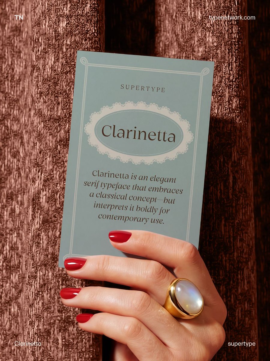
Want an elegant serif with a modern edge? Clarinetta, designed by Jürgen Huber, pairs deliberately pronounced serifs with striking contrast, bringing fresh energy to time-honored typographic principles. 👉 License Clarinetta at https://t.co/gGi8rtPeTJ
Good menu type does what a good host does: It makes a stranger feel like they already belong at the table. Here are five faces for the menu, the packaging, and everything in between, from bistro serifs to chalkboard scripts.
https://t.co/ZTnJVYz9vz
Late Serif by Henning Skibbe is a silky, contemporary text typeface. The typeface family supports 210 languages through its Latin, Greek and Cyrillic scripts. 👉 License Late Serif at https://t.co/gGi8rtPeTJ
Pieter van Rosmalen's Oigle offers a fresh perspective on Cake Sans, flipping its structure into a reverse-contrast typeface. It comes in one style and supports Latin Extended, including Vietnamese, and Cyrillic.
👉 License Oigle at https://t.co/gGi8rtPeTJ
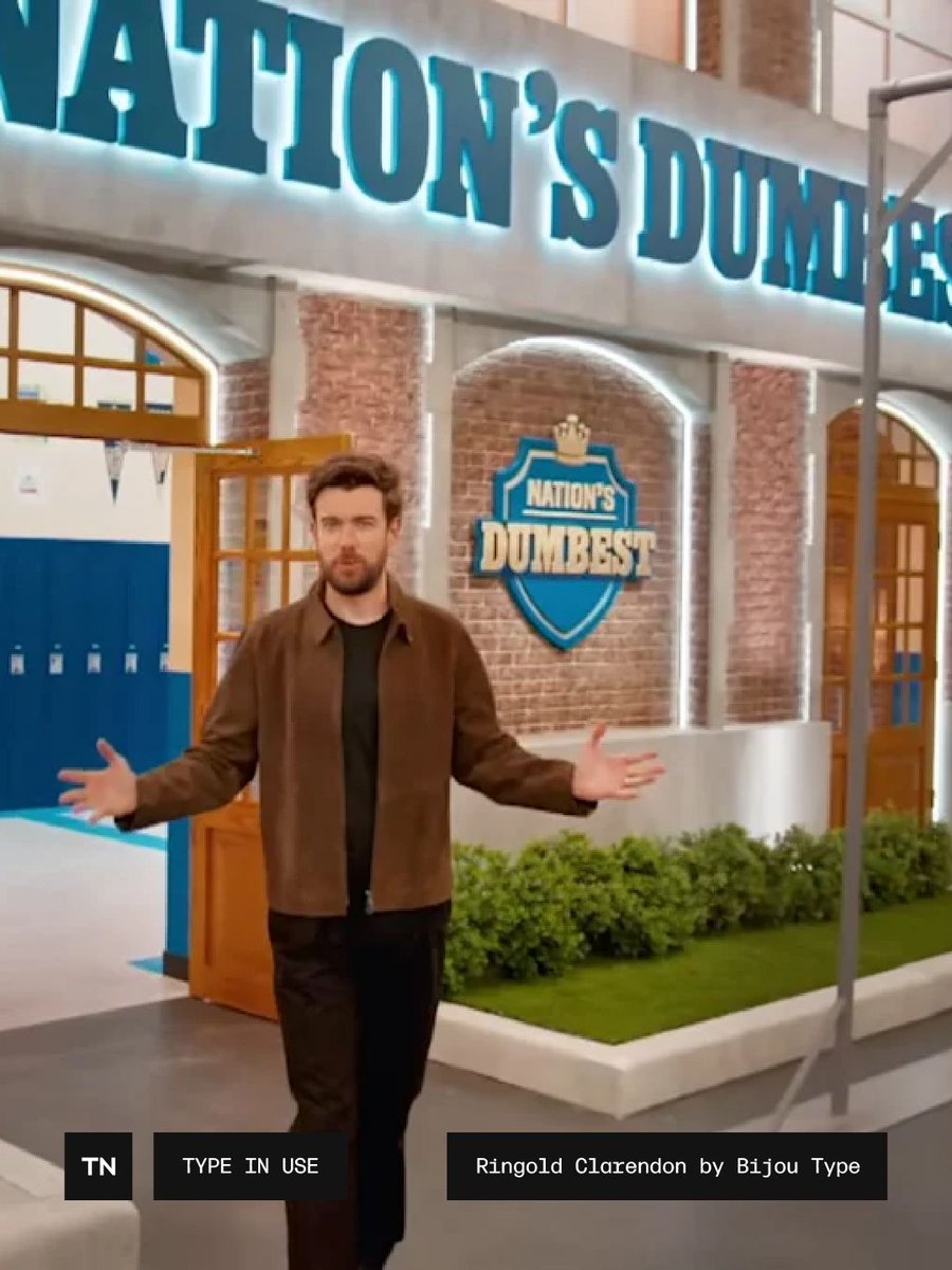
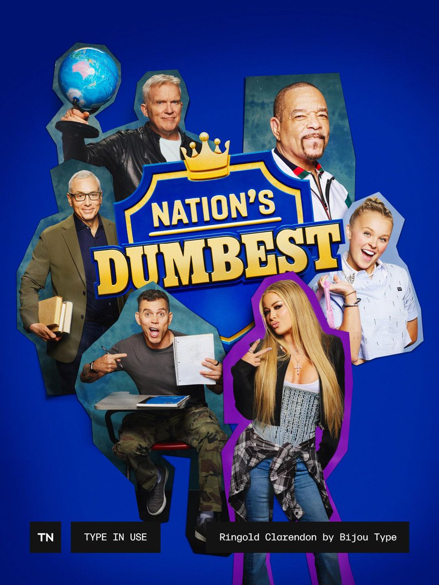
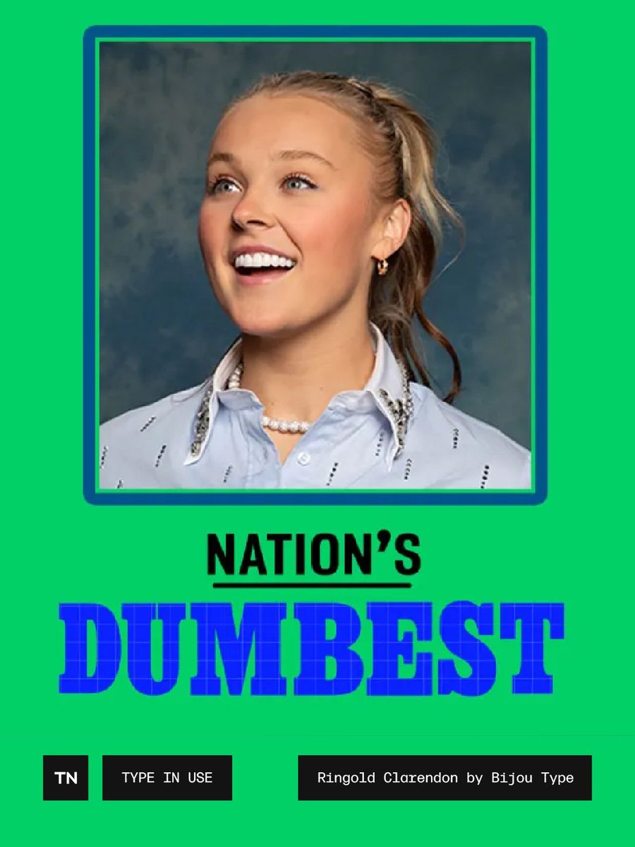
Ringold Clarendon by Bijou Type in use in Nation’s Dumbest – Nation’s Dumbest follows celebrities competing in school-themed challenges, where the goal isn’t to win but to avoid coming in last.
👉 License Ringold Clarendon at https://t.co/gGi8rtPeTJ
Dyana Weissman is typically not a fan of sans serif typefaces, but on a trip to Norway, she was inspired by the labels on antique medicine bottles she saw on display in a museum. The robust personality of the letters convinced her to give sans serif a try. 👉 License Apotek at https://t.co/kg1AxxUyxB
Sudz by Jamie Chang is a graffiti and bubble-letter inspired color font, built from winding, looping strokes that create a dynamic and hypnotic texture. Made for display use, it's best suited for brand identities, merch design, and packaging.
👉 License Sudz at https://t.co/kg1AxxUyxB
Borax is an ode to the typography scene of New York City and Chicago in the late 1970s, when ad agencies and typesetters used cameras, geometry sets, and drafting boards to model an ideal life of consumption, printing it all into a sleek culture everyone thought would last forever.
Borax revives that tension between restraint and personality, and the quirkiness that comes with it.
👉 License Borax at https://t.co/kg1AxxUyxB
Looking for an interesting script typeface? 🖋️ Sedgwick, designed by Troy Leinster, is a mannered, upright, unconnected script, with a touch of ’tude. License Sedgwick at https://t.co/gGi8rtPeTJ
The season begins, and it’s time to send out the premiere invites. Here are six scripts, six different ways to make an entrance. Some are polished and formal, others are playful and a little unexpected, but all have plenty of personality. Together, they make a case for letting your type do a little of the talking.
https://t.co/wFi4ubkoHk
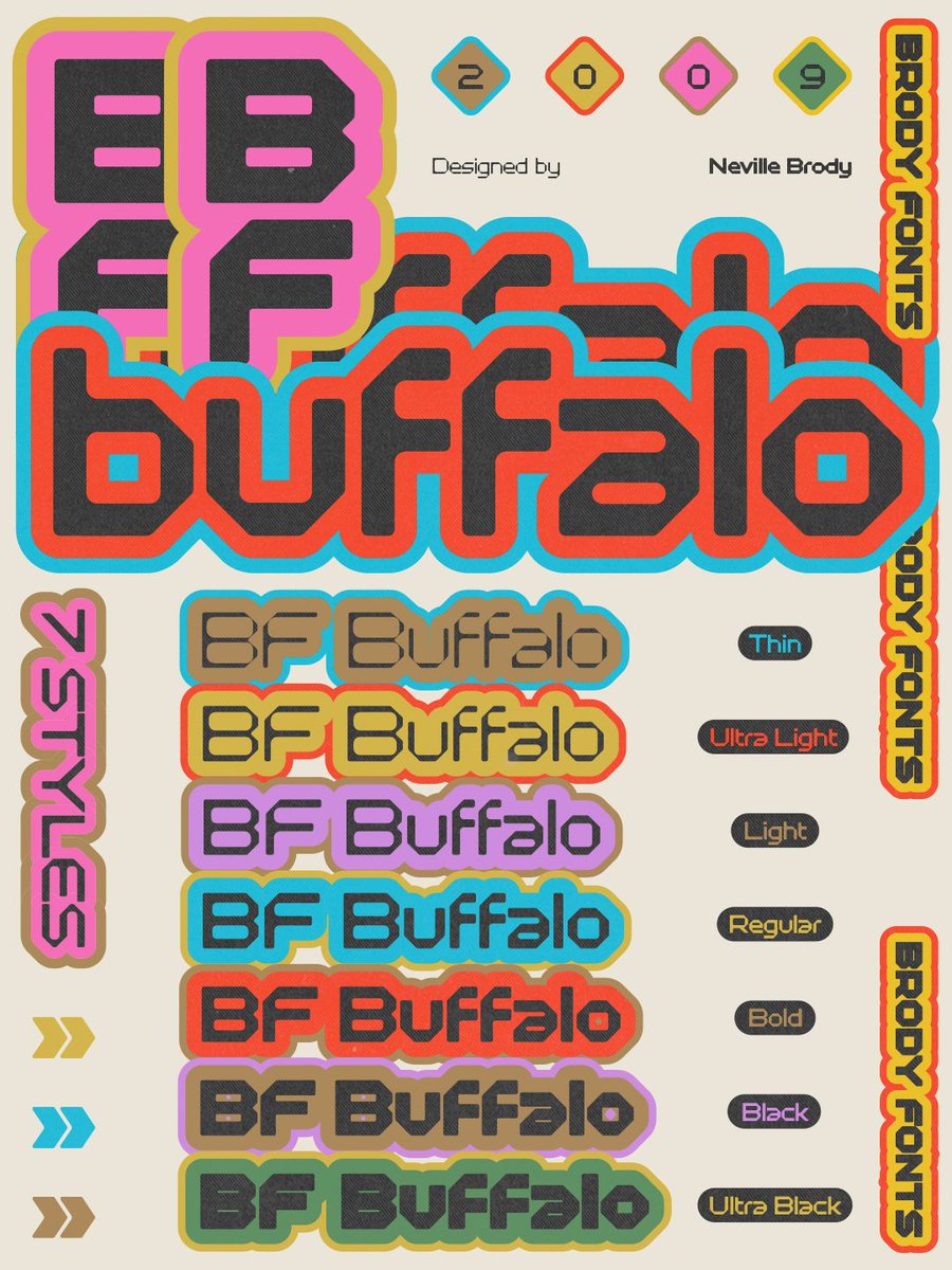
For posters that want to make some noise: BF Buffalo pits faceted outer contours against taut inner curves that turn into angular corners as the weight increases. 👉 License BF Buffalo at https://t.co/gGi8rtPeTJ
Fall issues are cast long before they hit the newsstand, and there is no better time to audition your typographic masthead. We're recommending five typefaces with real newsroom pedigree, each matched to the publication it was born to run. Read it here: https://t.co/sDZ9d4iRxi
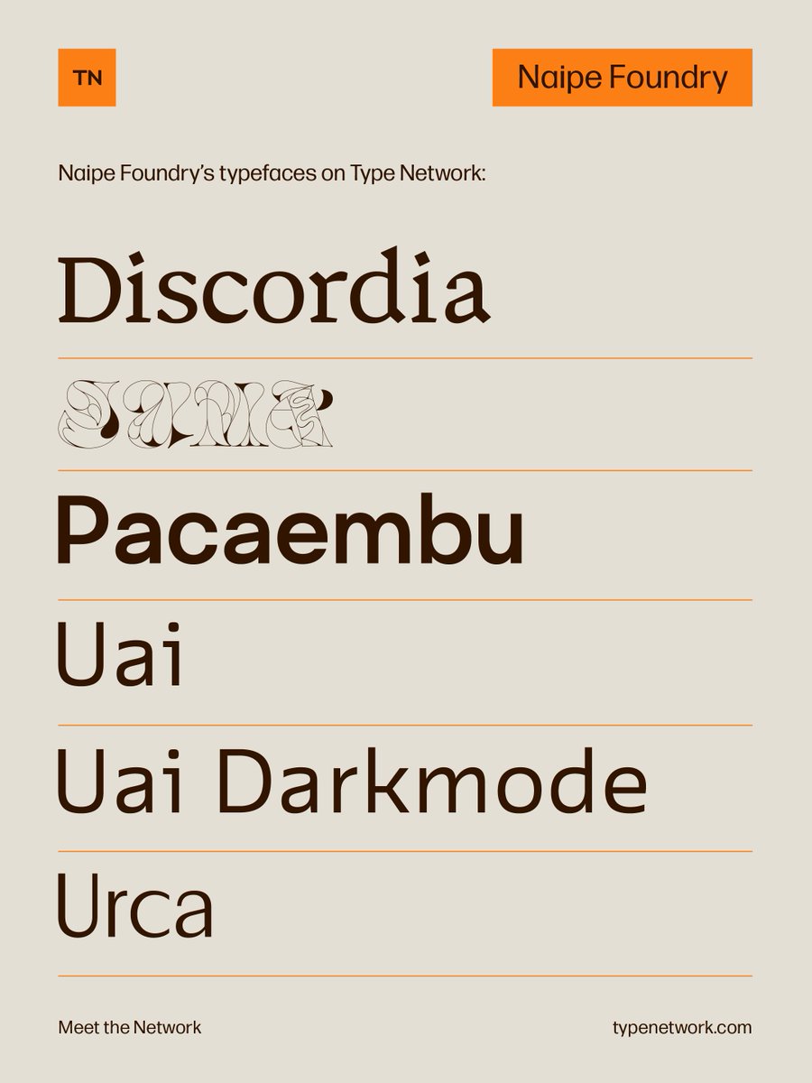
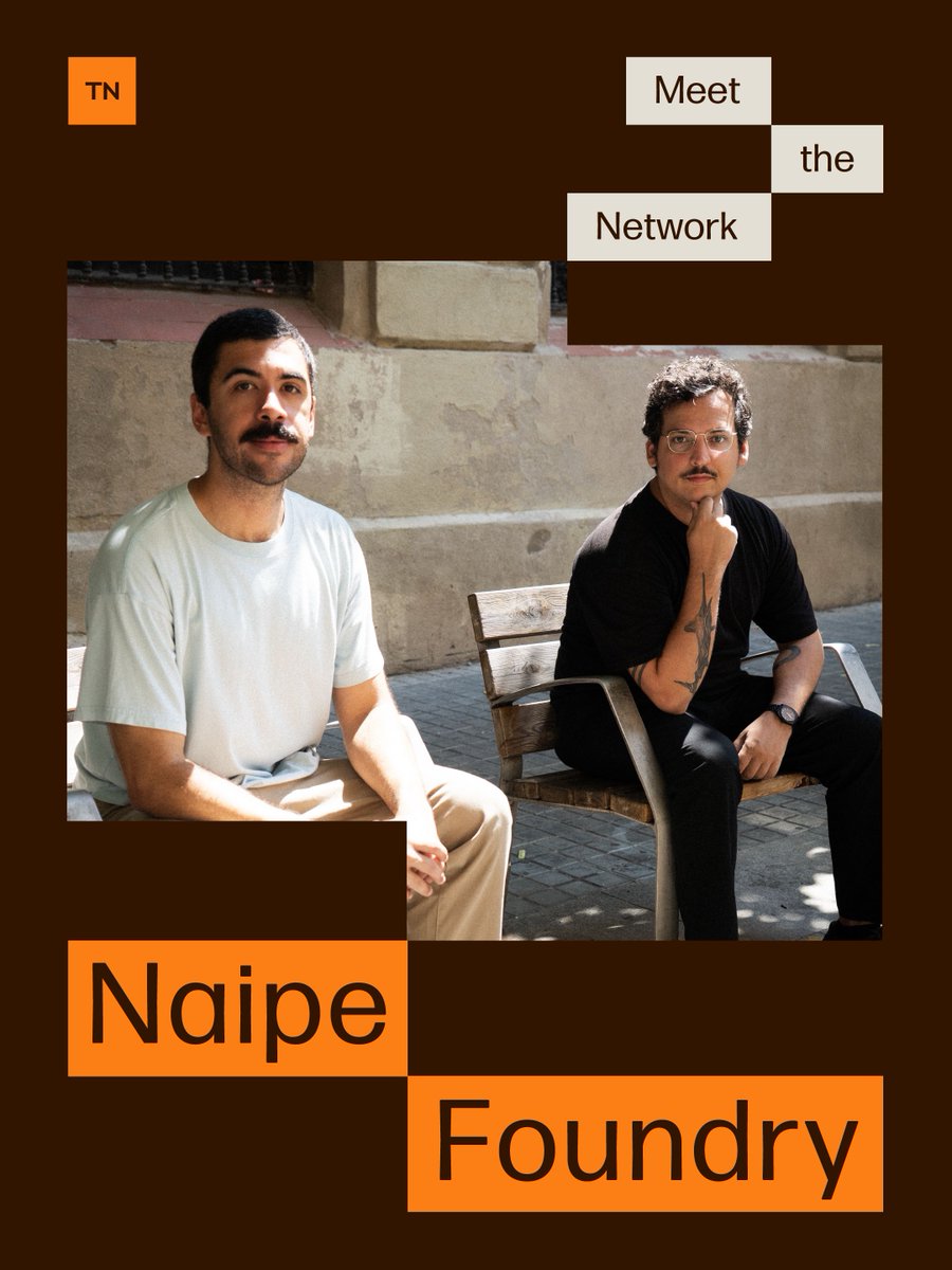
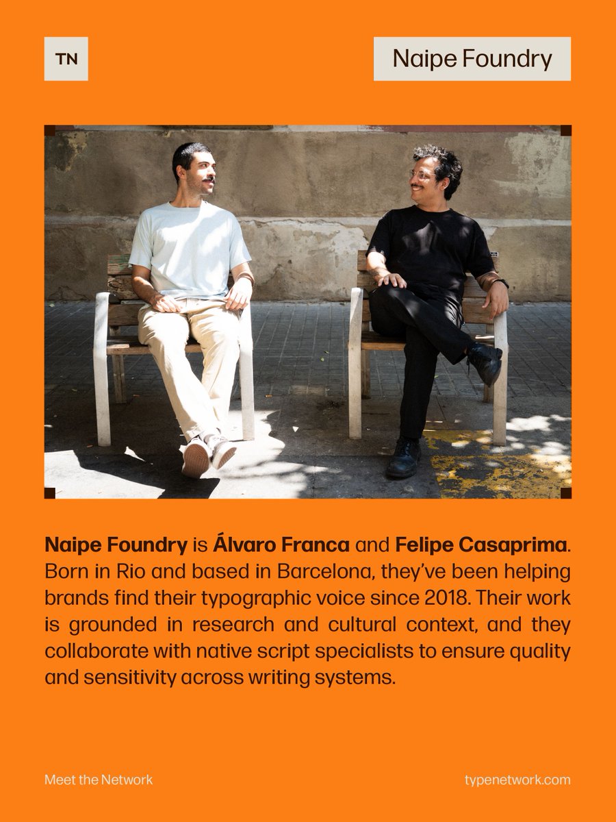
Meet Naipe Foundry, a duo from Rio de Janeiro and now based in Barcelona, who have been helping brands find their typographic voice since 2018.
Watch their Meet the Network episode, where they talk about how they navigate being both business and design partners, share a recent favorite project, and let us in on what they get up to when they’re not designing type. Catch it in our Instagram Reels: https://t.co/w4Lrwytfie