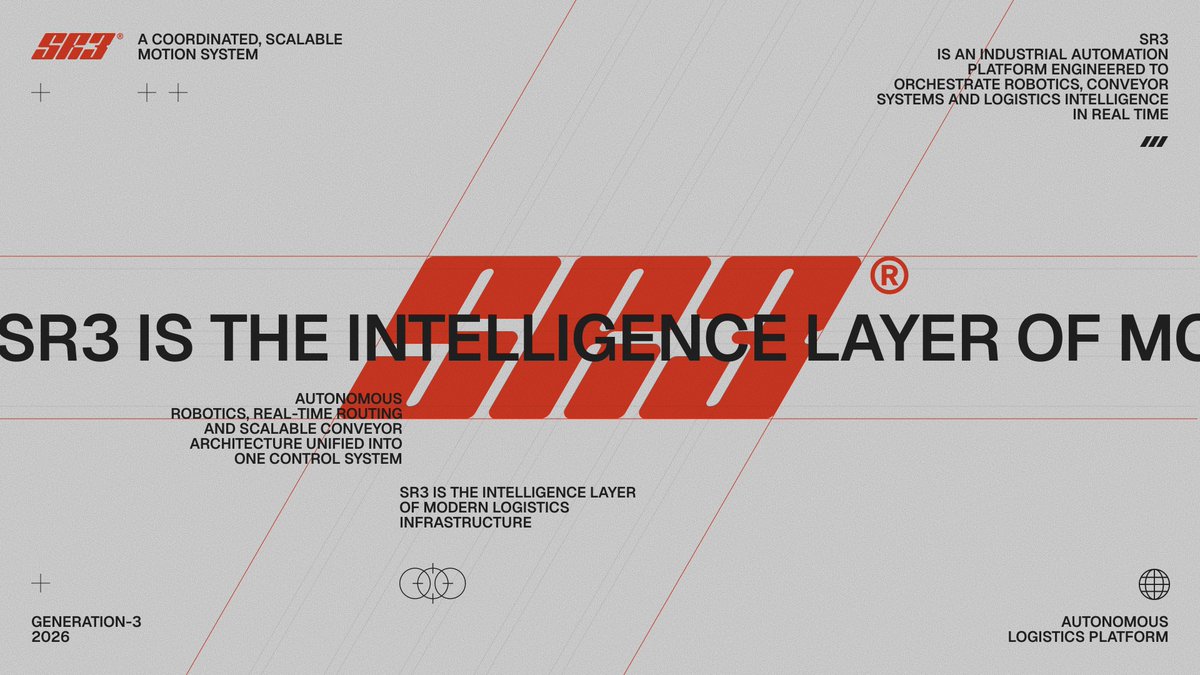
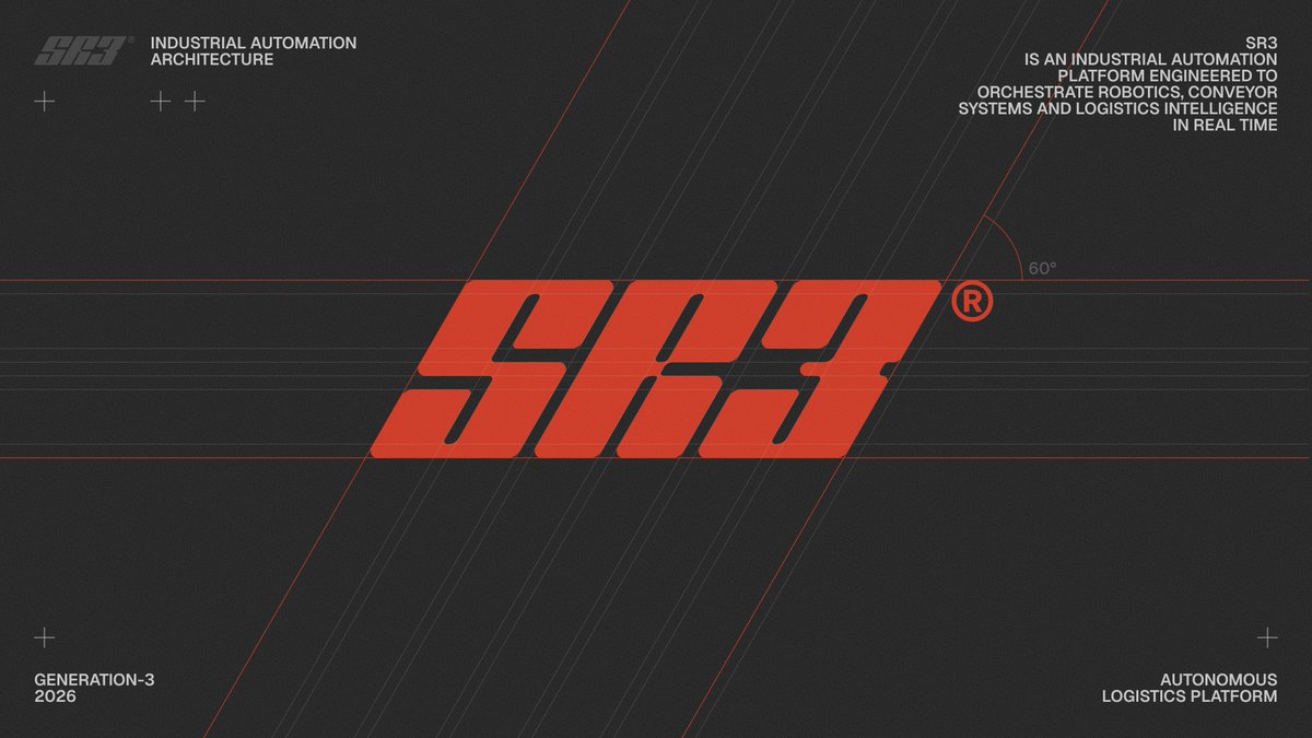
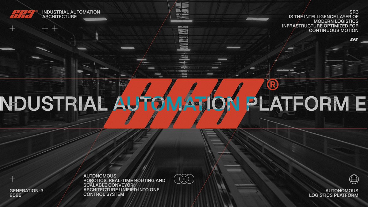
Exploring new branding and visual system for an AI-powered autonomous logistics and robotics platform. Looks bold and fast. I’m genuinely obsessed with this direction.
I dove deeper into the design and animations for the landing page of an experimental project for an AI investing assistant. It has already turned into a full fledged project with an interesting structure and style.
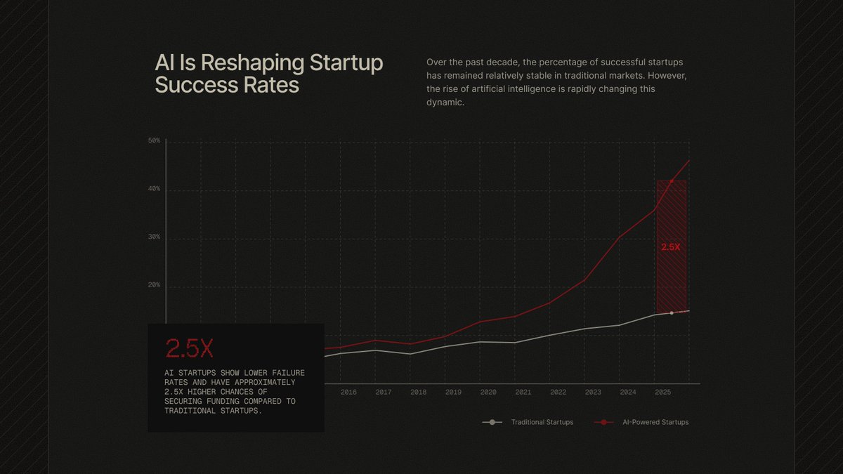
@AlbertLath14811 asked me if it was possible to create a technical document in the same style and sent over his file. So, I put together a structure from the elements and adapted it into the desired style. If he manages to automate the generation of these structures programmatically, it would be a cool experiment and a really interesting approach to boring documents.
I get a lot of enjoyment from working on this kind of animation, exploring solutions and figuring out the logic behind it. It’s fun and interesting, and the results turn out great.
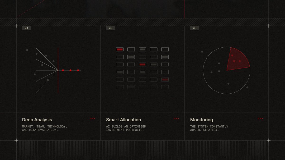
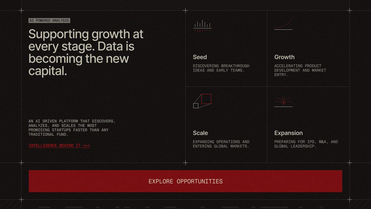
Continuing the experiments and applying the style to web design for AI investing tools. Here are a few screens from the landing page. It turned into a quite solid and really nice structure.
I decided to bring these screens to life a bit and added some animations for the presentation, with the idea of later turning it into a small showreel. In motion it looks quite interesting.
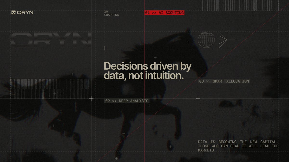
I dove into a new style exploration for branding an AI investing assistant. I combined machine like typography with engineering drawing elements and used a more restrained color palette with a subtle touch of spice.
Sharing static screens for the second related direction as well, so it’s easier to take a closer look. This structure and color combination also grew on me. It feels more dynamic, and I think it turned out well.
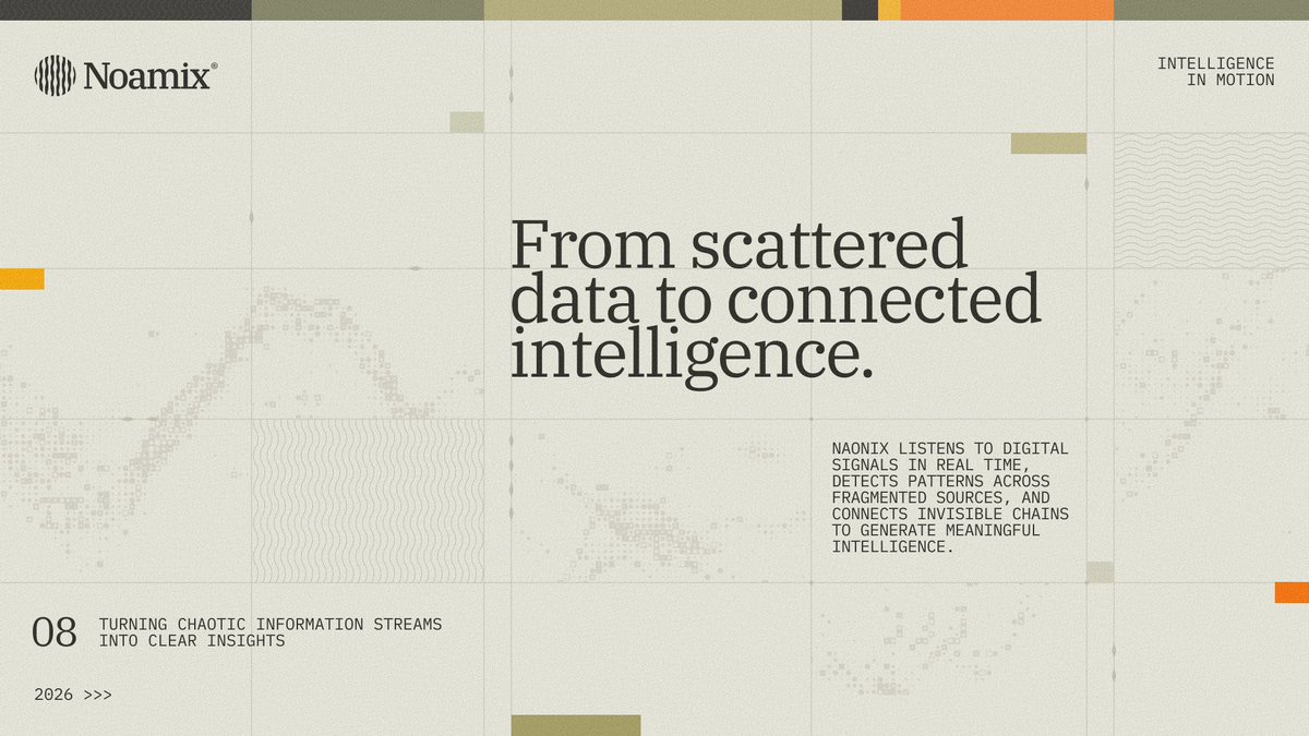
Continuing the theme, I’m sharing some static layouts without motion so they’re easier to explore. Everything is quite simple and refined: typography, color shifts to highlight section transitions, and a touch of digital texture. Overall, the experiment turned out pretty nice.
So this is how the mobile version could look with this structure. Slightly simplified, but it works without any loss and keeps the same style and dynamics.
When I was working on this website concept, I explored several directions. I also experimented with the structure, added constraints to the working area, and introduced extra interactivity. The second direction turned out quite successful as well. How do you feel about this structure?
Continuing to explore and experiment with a new style. I quickly put together a few landing page sections to see how this direction could work on the web, trying out new colors and structures. It’s turning out quite interesting.
Continuing the exploration. Pushing the same system further, refining structure and visual language. This is another screen that emerged naturally during the process.
Exploring a new visual language. Type driven systems with industrial logic and raw structure. Typography, color, and a controlled layer of visual noise for atmosphere.
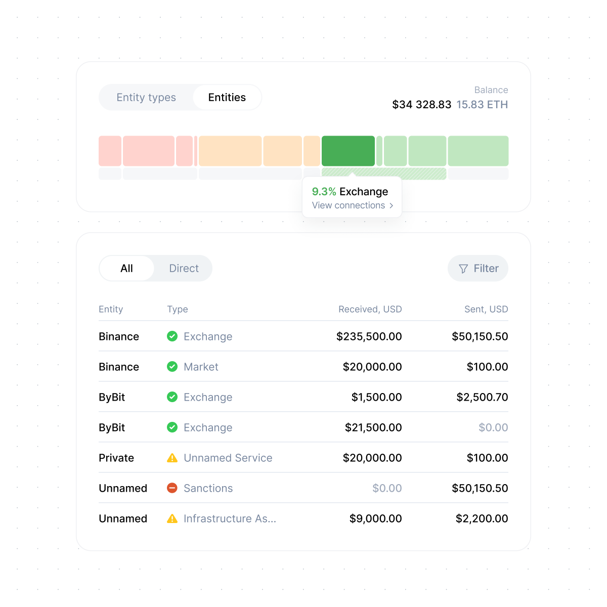
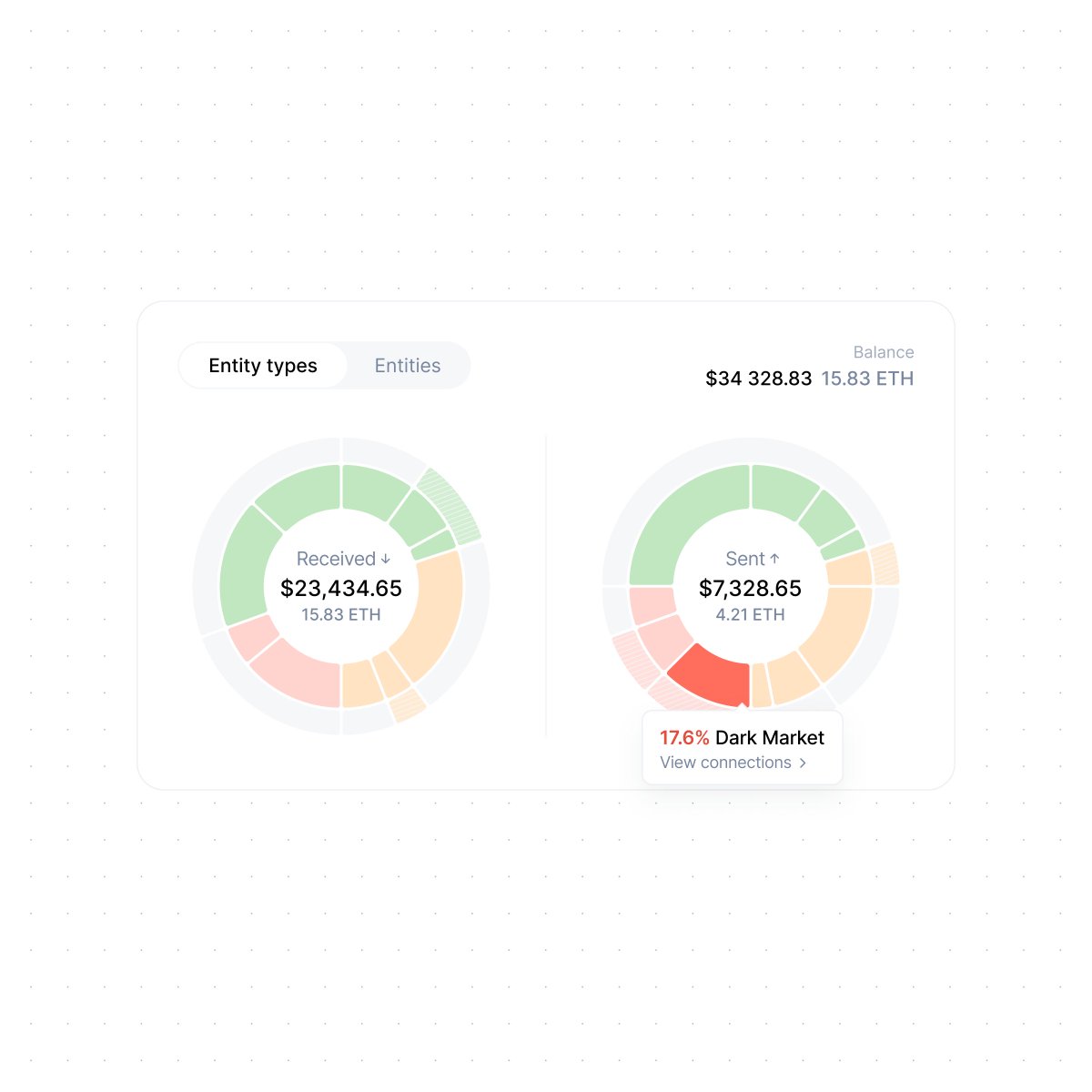
A few details from widget screens embedded into partner services for risk checks. The widget provides functionality similar to the user dashboard but in a more limited form, allowing partners to offer risk checks for addresses and transactions to their customers in just a few clicks.
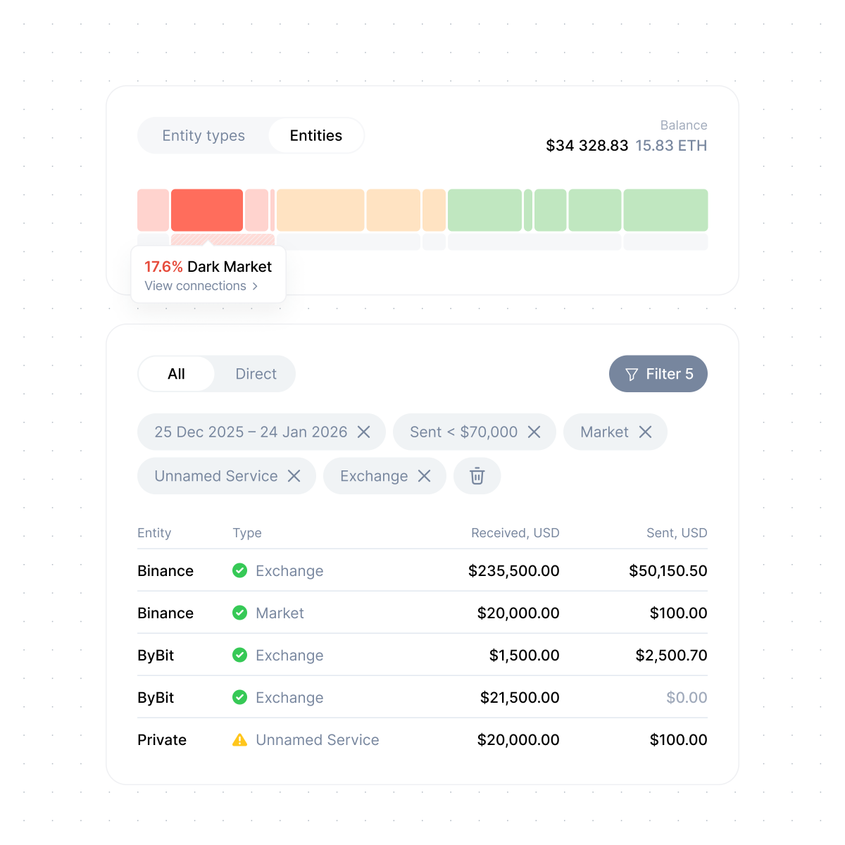
A bit more detail with entities and filters. Even with a relatively small amount of additional data and the same restrained minimalist style, the interface quickly grows in information density that already needs to be explored and analyzed by the user.