Margaret Calvert diseñó la #tipografía y la #señalética de las señales de tráfico para el ferrocarril británico, autopistas, aeropuertos, vías y tipografías entre las que destacan Calvert Brody, Transport o Railway @pilarmlazaro https://t.co/KCUfAw2W4m vía @graffica_info
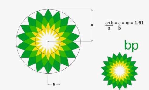
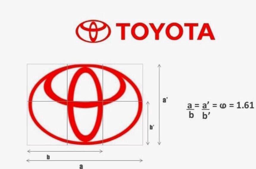
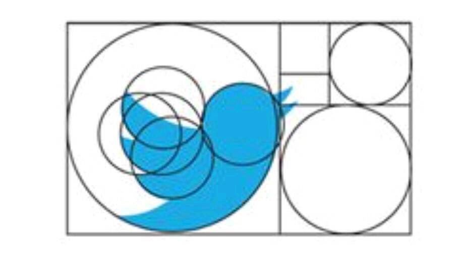
I find it fascinating to see how much the golden ratio is used in well known logo designs... I’m certainly going to start doing a second version of any design applying the ratio for comparison...
NEW WORK: Today the @guardian relaunches as a tabloid and unveils a redesigned website & apps. @reppiRmiT reworked Guardian Egyptian Headline for the redesign: higher contrast, more compact proportions, some rethought details, and a softer italic.