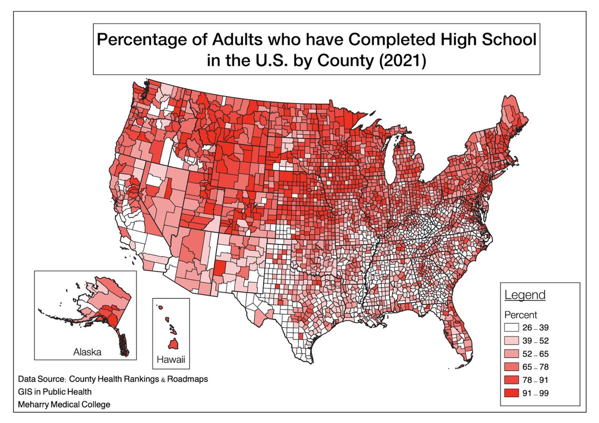
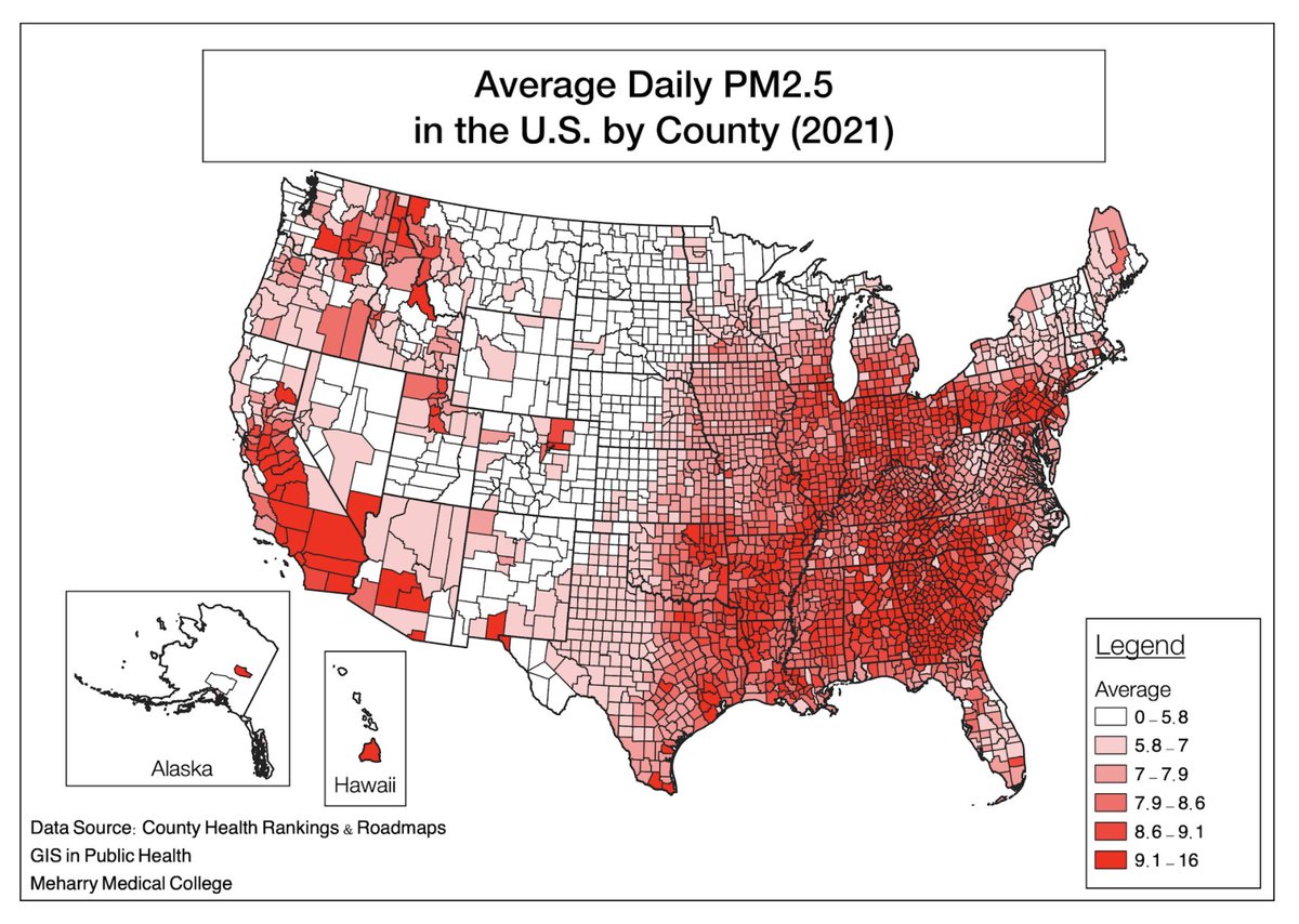
As the semester comes to a close, some students are utilizing QGIS to create visualizations of statistical data for their final Integrated Learning Experience Projects. #GIS#Publichealth#mapping#MPH
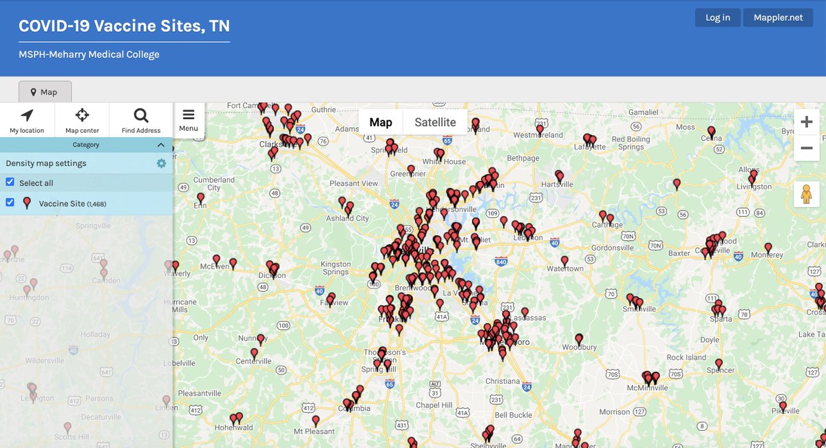
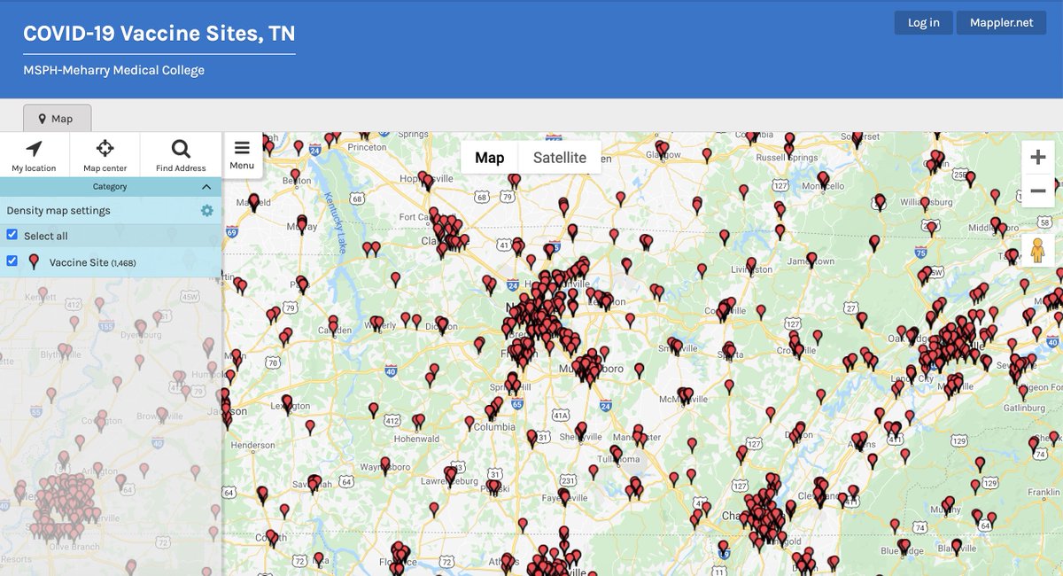
Knowing the location of COVID-19 Vaccination Sites are vital for increased vaccination rates! MSPH Students create an interactive COVID-19 Vaccination Sites map to help the public find places to go. https://t.co/jGI64qCSDE #MSPH#Meharry#COVID19#publichealth#VaccinEquity
Knowing the location of COVID-19 Vaccination Sites are vital for increased vaccination rates! MSPH Students create an interactive COVID-19 Vaccination Sites map to help the public find places to go. https://t.co/jGI64qCSDE #MSPH#Meharry#COVID19#publichealth#VaccinEquity
Students were able to create a map showing percents of adults who have completed high school. Education has been deemed one of the most significant social determinants of health that influences health over the course of a lifetime. #publichealth#GIS#Meharry#QGIS
Students at Meharry were able to create a map showing percents of adults who have completed high school. Education has been deemed one of the most significant social determinants of health that influences health over the course of a lifetime.#publichealth#GIS#QGIS@gis_meharry
Follow @gis_meharry to see maps made by students in the Division of Public Health at Meharry Medical College. These maps depict relevant health-related statistics for the U.S.
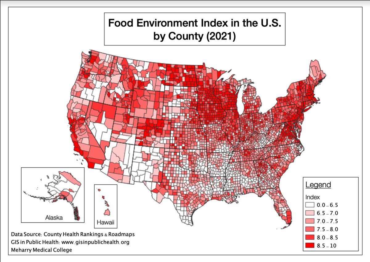
Do you know what the Food Environment Index is? Students made depicted the FEI by county in the US using #QGIS with data from County Health Rankings and Roadmaps (2021). Definition from DC Health Matters. #GIS#Publichealth#Health
Compare and contrast the COVID-19 Hotspots in the U.S. (The New York Times, 2022) to the Percent of Poor or Fair Health in the U.S. (County Health Rankings and Roadmaps, 2021)
#GISatmeharry@wansoo@MeharryMPH@HealthGIS#nytimes
Obesity is a medical problem that increases risk of disease and complication. The Division of Public Health GIS team created a map showing the Percent of Adults with Obesity in the US (County Health Ranking and Roadmaps, 2021) #Publichealth#GIS@MeharryMPH
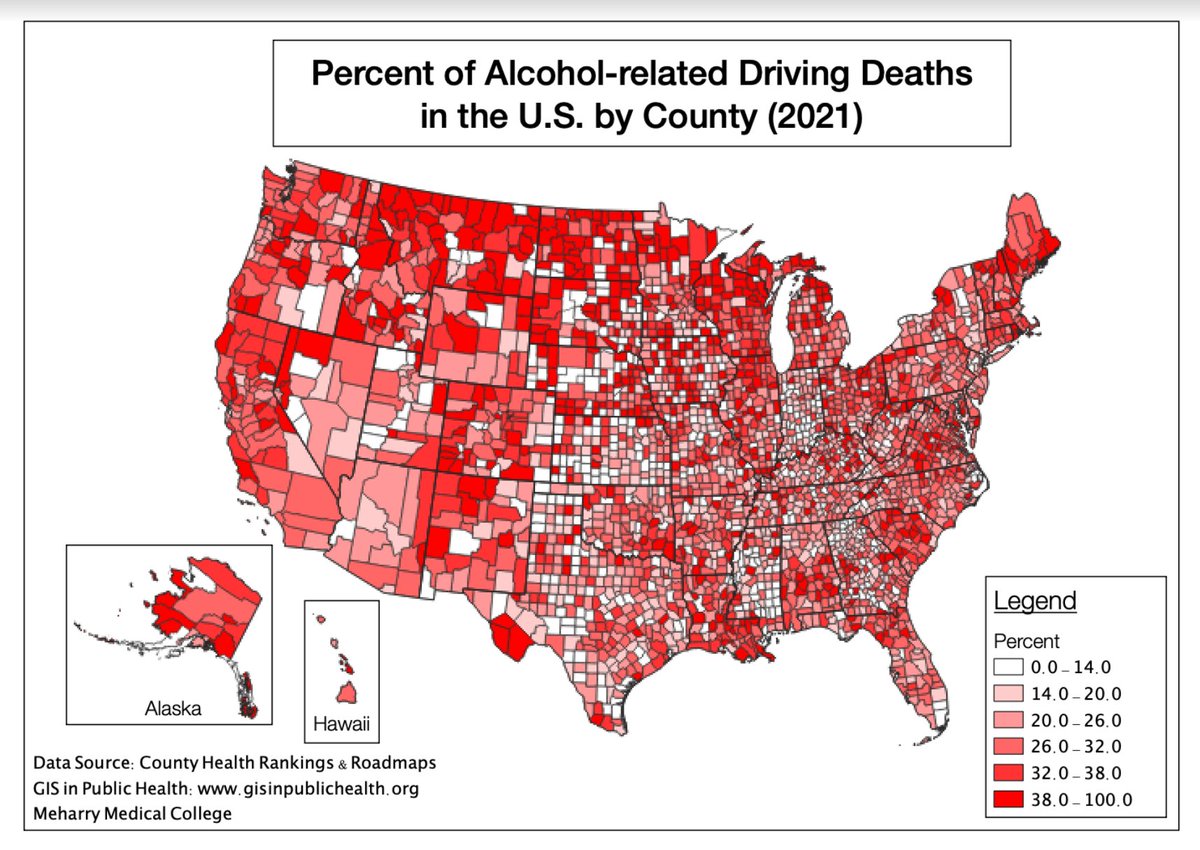
Using #QGIS students were able to create a map showing the Percent of Alcohol-related Driving Death in the U.S. (County Health Rankings & Roadmaps, 2021) #Thoughts ? #Meharry#PublicHealth#GIS@wansoo
Percent of Physically Inactive Adults in the U.S. (County Health Rankings & Roadmaps, 2021). Stay tuned to see more maps made by students in the Division of Public Health! #GIS#Publichealth#Meharry#Health
Follow @gis_meharry to see maps made by students in the Division of Public Health at Meharry Medical College. These maps depict relevant health-related statistics for the U.S.