A sneak peek at my latest UI/UX concept for an AI & robotics platform.
Went with a sleek dark mode and neon-purple accents to nail that futuristic vibe across desktop and mobile.
What do you think of the design?
#webdesign#uiux
@NickDoesDesign Honestly, creating a logo for a project is one of the hardest stages in my opinion. Making it beautiful, unique, conceptual, and recognizable. Props for seeing it through to the end
@VadimCarazan It seems like a cool concept, but personally, I think it's silly to put a logo in the headlights. It ends up looking like there are five logos on the back of the car
We're wrapping up work on the AIVORN case study.
Branding + web design for an artificial intelligence and robotics platform.
Coming tomorrow on Behance 🚀🚀🚀🚀🚀🚀🚀🚀
#webdesign#uidesign#behance
Cool work, I'd give it an 8 or 9.
The first thing that catches my eye is the spacing. There's almost no room at the bottom, and the image takes up a lot of space. Overall, it needs more breathing room.
In the top left corner, the project name should be stylized so it doesn't look like the website pages
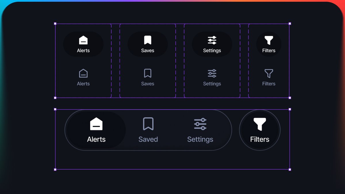
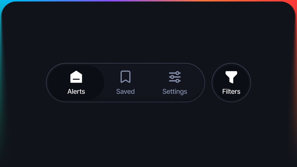
A nav bar done right. Let's break down the basics using my concept 👇
1. Massive tap targets. The icon itself might be small, but the invisible hit area around it needs to be large.
2. Clear contrast. It should be instantly obvious where we are. The active tab (Alerts) is bright, has a background, and uses a filled icon. The rest are dimmed and outlined.
3. Logical separation. Why is the Filters button separated? Because the first three icons are global app sections, while the filter is a local action for the current screen.
4. Breathing room. A floating bar, detached from the bottom edge of the screen, looks much lighter and more modern than a bulky classic bottom bar.
Working on an app design and came up with this dope nav bar.
What do you guys think about these floating styles? Or do you prefer the good old classic? ���