consistency ≠ uniformity:
for those who haven't lived through this era – we used to have beautiful, precision interfaces. now they're replaced by a design language that originated from the Apple Watch, with icons that only fit in squircles. but that's not even the point.
the point is we used to design the whole stack – the technology, the concepts, the interfaces. when designers only care about superficial consistency, platforms lose their uniqueness.
apple used to design systems. skeuomorphism wasn't just about leather textures – it was about teaching people new mental models. the trash can empties because you understand what a trash can does. aqua's lickable buttons and sheets had depth because the OS had layers you could understand. the old apple designed the whole stack – from metal to pixels to concepts. teams weren't just shipping features in the same box, they were building coherent platforms each with opinions about what computing should feel like for the medium.
liquid glass is fine on a phone. but on macOS it's unusable – lack of precision, visual noise everywhere. this is what happens when UI language designed for fingers bleed into macOS. we went from interfaces designed for a 27" cinema display with a precise cursor to interfaces designed for a 1.5" screen you tap with one finger.
the Mac is for creation and precision work. it needs information density. it needs chrome you can grab. it needs UI that gets out of your way but gives you power when you need it. instead we got padding and whitespace and translucent blurs optimized for touch targets nobody's touching.
the squircle icon mandate is a symptom. when you force every icon into the same shape, you're saying "brand consistency" matters more than "each app icon needs to communicate its function instantly." we traded clarity for uniformity. we traded precise design for cross-platform sameness.
consistency means your system has coherent rules within itself. uniformity means everything looks the same regardless of context.
the hardware team still gets it – that macbook pro + M-series chips, chef's kiss. but software design feels like it's chasing fat fingers instead of remembering what people do on a Mac.
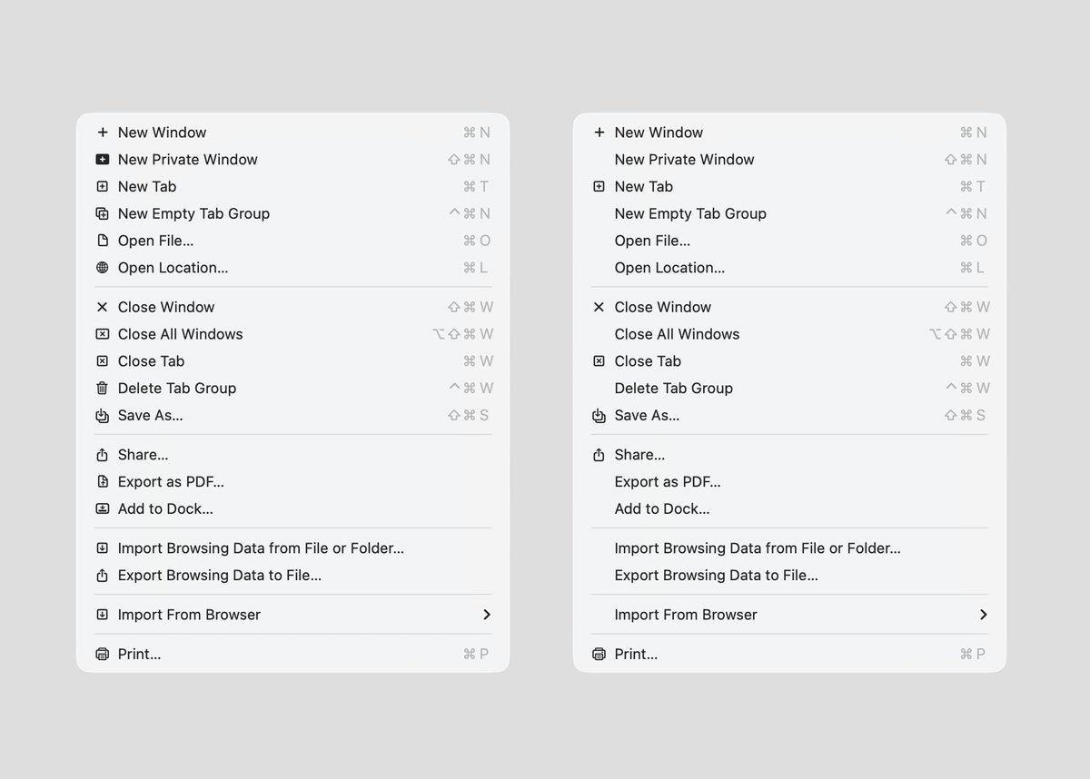
Apple shipped macOS Tahoe with an icon next to every single menu item. And in doing so, destroyed the entire point of icons.
An icon is a signal, and signals only work through contrast. The moment everything has one, none of them mean anything, you've just added noise that looks like clarity. Apple even reuses the same icon for completely different actions.
The right menu is my take: icons only on the actions you actually reach for daily: New Window, New Tab, Close. Everything else stays clean. Your eye knows exactly where to go.
The left is Tahoe. Every item screaming at the same volume.
Apple's own 1992 design guidelines called out every single one of these mistakes. Thirty years later, they made all of them.
Adding more is not the same as adding value. What's your take?
Anthropic says Project Glasswing uses its new Claude Mythos Preview model and has found security problems “in every major operating system and web browser.”
The model can scan code, test software, and identify serious vulnerabilities that may have been missed for years.
In some reported cases, it found issues in major operating systems and web browsers that survived decades of human review.
Mythos is also able to reason through how those flaws could be exploited, helping security teams patch them before attackers can use them.
Because of how powerful it is, Anthropic is not releasing the model publicly.
Instead, it is being used only with selected partners such as major tech companies and infrastructure organizations
A new phishing campaign targets financial and healthcare employees via Microsoft Teams.
Attackers pose as company IT support. They first spam the victim's email, then message via Teams offering to fix the "spam issue." They trick the user into starting a Quick Assist remote session.
During the session, attackers deploy signed MSI installers that install **A0Backdoor** malware.
Reported by BleepingComputer
NEW - Monkeys for hepatitis C, herpes and COVID animal testing were shot and killed after a truck carrying them overturned in Mississippi. The monkeys were said to be 40 pounds and "aggressive" to humans.
https://t.co/lBQpsz8NvQ
Adobe have revealed Project Moonlight.
A social media post AI agent that takes your images, analyses your analytics and delivers assets built for your brand and audience.
I haven’t seen a creative tool do this before.
#AdobeMax
Dear Friends, The reports that 3I ATLAS , rather than being behind the Sun at Perihelion on Oct 29 ( that's tomorrow) is actually Quite Visible in the sky away from the Sun are confirmed https://t.co/BK2MZsUfOC . Yes, this contradicts pervious "official" reports. Confused? Good!
startup founders:
design is about user behavior change, not pixels.
if you're redesigning the bad UI, it's not because it looks ugly...
it's because there is an undesired behavior with it.
if you're hiring a design shop to create a fancy UI that doesn't change behavior, you're burning cash.
make sure a designer knows how to reduce friction and how to improve product workflows at scale.
simple scales, fancy fails.
designers:
“this’ll look great on X”
clients:
“this better convert!”
“this better improve onboarding!”
“this better reduce churn!”
“this better make the dashboard usable!”
“this better not be another pretty thing that does nothing!”
and
that’s why most designers stay broke.
i want to design interfaces sooooo simple that it upsets designers!!! 😈
"really?!
this!?
someone paid you $20K+ for this?!
i can design this in 10 mins!" 🤬
☟
if you only saw the initial version and the long list of features the client wanted to have! : )
the brilliance of design lies in what is removed,
not in what is added.