We're chuffed to have helped @TreBluebirdsFC with their new club badge. Even though the old badge (pretty much identical to the Cardiff City 70s one) had strong historical ties to the club, it was time to move on and this new design signals a progressive future!
News Update👀
Trethomas Bluebirds is ecstatic to announce the new design of our club crest. Taking inspiration from our history as coal miners and a contemporary take on our mascot, the bluebird. A huge thank you to Mike Goode at Hop House Design for modernising our club crest👏🏻
As @LanceWymanNews begins sorting out his archive, he tells CR why our strange new reality is the perfect opportunity to look back at both the good and the bad.
Here’s a curious fact about Roy Hudd that not many know. He trained as a graphic artist before going pro as a comic and designed the iconic S logo of Schwartz spices.
Is today the day our oldest existing client website finally bites the dust? Hand coded in HTML it has proved very resilient over the years. We think it's close to 15 years old! The client has been bought out ~ otherwise it’d probably be going in another 15 years!
A day of experimenting with Facebook ads to promote a client’s new US e-commerce website (which we’ve also created). Lots of tweaking yet to do but the site is already seeing increased traffic from across the pond.
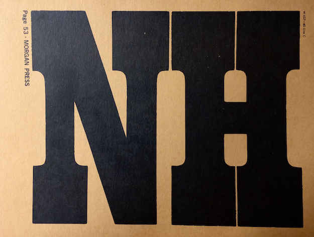
Figured out what the wood type used in the “No More War!” poster by Lubalin is. It's shown in Morgan Press’ wood type catalog. Face identified by @19cWT as Clarendon Italian (cc: @FontsInUse@stewf)
https://t.co/GC2EkItS9i
https://t.co/HIP4ywdiRn
The newly unveiled @Paris2024 logo combines two iconic symbols associated with the Games – a gold medal and the Olympic torch – with an image of Marianne, a female figure representing the French Republic https://t.co/3XVrWhtiDH
A deliberate retreat from social media mayhem, @nickcave is forging meaningful connections through his website, The Red Hand Files. @patrickburgoyne dives into its stories https://t.co/tfTzGVAEeY
@MOPrinting @sbf1891 @MaddySmith1804@brit_print_soc@PrintHistory @stbridelibrary Thank you so much! All of those followed… and will be visited. I miss the smell of ink and the sounds of printing… the graphic design industry has changed so much. And not, for the better!
🎃With the push of a button or motion activation, the skeletal hand emerges and types furiously for about 6 seconds before retreating out of sight. The typed message reads “it was a dark and stormy night.” Battery operated. While supplies last.
(2/3)
Been a while since we fired up Quark, which we did earlier. A strange experience tbh… a mix of nostalgia and OMG at how dated the UX is. It just aint 1995 anymore. Times have moved on.
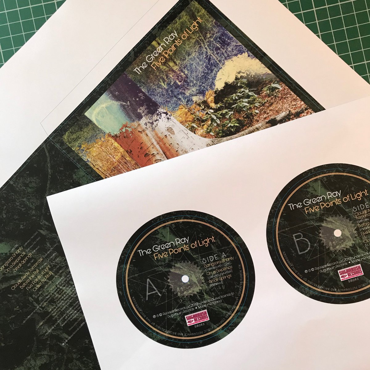
Artwork for The Green Ray's latest album, Five Points of Light has just gone to print. Really enjoyed working on it, a retro Decca/Island Records vibe for the cover with a slightly more contemporary twist for the labels. Looking forward to seeing it printed and freshly pressed!
Our new charter aims to increase diversity in the UK's creative industries. It include eight pledges aimed at ensuring our work - and the
people who make it - are fully representative of the richness, depth and diversity of the whole of the UK https://t.co/qg5MUGS8cn
We keep discovering so many inspirational creative people in this area. Thanks to Sue Milne and to @bmc_college for today. We could have stayed there all day!!!