https://t.co/AV0zlHulCj
This link shows an article furthering our discussion on Gestalt principles. From focal points to similarity, the article breaks down in ways how these principles are linked with psychology. Understanding both can lead to more insightful analytics #ISE5760
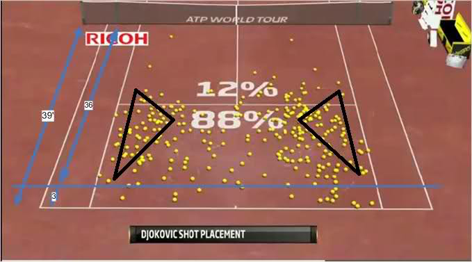
I would not necessarily say that this properly grouping the 88% from the 12% as all of the shots are represented in the same color. The triangles also group the better shots, however, its frame of reference is fuzzy. Nonetheless, it shows Djokovic's serving dominance
#ISE5760
This is another example of a very visual representation of data. Instead of using the rushing yard data in a graph, which could make the point less cohesive, the creators instead show each run in the frame of the field. This allows us to see efficiency more easily too #ISE5760
The Eagles gained 156 rushing yards before contact in their 48-22 victory over the Giants, edging out their Week 12 performance against the Packers (155) for the most yards before contact by any offense in a game this season.
#PHIvsNYG | #FlyEaglesFly
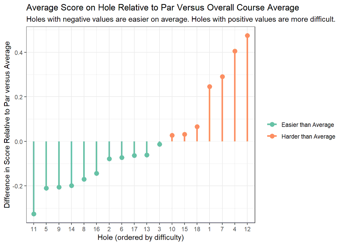
This is another example of a chart practicing Gestalt Principles we have learned in class. Its use of simplicity and continuation from 'bottom to up' make understanding which holes are the easiest and which are the hardest. The color changes also help us visualize this. #ISE5760
This visual epitomizes simplicity as it breaks down a more dynamic stat. Given analytical models that suggest when NFL team's should 'go for it' this graph efficiently shows a smooth transition from team to team. Here, you would like to be near the bottom. #ISE5760
Win probability lost per game by not going for it when a team "should" (according to @ben_bot_baldwin)
It was fun having 2021 Brandon Staley while it lasted
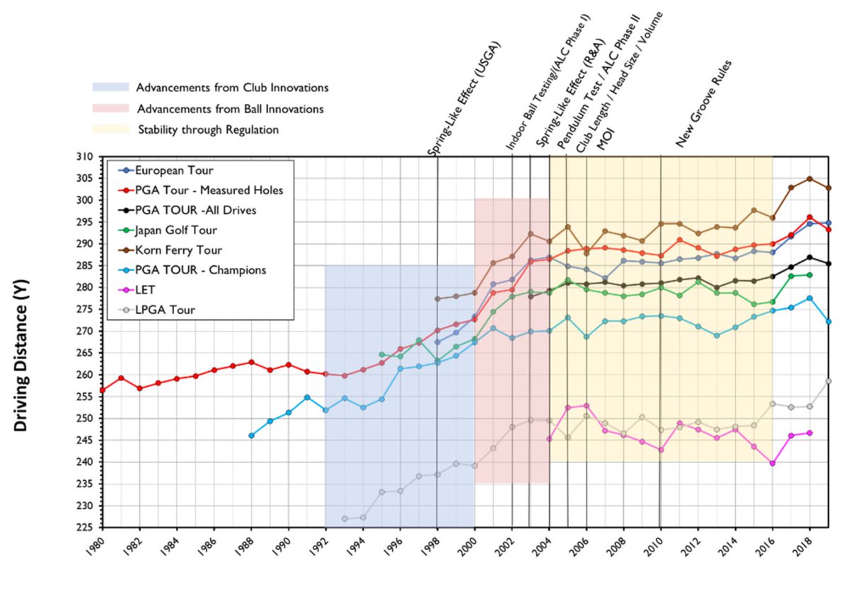
This is a golf visual with many different frame's of reference. The various leagues of golf's driving distance lines to the shaded regions giving insight on golf history that effected the trends. I assumed the PGA would hold the longest drives, yet that is not the case. #ISE5760
This is an interesting visual I was able to find regarding the Health and Income of nations in 2015. Given how their is so many countries the graph does a great job in its color separation, especially with a unique 'color by region' legend that I had yet to see before. #ISE5760
This visualization of the 49ers Pass Defense by game so far this year does a good job in simplicity and continuation. You could also see how the data is being put into context as the overall play of the defense tends to be at or below 0.2. #ISE5760
I saw much insight of gestlalt principles on slack, and figured to do my own dd outside of google. This is a great thread just from today. It was nice to hear more about what things we find more cohesive when used properly such as symmetry, continuation. #ISE5760
Rather you are creating a website, an app, or a printed design, you must take into account GESTALT PRINCIPLES
💕 Proximity: objects near each other appear as a group
👥 Similarity: similar items appear as a group